Nature Photographers Network
This is the preserved archive of the original Nature Photographers Network. The community continues at naturephotographers.network.
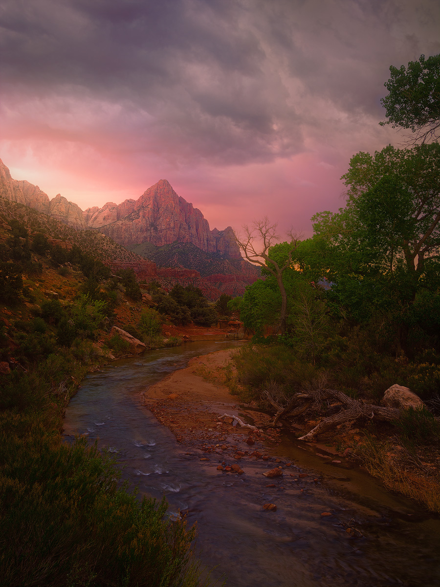
The Watchman [+info]
‹ PreviousLandscape GalleryNext ›

The Watchman [+info]

by John Williams

Gallery: LandscapePosted May 13, 20145,003 views39 comments
The sprained ankle I mentioned in a prior thread dramatically reduced my mobility for the second half of my trip to Utah last month, so my brother and I decided to go for the easy stuff. The Watchman is an oft-photographed icon, and it's an easy limp from the main road along a walking path to one of the bridges that crosses the Virgin River for this view. We took out folding chairs and coffee, and enjoyed a quiet dawn before the weekend crowd descended on the Park.

I have some thoughts on the processing of this image, but would like an untainted assessment first. If your interested in more info, pop back into the thread down the road. (I'll add “[+info]” to the title when I do.) All thoughts appreciated.

Nikon D7100
Nikon 12.0-24.0 mm f/4.0 at 19 mm (28mm equiv.)
0.5 sec. at f/16 and ISO 100

Comments

39 comments
Comment posted by Brian Schrayer on May 13, 2014 at 2:36 AM
:eek: :eek:
Wow, John. Nothing wrong with shooting icons when you can get something this spectacular. I like the composition and the way that the "S" curve follows its way from the creek up through the trees and then back to the highlights in the sky. More like a "Z" curve really. The light is what really makes this image stand out. Excellent work!!
Registered on May 28, 2004, 114 Posts, 2890 Comments
Comment posted by Navin Sarma on May 13, 2014 at 2:43 AM
Thats some incredible clarity, John, and the color is just amazing. Your web sharpening is fantastic. I love the orange and pink combo in the sky and the bleed. All around awesome image.
Registered on July 17, 2011, 233 Posts, 1373 Comments
Comment posted by Mark Metternich on May 13, 2014 at 3:18 AM
Now THAT is a great photo!!! Dreamy. I love it! :toast:
Registered on June 19, 2009, 276 Posts, 6240 Comments
Comment posted by Kane Engelbert on May 13, 2014 at 3:27 AM
Perfect comp, and color but just a tad too much applied Guas Blur for my eye. You witnessed a very colorful (rare) scene from the bridge and you "creamed" it up. If it were me, I would enhance/Curve darker those rare and amazing clouds which would add some much needed drama to the scene. As is, just looks like a beautiful scene. Which works on many levels.

Beautiful scenes will come and go....Adding a little drama might make us "connect." Connecting is forever, pretty scenes can fade away. There's too much competition out there these days to not take advantage of Bare Bones of what you have here.
Registered on June 14, 2009, 63 Posts, 291 Comments
Comment posted by John Williams on May 13, 2014 at 4:27 AM
I'm not sure if I caught all of that Kane, but do you mean something like this? Even more?
Registered on September 6, 2007, 221 Posts, 5985 Comments
Comment posted by Kane Engelbert on May 13, 2014 at 4:59 AM
The darker re post looks pretty darn good John. I'll be greedy asking for a notch of Curves highlights though.... However I think this version ups the drama of your first and to me works as is.
Registered on June 14, 2009, 63 Posts, 291 Comments
Comment posted by Dan Kearl on May 13, 2014 at 5:30 AM
The comp and light is really nice.
I might lighten up the bottom just a tad.
Registered on September 2, 2013, 209 Posts, 1514 Comments
Comment posted by Joseph Campisi on May 13, 2014 at 6:04 AM
Killer John! Even better on the repost with Kane's suggestions. Great light and image! :toast:
Registered on November 24, 2008, 304 Posts, 3211 Comments
Comment posted by Karsten Wrobel on May 13, 2014 at 6:59 AM
wonderful comp, light and colours, original post works well for me, but yes the repost has more impact :toast:
Registered on November 1, 2008, 117 Posts, 851 Comments
Comment posted by Alan LaFaver on May 13, 2014 at 8:01 AM
Definitely a very nice image. To me, a 'painting' look, which I like. The landscape is so nice and you captured it well. I really like the portrait crop and composition here. The strong magenta hue is from the dawn light, right? Interesting. I might dial that down a bit, might. The greens are great. I like the dark grey clouds and rusty color of that Utah soil. I might mess with the contrast of the peak to make it stand out just a bit more.
Overall, really nice. I'm not sure any adjustments would make it better, only different.
:toast:
Registered on February 28, 2014, 18 Posts, 147 Comments
Comment posted by John&Patty Benway on May 13, 2014 at 10:29 AM
What a pretty scene John, I would be happy with either one. Beautifully seen and presented.
John
Registered on May 12, 2006, 626 Posts, 8700 Comments
Comment posted by Rick Turner on May 13, 2014 at 1:28 PM
ohn,

This is one of your best. The subdued color looks magical. :toast:
Registered on February 18, 2012, 534 Posts, 2755 Comments
Comment posted by Jared Warren on May 13, 2014 at 1:29 PM
Fantastic! Love the repost especially.
Registered on May 11, 2012, 84 Posts, 931 Comments
Comment posted by Sairam Sundaresan on May 13, 2014 at 1:52 PM
Alright, I'm retiring. Don't think I can top this. Seriously, John, you've outdone yourself! I prefer the repost too :smile:
Registered on March 14, 2013, 100 Posts, 643 Comments
Comment posted by Nick Bristol on May 13, 2014 at 2:00 PM
Wow John, This is a wonderful scene captured in fantastic conditions. Really like the overall feel and mood this has. Both versions are very nice but I think the repost works best. :toast:

Nick Bristol
Lone Rock, WI
Registered on February 1, 2004, 752 Posts, 14140 Comments
Comment posted by Kah Kit Yoong on May 13, 2014 at 2:01 PM
Being out of action for the last 6 weeks I can understand shooting the 'easy stuff'. I feel that this presentation is a departure from your usual style. Even though there's a painterly quality to this, it seems more in line with the dreamy warm look that has been very popular lately. The colours and hues seem less natural to me for example, the vivd greens should not look this way under the glow of such a coloured sky. Anyway these are just observations and have nothing to do with my overall impression - I like the result very much.
Registered on September 27, 2006, 636 Posts, 10682 Comments
Comment posted by gary phillips on May 13, 2014 at 2:55 PM
Beautiful take on Zion and the Watchman, John. Not much I can add to the discussion, except the fact that this is a wonderful image made better by Kane's suggestion. I also agree with Alan that I would back off the magenta particularly in the cliff band below the Watchman. Great work as usual. :toast:
Registered on October 24, 2013, 185 Posts, 4136 Comments
Comment posted by Bruce King on May 13, 2014 at 4:06 PM
gorgeous John. I like the slightly moodier repost.
Registered on January 14, 2010, 276 Posts, 2212 Comments
Comment posted by John Williams on May 13, 2014 at 4:19 PM
Kane, you greedy... :wink: After playing with your suggestion, you're right (grumble grumble :biggrin: ). If I'm going to take a photo in the direction you suggest, I might as well go the full distance.
Registered on September 6, 2007, 221 Posts, 5985 Comments
Comment posted by John Williams on May 13, 2014 at 4:21 PM
As I noted in the original post above, I was curious to see what you thought of the image as presented. Now I'll post several more stages below, and I'd be curious to hear what you think after seeing them.

As digital photography has matured, processing has become a bigger and bigger part of our art. Here on NPN we normally critique the final image, but I wonder if it would be helpful if we occasionally posted examples of what we started processing with. How much should an image's starting point effect photo critique. A lot? Not at all?

Although I'm not a big fan of cotton candy images (where the sky is pushed so hard you get unnatural pinks and blues), I'm pretty liberal when it comes to image processing. As one NPNer said “It's all guise guys.” (I wish I could remember who it was that said that. Anybody remember?) I was recently reading a book about Ansel Adams, and was fascinated that later in his career he spent much less time in the field, and much more time in the darkroom.

In Kah's (BTW, my apologies for being so ignorant, but is it Kah's or Kah Kit's or Yoong's?) comment he noted “...it seems more in line with the dreamy warm look that has been very popular lately.” I find the popular trend he refers to in processing to be very appealing in others' work, but struggle with how far to take an image in that direction in my own work. Kane's comments also address this. This image was different for me from the beginning (the first time I've sat in a comfortable chair drinking coffee while taking a landscape photo), and I thought it would be fun to throw out those internal thoughts for a change and specifically process towards that popular look.

The end result, as Kah noted, is that this image is farther from what my eye saw then my typical images, and that's what got me thinking about whether it would be a good trend to post “before” in addition to “after” versions of our images occasionally.

NPN has been the biggest influence in my photography since I started playing with landscapes 10 years, or so, ago. I've learned so much from receiving and (especially) giving critiques and comments. To be very clear, I'm not interested in rehashing the never-ending argument of the right or wrong of processing to reality vs. vision. Rather I'm wondering if it would add to our learning process here on NPN if we posted more of our “beginnings” in addition to our “ends,” especially with images that receive a lot of processing?

Thoughts?
Registered on September 6, 2007, 221 Posts, 5985 Comments
Comment posted by R.Bill Moser on May 13, 2014 at 4:22 PM
John, this is simply breathtaking. Great image. I love it :toast: :toast: :toast:
Registered on January 29, 2010, 285 Posts, 4281 Comments
Comment posted by John Williams on May 13, 2014 at 4:23 PM
Here's the jpg the camera recorded along with the raw. (Unless you choose an appropriate "canned" setting, camera's often struggle with early or late light.)
Registered on September 6, 2007, 221 Posts, 5985 Comments
Comment posted by John Williams on May 13, 2014 at 4:23 PM
What I pulled from raw.
Registered on September 6, 2007, 221 Posts, 5985 Comments
Comment posted by John Williams on May 13, 2014 at 4:24 PM
A rough draft, more along the lines of how I would normally process the image.

(It would seem the best way to get a lot of comments on an image is to post a gazillion times yourself :wink: :wink: !)
Registered on September 6, 2007, 221 Posts, 5985 Comments
Comment posted by Daniel Rappaport on May 13, 2014 at 4:40 PM
You've really caught some beautiful light here, and made the most of it. Keeping the foreground naturally dark really emphasizes the background glow. Well done.
Registered on September 9, 2009, 294 Posts, 2006 Comments
Comment posted by Navin Sarma on May 13, 2014 at 4:44 PM
An interesting study of images john. I agree with you that sharing some of the interim steps would help folks immensely in visualizing their own final product. Also, could help the sharer by getting comments through the processing workflow. Perhaps some will be hesitant to share if they feel others will copy the style. My 2c is that if this style appeals to you (and it certainly does to me), one should try to learn how to execute it. Then hopefully that person will take some creative liberties here and there to put his or her mark on it so to speak. To the end of learning this style, I took a skype class from Ryan Dyar late last year to get a handle on the light bleeding that continues to catch fire on the net. So far I haven't executed it much, because of a reason somewhere between I don't want to mimic exactly and I still can't do it that well :toast:
Registered on July 17, 2011, 233 Posts, 1373 Comments
Comment posted by Bill Chambers on May 13, 2014 at 8:22 PM
I really like your composition. As always with you, you very carefully craft your images. As for processing, I think the upper half looks great but I find the lower half kind of melds into one big pot; i.e. not much separation of subjects. I think with a little selective burning and dodging or blending that can be easily solved.

OOPS, I just noticed you have edited this before. I was commenting on the original.
Registered on April 10, 2005, 753 Posts, 21216 Comments
Comment posted by Dan Kearl on May 13, 2014 at 8:59 PM
Thanks for posting your sequence and the out of camera photo.
It does make for some good discussion. That said, I like the last repost best. Your original post
has the mood you obviously were trying to portray, but while good, it is a bit dark and muddy for me.
I find the sky and the FG more to my liking.
Registered on September 2, 2013, 209 Posts, 1514 Comments
Comment posted by Bill Leggett on May 13, 2014 at 9:05 PM
A classic from Zion, John. You really had the sky conditions in your favor. I'll be there tomorrow and likely will shoot on your tripod holes. I'm on my laptop while traveling so cannot make an assessment, but the comp looks quite good. Only possible nit I see is the location of the bare tree with the Watchman - possibly moving left a bit would change that.
Registered on July 21, 2004, 706 Posts, 3233 Comments
Comment posted by Brian Schrayer on May 14, 2014 at 1:56 AM
It's very interesting to see this image unfold, John. I would never have expected the final result if I had only seen the RAW file (of course knowing that the RAW file is a low saturation and low contrast version of the image). I find it very helpful to see how you brought this one to life.

I am interested in knowing which image is closest to what you actually saw - not from the perspective of arguing about processing vs. reality, but more from the perspective of better visualizing the end result in my own images.
Registered on May 28, 2004, 114 Posts, 2890 Comments
Comment posted by John Williams on May 14, 2014 at 2:13 AM
The final one for sure Brian, with touches of the jpg in the sky drama and a bit of the heavier shadows of the raw version (and of course, no vignetting).

I typically pull images out of raw fairly flat. (I like to reach end points in Photoshop.) There was a nice touch of magenta, mostly left of the mountain, but it was fairly subdued. The jpg version totally misses that. The clouds were quite dramatic (a little less than they are in that final version, but still heavy with contrast); Kane's suggestions actually moved the original post back toward what I was seeing. There was a lot of contrast between the earth and the sky, much like the jpg shows, but the eye adjusts so well that the final version is more like what I was seeing.
Registered on September 6, 2007, 221 Posts, 5985 Comments
Comment posted by Brian Schrayer on May 14, 2014 at 2:23 AM
Thanks, John. I appreciate the reply and I always enjoy seeing your work posted here.
Registered on May 28, 2004, 114 Posts, 2890 Comments
Comment posted by Stuart Williams on May 14, 2014 at 6:34 AM
NPN should have a forum dedicated to people showing what they've done - as you have done, john! it'd be a great learning forum for people.
Registered on December 7, 2007, 247 Posts, 4792 Comments
Comment posted by Thomas Haney on May 14, 2014 at 1:03 PM
John, thank you so much for posting your raw file and workflow, I'm sure we all would learn more by doing so if we can get past the fear. Posting a raw file next to a finished product feels a bit like posting a nude photo of oneself in a strange way, but I'm all for a forum dedicated to it. Regarding the image, the processing takes it much too far from reality for me, though I wouldn't have known that without seeing the raw file.
Registered on April 7, 2013, 138 Posts, 537 Comments
Comment posted by Mark Seaver on May 16, 2014 at 4:36 AM
Awesome set of colors here, John. I may need to sprain my ankle, if this is the result. :wink: I would burn the brightest section of the sky (left side, ~1/3 down) and possibly tone down the green saturation in the trees on the right, but those would be subtle adjustments to a lovely image.
Registered on January 23, 2011, 1103 Posts, 17270 Comments
Comment posted by Marylynne Diggs on May 17, 2014 at 9:03 PM
Interesting post, John. The final result is Bierstadt-ish. I like it, but it doesn't quite feel like you, whatever that means, coming from an acquaintance
;-). I like the idea ofp a Before and After forum...start with raw, have a "finished version" and then get feedback on going further or retracing steps. It would be very illuminating, I think.
Registered on December 14, 2010, 122 Posts, 1034 Comments
Comment posted by Kah Kit Yoong on May 17, 2014 at 10:15 PM
This has been very interesting to watch evolve. I think the version after Kane's comment is the best. Personally I think this falls into the photo art category with the degree of liberties taken with colour and white balance, although more and more I see this being the norm with warmth and magenta added to scenes. I'm not saying that such an approach is right or wrong.
Registered on September 27, 2006, 636 Posts, 10682 Comments
Comment posted by Vance Gese on May 18, 2014 at 9:24 PM
A little late in commenting, John, but this is incredible. I especially like your second repost. And thank you for adding the images of the RAW file, etc. Superb work in accomplishing your final visualization. I'm always reminded what Ansel Adams said about the negative being the score and the final image or print the performance; it's all up to you, the artist.
Registered on November 13, 2008, 298 Posts, 6629 Comments
Comment posted by Thomas Miller on May 19, 2014 at 4:57 PM
Beautiful shot! :toast:
Registered on March 10, 2011, 56 Posts, 56 Comments