Nature Photographers Network
This is the preserved archive of the original Nature Photographers Network. The community continues at naturephotographers.network.
Tulips 10 (REAL Final)
‹ PreviousFlora GalleryNext ›

Tulips 10 (REAL Final)

by Nathan Buck

Gallery: FloraPosted May 13, 2014159 views11 comments
Hi all.

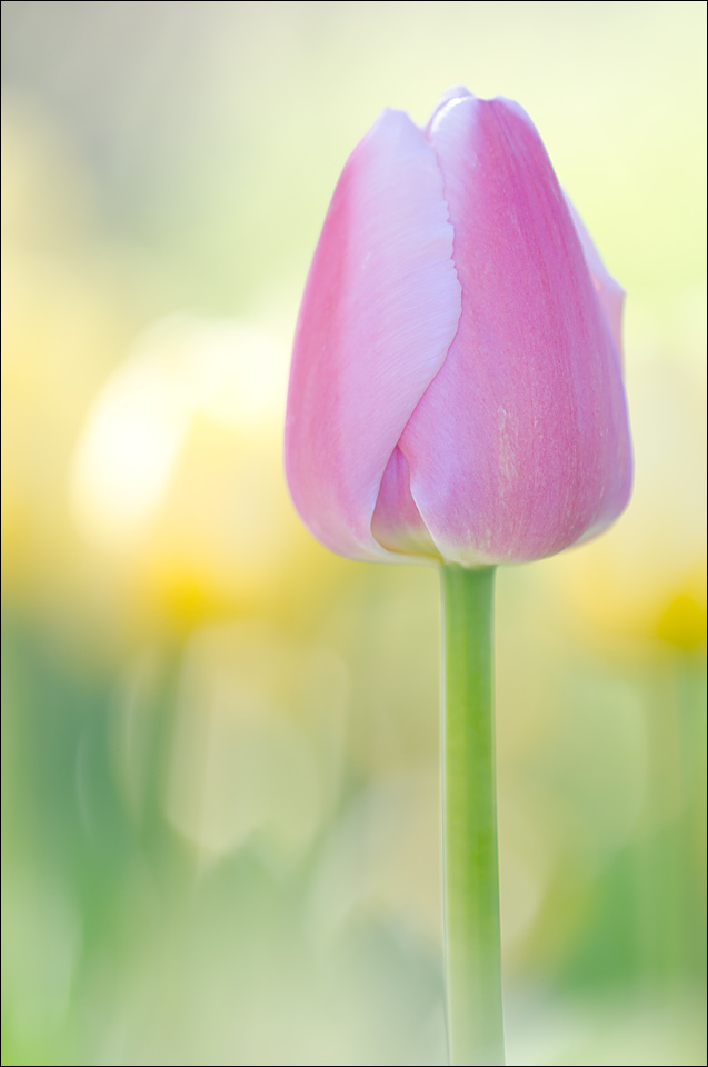
OK. Sorry, I lied. I wanted to get your thoughts on whether you prefer this version to Tulips 6. Here is a link to that photo for reference.

Do you like one of them over the other? The only reason that I an wondering if this one works better is that I feel that the focus is a bit better, and maybe moving farther right for the subject helps a bit.

Any and all thoughts apprecited. Thank you for the time that you take to critique my images.

Nathan

Nikon D7000, Sigma 180 macro, tripod, ISO 200, f4

Comments

11 comments
Comment posted by Daniel & Loana on May 13, 2014 at 9:16 PM
I like this one very much. For both colours and composition and DOF are superb. In this one I like the fact that the stalk is completely visible.

D&L
Registered on October 7, 2008, 166 Posts, 3044 Comments
Comment posted by Floyd Hopper on May 14, 2014 at 12:08 AM
All of your tulip posts are great. I like the softness of the flower and DOf. I am a little distracted by the "white" area just left of the flower. My eye focuses on that "spot" distracting from the beautiful tulip itself.
Registered on May 1, 2009, 652 Posts, 762 Comments
Comment posted by Giuseppe Guadagno on May 14, 2014 at 2:02 PM
Nathan, I can't be often present in the site still for a while but I have seen and admired your 10 tulips. About the final choise I like better this number 10. I love the delicete, low satureted, pastel colors of both but my eyes like better the backgrond here with the far echos of blurred tulips behind the stem.
One thought: what do you think about lowering the light of the white edge in the yellow tulip just behind the subject?
By the way, it's a beautiful photo!
Cheers.
Registered on February 3, 2007, 827 Posts, 5052 Comments
Comment posted by Philip Hodgkins on May 14, 2014 at 4:33 PM
I would say that the only difference is the length of the stem, which is in a more pleasing ratio to the bud. I would vote for this one on that basis alone.
Registered on July 24, 2006, 2741 Posts, 12349 Comments
Comment posted by Ramamohan Pai on May 14, 2014 at 11:29 PM
Nathan - Tough Call --> I might be slightly partial to the Tulip 6. I like the subtle echoes provides by the OOF tulips in that photo. If there was no comparison was made available, this photo would also look just pretty. The very bright area could be toned down a bit.
Registered on November 1, 2003, 550 Posts, 9037 Comments
Comment posted by Rick Diffley on May 15, 2014 at 12:02 AM
The main subject is great! What is distracting is the overexposed background areas. Adding a textured background may be a good addition.
Registered on April 8, 2012, 52 Posts, 279 Comments
Comment posted by Jim Hackley on May 15, 2014 at 1:52 AM
I happen to like tulips 6 just a little better. If it were not for the bright white spot just to the left of the tulip (instead of yellow to match rest of background) which draws me eye I would of gone for this one. This is a very beautiful composition and for many that spot may not matter, excellent series of tulip images.
Registered on September 17, 2009, 302 Posts, 5535 Comments
Comment posted by Sanjay Sundaram on May 15, 2014 at 4:30 AM
Quite a series Nathan. Excellent set of images. I like Tulip #5 the best, right after the image that was the weekly pick. Congrats! The composition was wonderful and the bold color in #5 really caught my eye. Wonderful!

Sanjay
Registered on April 9, 2013, 107 Posts, 725 Comments
Comment posted by Bill Fach on May 16, 2014 at 12:56 AM
Nathan: This has been a great series. My apologies for not commenting on them all. I do think this is my favorite of the two. Love the color palette of all of them but this comp works better for me. Just superb work. >=))>
Registered on November 1, 2003, 1805 Posts, 26981 Comments
Comment posted by Bob/Charly Nelson on May 16, 2014 at 3:04 PM
If you sent me large framed prints of all the tulip series I might have an easier time deciding :biggrin: . I like this for the stem.
Bob :wavey:
Registered on January 29, 2014, 35 Posts, 398 Comments
Comment posted by Albert Darmo on May 16, 2014 at 7:32 PM
Hi Nathan :wavey: I'll say like Ram. tough call .. both versions are perfectly done . with the croped #6 and # 10 neck & neck together. i guess the stem on #10 make it the winner :toast:


Albert Darmo
Canada
Registered on November 25, 2008, 1386 Posts, 11978 Comments