Gallery: LandscapePosted May 17, 2014227 views14 comments
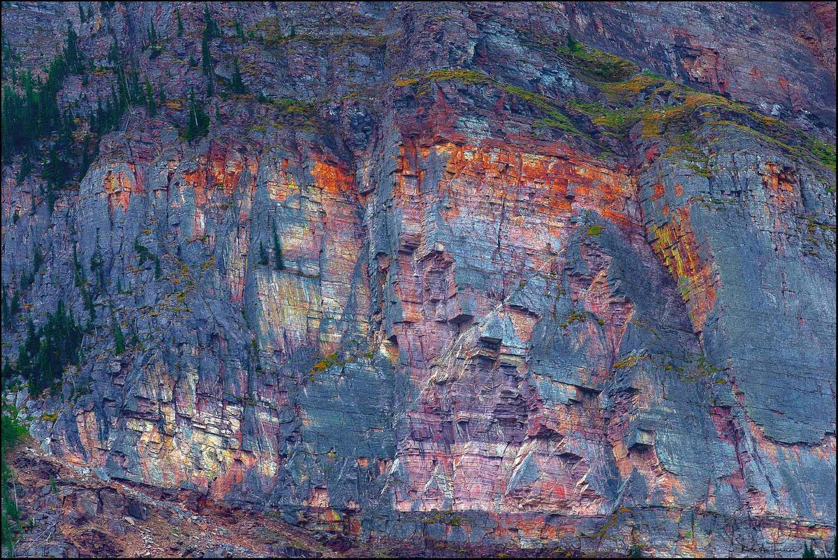
Time has created quite a special mural of rock and trees on the shoreline of Lake Louise, British Columbia.
I have been thinking about this shot for couple of years and think it is time to work on it.
C&C appreciated.
Comments
14 comments
Comment posted by Pat Sampson on May 17, 2014 at 12:58 PM
I really like the rich colors in this Rick and the textures. I might be inclined to brighten the upper quarter a little but would have to see it to know. I find the image appealing and interesting as posted.
pat
Registered on May 19, 2007, 953 Posts, 15989 Comments
Comment posted by Dan Kearl on May 17, 2014 at 2:24 PM
I like everything about it, Stunning natural colors……
Well seen and taken.
Registered on September 2, 2013, 209 Posts, 1514 Comments
Comment posted by Kathy Barnhart on May 17, 2014 at 3:04 PM
Beautiful and amazing colors, making a nice abstract. Very nicely seen!
Registered on November 11, 2011, 404 Posts, 1639 Comments
Comment posted by Eva McDermott on May 17, 2014 at 6:41 PM
Great color and and wonderful abstract. I might be tempted to darken the gray rock faces on the right and left sightly but that is my personal preference.
Registered on January 4, 2009, 1015 Posts, 13229 Comments
Comment posted by Mark Seaver on May 18, 2014 at 8:23 AM
This is a neat abstract, Rick, very well seen. I agree with Pat that brightening the colors, especially the greens in the top left third, would add nicely.
Registered on January 23, 2011, 1103 Posts, 17270 Comments
Comment posted by Rick Turner on May 18, 2014 at 9:35 AM
Thanks for the suggestions. This is a tweak of posted image.
C&C
Registered on February 18, 2012, 534 Posts, 2755 Comments
Comment posted by Michael Lowe on May 18, 2014 at 10:24 AM
I like the original better, Rick. The repost looks a little too neon
Registered on February 11, 2004, 777 Posts, 5252 Comments
Comment posted by Carol Hyman on May 18, 2014 at 3:00 PM
Wonderful complementary tones, Rick. Nice 3D effect. I do agree with Pat's comments. Would definitely lighten the upper portion of the image. As it stands now, IMO, it looks like two separate image and I think the colors need to be carefully blended.
best wishes,
Carol
Registered on January 18, 2007, 597 Posts, 8062 Comments
Comment posted by Zhoen on May 19, 2014 at 12:00 PM
Sweet color Rick!
Registered on May 16, 2013, 25 Posts, 188 Comments
Comment posted by gary phillips on May 19, 2014 at 12:42 PM
This reminds me of an old madras shirt I once had. It's amazing how in the right light an essentially monochromatic scene can take on so many colors. I think the repost is a bit too hot for my taste but I do like the brightened ULC that resulted there. Nice take on this, Rick.
Registered on October 24, 2013, 185 Posts, 4136 Comments
Comment posted by Nick Bristol on May 19, 2014 at 2:10 PM
Rick, This is really nice. I especially enjoy the more natural look of the original post.
Nick Bristol
Lone Rock, WI
Registered on February 1, 2004, 752 Posts, 14140 Comments
Comment posted by Pat Sampson on May 19, 2014 at 4:00 PM
Just two different images Rick. I think I actually like both equally. It would just depend on my mood and where they were hung. Very well seen and presented in both cases for my tastes.
pat
Registered on May 19, 2007, 953 Posts, 15989 Comments
Comment posted by Albert Darmo on May 23, 2014 at 10:59 PM
Hi Rick A perfect title, for a perfectly beautiful image
Albert Darmo
Canada
Registered on November 25, 2008, 1386 Posts, 11978 Comments
Comment posted by Patrick O'Healy on May 23, 2014 at 11:47 PM
Incredible shot
Registered on March 13, 2011, 326 Posts, 1679 Comments

Comments
14 commentspat
Well seen and taken.
C&C
best wishes,
Carol
Nick Bristol
Lone Rock, WI
pat
Albert Darmo
Canada