Nature Photographers Network
This is the preserved archive of the original Nature Photographers Network. The community continues at naturephotographers.network.
Rosy dawn
‹ PreviousLandscape GalleryNext ›

Rosy dawn

by Kathy Barnhart

Gallery: LandscapePosted May 30, 2014401 views11 comments
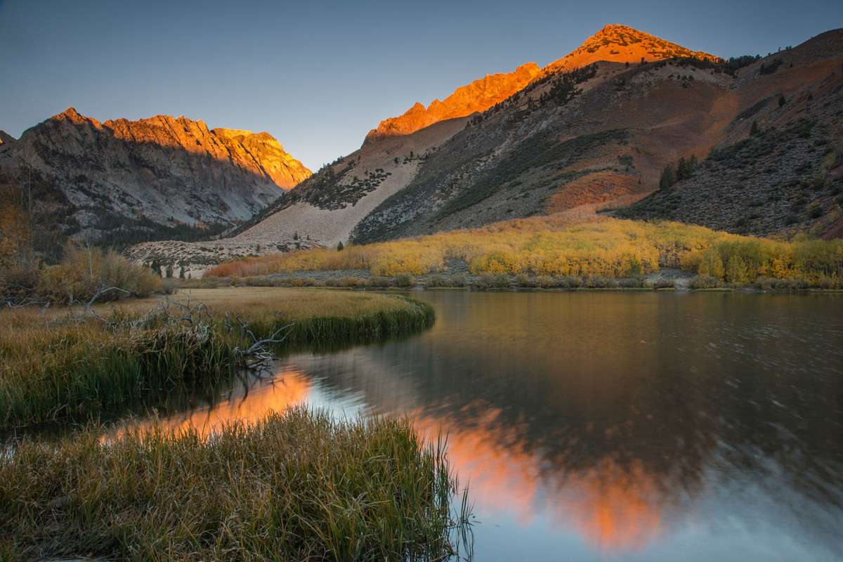
This is an old image that I have just re-discovered from fall of 2012 at North Lake in the eastern Sierras. I hadn't noticed the wonderful colors in the water that fan out due to the long exposure.

I would appreciate any comments or suggestions. I always learn from them.

Canon 5d,M3, ISO 100,24mm, f/18, 4.0sec.

Comments

11 comments
Comment posted by Nancy Lea Sandy on May 30, 2014 at 10:19 AM
Lovely warm light on the peaks and a wonderful serenity. Very nice as is but a bit more contrast might make it pop even more.
Registered on January 24, 2011, 576 Posts, 6942 Comments
Comment posted by Mark Seaver on May 30, 2014 at 10:45 AM
The colors are indeed lovely and the fanning action in the water adds some fine interest as well as a touch of tension. This is a fine, gentle scene. I would try dodging the aspens to see how a little more color/interest there works, but would have to see the result before deciding whether that's a real improvement.
Registered on January 23, 2011, 1103 Posts, 17270 Comments
Comment posted by gary phillips on May 30, 2014 at 11:30 AM
Very nice, Kathy. I agree with Mark and Nancy Lea that it might be cool to experiment with bringing some color out of those aspens and adding a little pop overall.
Registered on October 24, 2013, 185 Posts, 4136 Comments
Comment posted by Richard Teller on May 30, 2014 at 7:02 PM
Nice composition and light. I also agree with the others about playing with the contrast or color to add a little more pop to the image.
Registered on August 23, 2010, 1162 Posts, 6692 Comments
Comment posted by Bill Reid on May 31, 2014 at 10:50 AM
Beautiful light on the moutains and the water looks great in this Kathy. I agree with the others about a little more pop
in the image but nicely done as is. Great job.
Registered on January 27, 2013, 65 Posts, 2460 Comments
Comment posted by Sairam Sundaresan on May 31, 2014 at 11:58 AM
I love the warmth on the peaks, the light is quite beautiful. I find the foreground a little soft though. Adding some sharpening would really make this image sing.
Registered on March 14, 2013, 100 Posts, 643 Comments
Comment posted by Brian Schrayer on May 31, 2014 at 12:29 PM
Kathy, I really like the light on the peaks combined with the lovely fall color. The radiating lines in the foreground from the flow of the stream are really nice and lead my eye into the scene.
Registered on May 28, 2004, 114 Posts, 2890 Comments
Comment posted by Nick Bristol on May 31, 2014 at 2:47 PM
Hi Kathy, Some wonderful light on those peaks and also in the reflections. A little more pop would probably work well but I quite enjoy the quiet mood this scene has.

Nick Bristol
Lone Rock, WI
Registered on February 1, 2004, 752 Posts, 14140 Comments
Comment posted by Pat Sampson on May 31, 2014 at 5:07 PM
Kathy,

I wouldn't change a thing. Beautiful scene and mood. I like it exactly as posted. Would just like to see it printed large.

pat
Registered on May 19, 2007, 953 Posts, 15989 Comments
Comment posted by Preston Birdwell on May 31, 2014 at 6:12 PM
Kathy,

This is a lovely image of North Lake. I think a very slight pop in contrast would be nice. There is a trick where you use USM set to a high radius and low amount that increases 'micro contrast' without a severe change in overall contrast. Here are settings to try, for a starting point. I would do this on a copy of your background layer so you can delete the layer if you don't like the result.

Radius: 60
Amount: Between 8 and 15%
Threshold: 0

Here's an older article from Online Photographer about the technique.

You can try different combinations of values, but be careful: It would be easy to go too far and begin to affect overall contrast too much. I don't think you'd want that here.

The aspens could use a little pop, too. Make a selection of the aspens and then create a curves layer and adjust it. If you want to increase their saturation, load the curves mask, create a Hue/Sat layer and bump the yellows and reds a bit. It won't take much adjustment on either of these layers.

I think this image would make a lovely print--that's why I went into detail.

--P
Registered on November 1, 2003, 471 Posts, 5188 Comments
Comment posted by Kathy Barnhart on May 31, 2014 at 10:25 PM
Thanks to everyone for the suggestions. I'm leaving on a short trip but when I return I'll try out some of the ideas.

Kathy
Registered on November 11, 2011, 404 Posts, 1639 Comments