Nature Photographers Network
This is the preserved archive of the original Nature Photographers Network. The community continues at naturephotographers.network.
Sentinels (+RP)
‹ PreviousLandscape GalleryNext ›

Sentinels (+RP)

by Jared Warren

Gallery: LandscapePosted June 13, 2014325 views17 comments
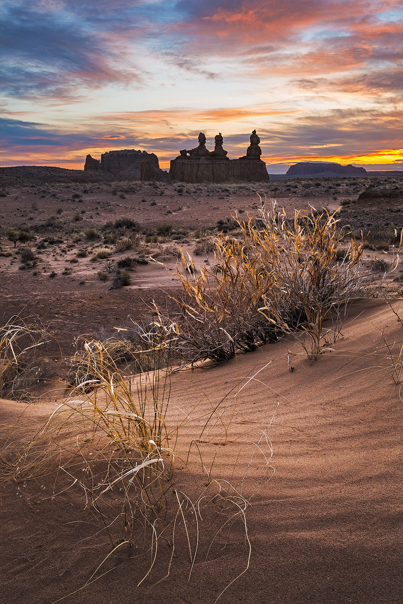
This is a sunrise from a couple months ago at Goblin Valley. It's a blend of 4 exposures for dynamic range and depth of field. There was a breeze that made capturing the foreground challenging, and at 100% there are some noticeable issues with the focus blend.

I had put off processing this one because I didn't know if I could make it work, but it made for good PP practice and your feedback always helps me improve things further. Along with any other feedback you'd like to provide, I'm wondering if the background feels too dark relative to the foreground. Thanks!

Comments

17 comments
Comment posted by Pat Sampson on June 13, 2014 at 10:10 PM
Jared,

I like this image a lot. The stack looks good on my Macbook Pro - no artifacts and the grasses and sand look crisp to me. I also like the light in the foreground but it does look a little strong to me relative to the rest of the image. I think I'd probably try to bring the brightness up some in the mid and back while holding the sky where it is. Love the comp and the light.

pat
Registered on May 19, 2007, 953 Posts, 15989 Comments
Comment posted by Michael Cothran on June 13, 2014 at 10:25 PM
The lighting in the foreground is simply beautiful as is. But I do believe the background (other than the sky) is too dark relatively.
Registered on December 5, 2012, 31 Posts, 730 Comments
Comment posted by Tony Kuyper on June 13, 2014 at 10:35 PM
I like the elements and the depth you've create with them. My only thought is the contrast balance feels off. Foreground looks right, but hoodoos and sky in back look too contrasty. Sort of feels like a too strong NDF.
Registered on November 1, 2003, 364 Posts, 22328 Comments
Comment posted by Scott Smorra on June 13, 2014 at 11:10 PM
Very nice image Jared. I like how you used the grass and sand as a nice foreground element. To me the background rocks feel too dark relative to the foreground. I might try opening up the shadows just a bit on the upper third of the image to balance out the exposure. Overall, I feel this is an excellent image and I would keep working at it until you are happy with it. I don't notice any major problems with the blend at this web size.
Registered on November 2, 2009, 161 Posts, 2143 Comments
Comment posted by Bill Reid on June 14, 2014 at 8:50 AM
I really like this scene Jared and the fore ground looks very nice. I agree with the others about the back feeling too dark or maybe the fore ground is too bright for the sky. I'm not sure. But a wonderful image though.
Registered on January 27, 2013, 65 Posts, 2460 Comments
Comment posted by John Fan on June 14, 2014 at 9:36 AM
Great composition. I like your choice for foreground. I am OK with the brightness of foreground, but the hoodoos at horizon seem too dark as others pointed out. The middle of the sky looks too bright to my eyes. It pulls my attention to the area.
Registered on August 24, 2010, 135 Posts, 489 Comments
Comment posted by Ronald Murphy on June 14, 2014 at 9:51 AM
I definitely like the composition, but given the apparent position of the Sun, I'd say the foreground is too bright relative to the rest.
Registered on March 13, 2012, 279 Posts, 975 Comments
Comment posted by Preston Birdwell on June 14, 2014 at 11:35 AM
Jared,

I agree with the other comments about the balance of the light. I also agree with Tony regarding the contrast in the sky and the hoodoos. The composition is lovely, and you did a great job with the blending.

--P
Registered on November 1, 2003, 471 Posts, 5188 Comments
Comment posted by scott lanz on June 14, 2014 at 11:59 AM
Beautiful combination of elements, Jared. Strong foreground to go with the dramatic bg and sky. :toast:
Registered on November 14, 2003, 840 Posts, 12902 Comments
Comment posted by Mark Seaver on June 14, 2014 at 11:59 AM
The blending looks good and it's a great image with front to back interest. I agree that the foreground seems too bright, particularly the brighter sand, relative to the rest of the image. You may want to keep the grasses a bit bright or they'll get lost. Focus blending with highly overlapped planes of focus is very challenging. It can be handled, but it means spending a long time fixing subtle edge effects (and I'm sure you've got lots of them around those mid-ground grasses) using a very small cloning brush
Registered on January 23, 2011, 1103 Posts, 17270 Comments
Comment posted by Jared Warren on June 14, 2014 at 2:14 PM
Thanks for the comments and helpful feedback so far. In this new edit I brought up the background shadows, nudged down the lights in the sky, and selectively lowered the brightness a little in the foreground. It could still use some cloning/cleaning up to fix subtle issues with the focus blend, but I think the image is moving in the right direction.
Registered on May 11, 2012, 84 Posts, 931 Comments
Comment posted by Bill Fach on June 14, 2014 at 2:30 PM
Jared: Fantastic scene and comp and for me the repost puts it all together. Well seen and superbly crafted.>=))>
Registered on November 1, 2003, 1805 Posts, 26981 Comments
Comment posted by Nick Bristol on June 14, 2014 at 3:13 PM
Jared, I really like this. It is a beautiful scene very nicely captured and I'm really enjoying the combination of elements here. The foreground is great with wonderful light, color and textures, and It would be hard to find a nicer background. I think your repost works very nice and is probably the way to go but I did like the large version of the original post as well. :toast:

Nick Bristol
Lone Rock, WI
Registered on February 1, 2004, 752 Posts, 14140 Comments
Comment posted by Larry Fischer on June 16, 2014 at 5:05 PM
I like the brightened and contrasted leaves and sand in the foreground. To me it adds depth compared to the shadowy wall in the distance. Sky is believable and shows a variety of color.
Registered on July 28, 2008, 155 Posts, 874 Comments
Comment posted by Bill Chambers on June 17, 2014 at 2:53 PM
Excellent capture Jared, and the re-post was masterfully crafted and processed. Well done.
Registered on April 10, 2005, 753 Posts, 21216 Comments
Comment posted by Pat Sampson on June 17, 2014 at 5:54 PM
The repost looks good to me Jared. Very nice.
pat
Registered on May 19, 2007, 953 Posts, 15989 Comments
Comment posted by Harry Lichtman on June 18, 2014 at 8:08 AM
The brightness levels look pretty realistic to me, especially with the subdued backlighting. When I look at tree branches against a bright sky for example, they look much darker as our eyes compensate for the bright sky. As I move my eyes down the tree, the tree looks much brighter. So, I have no problem with the way you have represented the scene here. Very natural.
Registered on September 17, 2010, 304 Posts, 3507 Comments