Nature Photographers Network
This is the preserved archive of the original Nature Photographers Network. The community continues at naturephotographers.network.
A Regal Mara Portrait
‹ PreviousWildlife GalleryNext ›

A Regal Mara Portrait

by Mario Moreno

Gallery: WildlifePosted July 12, 2014154 views7 comments
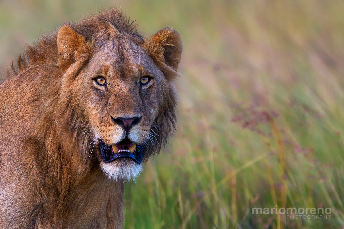
A portrait of one of the two dominant male lions of a resident pride in Mara North Conservancy in Kenya captured in very low light conditions during the last Masai Mara tour I led in March. Looking forward to return in September for the Great Migration.

EOS 1D Mark IV - EF300mm f2.8L IS USM - 1/640 sec @ f4.0 - ISO 1250

Comments

7 comments
Comment posted by Ken Watkins on July 12, 2014 at 5:04 AM
Mario,
It looks to me that a minor white balance adjustment may be needed, as I see quite a bit of blue in the blacks and perhaps a little magenta.
Not to sure about the space on the right?
:toast: :toast:
Registered on December 15, 2010, 1537 Posts, 4877 Comments
Comment posted by Max Waugh on July 12, 2014 at 11:32 AM
Nice portrait, and I think it's well-composed. I'm also seeing a tinge of magenta.

Max
Registered on September 26, 2008, 428 Posts, 2329 Comments
Comment posted by Dennis Plank on July 12, 2014 at 4:36 PM
Beautiful light and detail, Mario and a great expression on the lion. I think I might crop a bit off the right for composition as there's a lot of empty space there. I checked the brightest areas of the image and couldn't find a definite color cast.

:toast:
Registered on January 28, 2008, 1767 Posts, 23192 Comments
Comment posted by Brad Hill on July 12, 2014 at 6:16 PM
Hi Moreno,

I love the expression, the exposure, and the contrast. Overall I like the colour palette (meaning in this case the mix of colours in subject and background), but I do see the blue/magenta cast mentioned by Ken. Even the cyans in the chin whiskers seem a bit strong.

I'm torn on the composition - while I quite like innovative and/or unique compositions, I'm having a hard time wrapping my head around the extra space on the right. I do like well-used negative space (which are, more often than not, OOF), but it still seems like there's just too much space on the right. But this is obviously an in issue of personal preference...

Cheers...

Brad
Registered on May 29, 2007, 431 Posts, 6061 Comments
Comment posted by Jerry Austin on July 13, 2014 at 11:42 AM
I downloaded your image and did a slight white balance adjustment, and it made a world of difference. Correct the white balance and crop a little of the right hand space and this image goes from excellent to stunning, at least for me. Love it.
Registered on January 6, 2012, 651 Posts, 3448 Comments
Comment posted by William Bickle on July 13, 2014 at 11:53 AM
Hello Mario

At first look in large image , I find the exposure, colour tint, and sharpness, Right on! :)

Really like how you have captured the nose to shoulder sharp and detailed!! Congrats on a Stunning Capture!!!

At further viewing I find a very slight magenta cast , but I like it the way presented
... Just Fine!

Bill
Registered on June 13, 2011, 183 Posts, 1702 Comments
Comment posted by Gary Gulash on July 14, 2014 at 2:42 PM
Looks great to me...stunner! :toast:
Registered on January 28, 2005, 879 Posts, 12098 Comments