Gallery: WildlifePosted July 20, 2014358 views7 comments
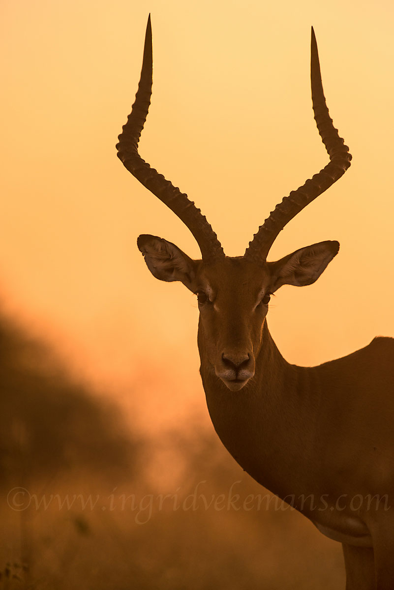
Just back from the Tanzania Wilderness Safari and still struggling through all my images…just picked this one out at random…a male impala AT LAST posing nicely against the sunset coloured sky
Comments
7 comments
Comment posted by Mark Seaver on July 20, 2014 at 5:35 PM
The background colors really add a lot to this image and you've held the detail in the Impala and his intense stare very well.
Registered on January 23, 2011, 1103 Posts, 17270 Comments
Comment posted by Thomas Haney on July 20, 2014 at 6:38 PM
I really like this Ingrid. The composition and color are wonderful. As far as suggestions, I would consider cropping in from the left a bit, and adding a small amount of canvas on the top. Well done.
Registered on April 7, 2013, 138 Posts, 537 Comments
Comment posted by Brad Hill on July 21, 2014 at 8:59 AM
Hi Ingrid,
Nice overall "graphic" appeal to this and I like the amount of shadow detail on the subject. I'm in agreement with Thomas about the amount of space on the left (I'd crop just a sliver off). But overall very appealing as posted.
Cheers...
Brad
Registered on May 29, 2007, 431 Posts, 6061 Comments
Comment posted by Balan Vinod on July 21, 2014 at 2:07 PM
Ingrid ..you have a worked very well with the light and the color. The image is definitely fresh. The pose and stare fantastic. Am thinking twice about the space on top...love this anyways..
Balan Vinod
Registered on March 20, 2006, 889 Posts, 2312 Comments
Comment posted by Morkel Erasmus on July 22, 2014 at 4:14 PM
Love the mood and light here! The balance feels off to me, I agree with taking some off the left, and even perhaps from the bottom?
Registered on March 22, 2011, 385 Posts, 2068 Comments
Comment posted by Ingrid Vekemans on July 22, 2014 at 4:25 PM
Hi all, thanks for the comments! I have tried cutting left and bottom as Morkel suggests but to me that gives the image less power, so I left it the way I saw it at the time…a bit more space at the top would have been good, but it wasn't there and I don't like adding canvas
Lots of thanks
Ingrid.
Registered on August 2, 2010, 138 Posts, 780 Comments
Comment posted by Kurt Bowman on July 22, 2014 at 10:19 PM
Love the feel of this shot. I like the comp for the most part, but would also remove a sliver form the left and bottom.
Registered on June 19, 2008, 1005 Posts, 8028 Comments


Comments
7 commentsNice overall "graphic" appeal to this and I like the amount of shadow detail on the subject. I'm in agreement with Thomas about the amount of space on the left (I'd crop just a sliver off). But overall very appealing as posted.
Cheers...
Brad
Balan Vinod
Lots of thanks
Ingrid.