Nature Photographers Network
This is the preserved archive of the original Nature Photographers Network. The community continues at naturephotographers.network.
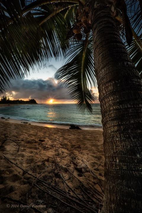
Haena while camping
‹ PreviousLandscape GalleryNext ›

Haena while camping

by Daniel Finchum

Gallery: LandscapePosted August 5, 2014227 views9 comments
Took this pic while working at a annual children's youth camp here on Kauai. Each evening and early morning I was able to step out onto the beach to snap away.
Canon 5DM3 16-35MM two exposures for focal blend and one for sky.

Comments

9 comments
Comment posted by Aaron Feinberg on August 5, 2014 at 7:17 AM
Nice. Good to see some from ya :)
Registered on October 26, 2009, 399 Posts, 2789 Comments
Comment posted by Mark Zelinka on August 5, 2014 at 10:34 AM
I like your comp, the color of the water, and the sunstar. I know it's tough to expose shots like this, but the palm does look too dark to me. Also the footprints mean it should probably go to Man & Nature.
Registered on August 20, 2007, 206 Posts, 998 Comments
Comment posted by Mark Seaver on August 5, 2014 at 12:32 PM
The blending looks good and the sunburst is a nice touch. I like the framing using the palm tree. Having said that, I wonder about cropping to show less of the tree at the top. That depends on what you're trying to show...more of the sun and sky or the combination of tree and landscape as shown here.
Registered on January 23, 2011, 1103 Posts, 17270 Comments
Comment posted by Joseph Campisi on August 5, 2014 at 12:50 PM
Interesting perspective Daniel, I like it! Very calming.
Registered on November 24, 2008, 304 Posts, 3211 Comments
Comment posted by Philip Hodgkins on August 5, 2014 at 4:18 PM
I'm with Mark. Less of the palm and more of the beach, water and sky would be my preference. Having said that, I like it very much anyway. Nice job of blending, BTW. :smile:
Registered on July 24, 2006, 2741 Posts, 12349 Comments
Comment posted by Preston Birdwell on August 5, 2014 at 7:06 PM
I like the water, sun and sky, but feel the palm and the sand are too heavy. I agree with cropping some off the top.

--P
Registered on November 1, 2003, 471 Posts, 5188 Comments
Comment posted by Kory Lidstrom on August 6, 2014 at 3:35 PM
A decent comp, but looks too HDR-ish for my tastes.
Registered on November 19, 2008, 49 Posts, 1035 Comments
Comment posted by Stan Rose on August 6, 2014 at 8:52 PM
Cool... :smile:

EDIT: I noticed Kory's comment. I did notice the HDR look right away, it doesn't really bother me too much cause in comparison to 'bad HDR' it's not so 'bad' :smile: But i think he has a point, the bg does have that dreaded look to it--if you're so inclined i think a few slight tweaks to the bg could improve this. I like it as is though. :razz:
Registered on September 15, 2005, 836 Posts, 17099 Comments
Comment posted by Daniel Finchum on August 7, 2014 at 2:00 AM
Thanks for your comments everyone. About the "HDR" look... I really did blend these exposures manually and added a slight orton effect and then worked on mid-tone contrast. Was trying to achieve a vintage post card look to this. I also wanted to create the feeling of laying in a hammock looking up and out thus the wide angle view of palms and sand. I appreciate the suggestions and will consider them if I choose to edit this pic, but I think I achieved what I was after so probably will just leave it alone. Cheers!
Registered on September 8, 2013, 43 Posts, 222 Comments