Gallery: LandscapePosted August 15, 20142,942 views7 comments
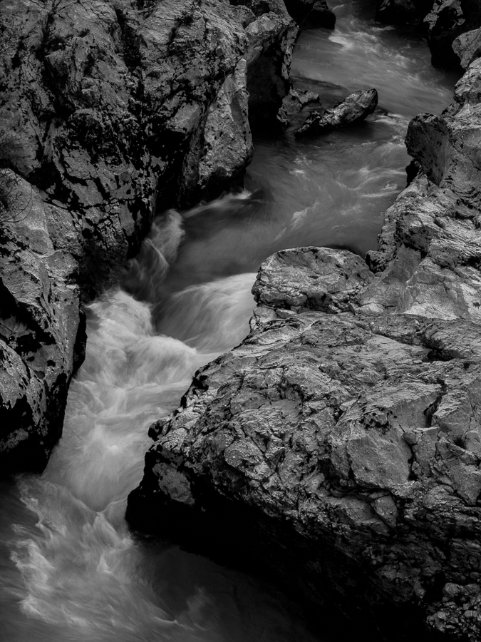
An image from Soca Valley in Slovenia. Despite the incredible turquois of the river I decided to present the b&w version to concentrate on the dynamic interplay of water and rocks.
Comments and critique are appreciated.
Comments
7 comments
Comment posted by Ronald Murphy on August 15, 2014 at 1:03 PM
I definitely like the comp. On my monitor, looks a bit dark, both the brights and the darks.
Registered on March 13, 2012, 279 Posts, 975 Comments
Comment posted by Peter Richter on August 15, 2014 at 1:08 PM
Thanks Ronald for your comment. I decided for that exposure to keep the foreboding character of the scene. The image was taken at dusk and I tried to convey this atmosphere.
Peter
Registered on November 10, 2010, 218 Posts, 2723 Comments
Comment posted by Pat Sampson on August 15, 2014 at 2:34 PM
This works well for me as posted Peter. I like the comp and the mood of the image.
pat
Registered on May 19, 2007, 953 Posts, 15989 Comments
Comment posted by Nick Bristol on August 15, 2014 at 2:42 PM
Hi Peter, I think this comp works quite nice and I also enjoy the mood you captured in the low light and b&w version. It works well for me and especially so in the larger version. I like the textures in the water very much! Still enjoying that beautiful book you sent me!!
Nick Bristol
Lone Rock, WI
Registered on February 1, 2004, 752 Posts, 14140 Comments
Comment posted by Preston Birdwell on August 15, 2014 at 7:40 PM
Peter,
While I agree with your idea of retaining the foreboding character of the scene, I still think this is a bit too dark, and the high values could be brought up just a little. I do like the composition.
--P
Registered on November 1, 2003, 471 Posts, 5188 Comments
Comment posted by John Williams on August 16, 2014 at 9:55 PM
Nice textures Peter. I like the dark/foreboding, but would bring the lighter areas closer to white.
Registered on September 6, 2007, 221 Posts, 5985 Comments
Comment posted by Stan Rose on August 19, 2014 at 10:24 PM
Yes, John is on the right track IMO. I think dark is fine--the rocks look great to me, its the water that looks flat. Set the white point for the brightest pixel in the water, leave the rocks alone, and to me that would be killer. Just my take!
Registered on September 15, 2005, 836 Posts, 17099 Comments

Comments
7 commentsPeter
pat
Nick Bristol
Lone Rock, WI
While I agree with your idea of retaining the foreboding character of the scene, I still think this is a bit too dark, and the high values could be brought up just a little. I do like the composition.
--P