Nature Photographers Network
This is the preserved archive of the original Nature Photographers Network. The community continues at naturephotographers.network.
A Dream from the Past + Selective Coloring Repost
‹ PreviousPhoto Art GalleryNext ›

A Dream from the Past + Selective Coloring Repost

by Carol Hyman

Gallery: Photo ArtPosted August 17, 2014602 views6 comments
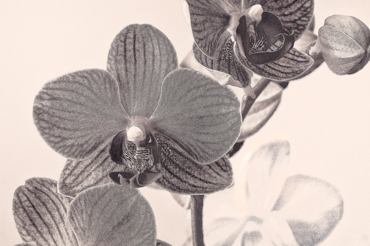
Orchid blooms depicted in black and white with added grain to emphasize the texture and feeling of dreaminess. An orange photo filter was added for warmth. The textured blossoms are viewed from the front. the fainter black and white blossoms are viewed from the back. This image started as 3 images taken with differing amounts of light; I converted it to an HDR image in PS and then used NIK SEP2 to convert to black/white.

Aspect Ratio: 3:2

The image were taken with a Nikon D700, a 105 macro lens + a T6 filter, and a tripod with manual focusing at f/18, ISO 100.

Thank you in advance for viewing and adding your C&C.

Best,
Carol

Comments

6 comments
Comment posted by Howard Cheek on August 18, 2014 at 7:45 AM
I like the title Carol, it works well for this.
Interesting comp with the one orchid a great focal point.
Good call on the added grain with respect to "dreaminess"..
Would that be the 'sandman' at work?:biggrin:
Thanx for the info on how you processed, well done:toast:
Registered on July 24, 2008, 1201 Posts, 10758 Comments
Comment posted by Carol Hyman on August 18, 2014 at 3:04 PM
There are times when an image can look different in black and white or color. This is one of them. This Orchid bloom in this version is depicted in black and white but with with selective coloring to emphasize the shapes and texture of the blossoms; a redish photo filter has been added to emphasize the colors in the blossoms and add to the depth of field. The textured blossoms are viewed from the front. the fainter black and white blossoms are viewed from the back.

Thanks for adding your 2-cents.

Best,
Carol
Registered on January 18, 2007, 597 Posts, 8062 Comments
Comment posted by Karen Kane on August 23, 2014 at 12:41 PM
This is very pleasing Carol - WELL worth the effort you invested!!!! You are correct - the two images (colour vs B&W) are so different. In your original post, you mention the 'feeling of dreaminess' and for me, the original post achieves that - I think in large part because of your decision to add the grain.
Well done :toast:
Registered on August 4, 2012, 66 Posts, 726 Comments
Comment posted by Mike Ramy on August 23, 2014 at 9:46 PM
Hey Carol,
I also like both versions and they are so different, it is as if they were two totally different images. Well done and thanks for sharing.
:toast:
Registered on June 16, 2012, 567 Posts, 2809 Comments
Comment posted by Catherine Reilly on August 30, 2014 at 4:58 PM
Though I personally prefer the selectively colored version, both are ingenious, Carol. The process taken from initial capture(s) to final image represents a lot of creativity. congrats on the Pick!
Registered on August 16, 2006, 603 Posts, 9192 Comments
Comment posted by Carol Hyman on August 31, 2014 at 11:19 AM
I would like to thank whoever selected this as a weekly pick. :toast:

Cheers,
Carol

I've been on an orchid kick.
Registered on January 18, 2007, 597 Posts, 8062 Comments