Gallery: LandscapePosted August 22, 2014137 views16 comments
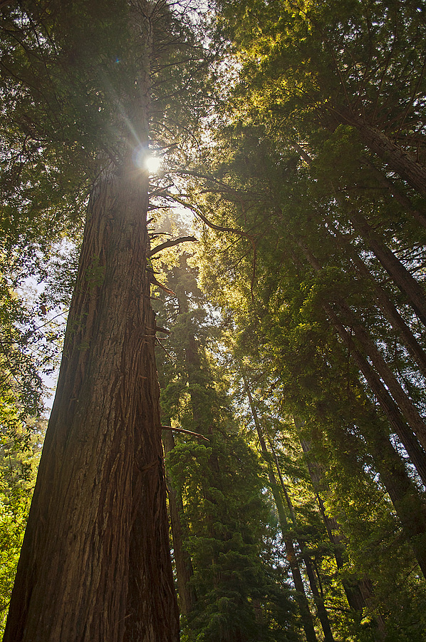
Took this one at our campsite one morning during my June Redwood trip. It's kind of grown on me...
Nikon D5000
20mm, f/3.8, 1/200, ISO-200
Comments
16 comments
Comment posted by Bill Reid on August 22, 2014 at 2:13 PM
Very nice image Joseph with an interesting comp. and feeling of height to it. I wonder if a little more saturation might
give it a bit more pop and contrast. Very nice as is though. Well done.
Registered on January 27, 2013, 65 Posts, 2460 Comments
Comment posted by Mark Zelinka on August 22, 2014 at 2:44 PM
Captures the majesty of these trees nicely.
Registered on August 20, 2007, 206 Posts, 998 Comments
Comment posted by John&Patty Benway on August 22, 2014 at 3:51 PM
Great job, especially with the light Joe, and I definitely like your composition. All and all, beautiful work.
John
Registered on May 12, 2006, 626 Posts, 8700 Comments
Comment posted by Stan Rose on August 22, 2014 at 4:43 PM
Hmmm...I really like the scene and comp. I can't tell whether the haziness is due to the processing or real haze. If it was haze--it probably needed more haze But it's a cool shot.
Registered on September 15, 2005, 836 Posts, 17099 Comments
Comment posted by Pat Sampson on August 22, 2014 at 5:02 PM
I love the composition and the light Joe. I like this very much as posted but might also consider a black and white conversion.
pat
Registered on May 19, 2007, 953 Posts, 15989 Comments
Comment posted by Joseph Campisi on August 22, 2014 at 7:24 PM
Stan, the slight haze is due to the smoke from the firepit. Pat, I might give that a try...
Registered on November 24, 2008, 304 Posts, 3211 Comments
Comment posted by Nick Bristol on August 22, 2014 at 8:02 PM
Joe, This is very nice, and I'm especially enjoy this comp. It really does a great job of showing off these Redwoods. A b&w does sound interesting too.
Nick Bristol
Lone Rock, WI
Registered on February 1, 2004, 752 Posts, 14140 Comments
Comment posted by Ed Lowe on August 22, 2014 at 9:41 PM
The perspective showcases the timeless quality of these magnificent trees beautifully, Joe. I like Bill's suggestion of a little more contrast to give the scene a bit more pop. The sun star is a nice touch.
Ed
Registered on February 7, 2004, 414 Posts, 7115 Comments
Comment posted by Joseph Campisi on August 22, 2014 at 11:57 PM
Thanks for the suggestions guys. Here's a monochrome version. I think it looks very graphic in B&W. Not sure if I like it.
Registered on November 24, 2008, 304 Posts, 3211 Comments
Comment posted by Joseph Campisi on August 23, 2014 at 12:01 AM
And here's a version with a little more saturation and contrast.
Registered on November 24, 2008, 304 Posts, 3211 Comments
Comment posted by Pat Sampson on August 23, 2014 at 12:05 AM
Joe,
I don't like the black and white either. At least not that conversion but I like the color repost a lot. It's my favorite of the three.
pat
Registered on May 19, 2007, 953 Posts, 15989 Comments
Comment posted by Nick Bristol on August 23, 2014 at 9:17 AM
Joe, The b&w doesn't work for me but I really like the color repost! Nick
Registered on February 1, 2004, 752 Posts, 14140 Comments
Comment posted by Joseph Campisi on August 23, 2014 at 10:41 AM
Thanks guys. I've decided I agree, I don't like the B&W either. Maybe I'll try a different approach.
Registered on November 24, 2008, 304 Posts, 3211 Comments
Comment posted by Preston Birdwell on August 23, 2014 at 2:50 PM
Another nice image from your series, Joseph. Yeah, you should look for a different approach to the B&W in terms of contrast and separation in the mid-tones. I Also prefer the second color image: It has nicer feel.
--P
Registered on November 1, 2003, 471 Posts, 5188 Comments
Comment posted by Paul Breitkreuz on August 24, 2014 at 6:06 PM
Joe, the second color version works nicely for me all around. I do like the sunburst in the image. Again deep forest scenes are tough to work out, this is nicely done.
Registered on February 25, 2006, 525 Posts, 8448 Comments
Comment posted by Daniel Rappaport on August 24, 2014 at 8:28 PM
Nice to included the sunburst here - it adds to the sense of up and up. Looking directly at the sun should give a bit of washed out contrast by the nature of it.
Registered on September 9, 2009, 294 Posts, 2006 Comments

Comments
16 commentsgive it a bit more pop and contrast. Very nice as is though. Well done.
John
pat
Nick Bristol
Lone Rock, WI
Ed
I don't like the black and white either. At least not that conversion but I like the color repost a lot. It's my favorite of the three.
pat
--P