Nature Photographers Network
This is the preserved archive of the original Nature Photographers Network. The community continues at naturephotographers.network.
Dawn Greeters
‹ PreviousLandscape GalleryNext ›

Dawn Greeters

by John Williams

Gallery: LandscapePosted August 27, 20143,259 views20 comments
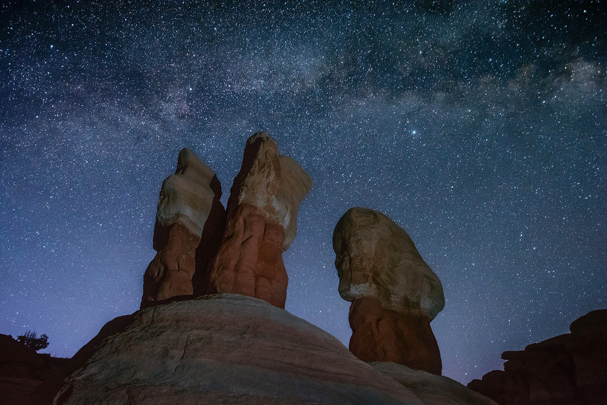
I'm currently in a run of weddings that is keeping me from shooting the summer flowers I'd like to be chasing, so I'm playing in the archives.

This is an image from the Devil's Garden in Utah when my brother and I visited in April. Dawn was just beginning to show in the sky. My brother had brought a flash along, and I photographed while he fired the flash from a distance.

Nikon D7100
Nikon 12.0-24.0 mm f/4.0 at 12 mm (18mm equiv.)
1/30 at f/4.0 and ISO 3200

Comments

20 comments
Comment posted by Daniel Rappaport on August 27, 2014 at 9:11 PM
Really nice composition and dawn mood. The flash lighting is really well done - not overdone.
Registered on September 9, 2009, 294 Posts, 2006 Comments
Comment posted by John Williams on August 27, 2014 at 9:14 PM
For some reason the Save For Web seems to saturate this more than I wanted; here's an adjustment (subtle). It's too much in the larger version too, but I can't adjust that one.

**edit** I edited my Monitor Profile as described here (and enabled ICC Version 4 profiles), and it looks a bit better now.
Registered on September 6, 2007, 221 Posts, 5985 Comments
Comment posted by gary phillips on August 27, 2014 at 10:40 PM
I've yet to visit the Devil's Garden, perhaps this fall when things cool off a bit. I would not have noticed the saturation issue, John. Looks great on my monitor. The absence of noise is remarkable to me at iso 3200. I'm afraid my 5d2 would be unrecognizable. I like the image a lot, the flash worked wonders and the lack of light pollution really makes the stars pop. Very nice image. :toast:
Registered on October 24, 2013, 185 Posts, 4136 Comments
Comment posted by Ed Lowe on August 27, 2014 at 10:57 PM
Beautifully done, John. The sky full of stars makes a wonderful backdrop for the rock formations. Nice job with the flash BTW.

Ed
Registered on February 7, 2004, 414 Posts, 7115 Comments
Comment posted by Tony Kuyper on August 27, 2014 at 11:13 PM
Unique take on this place. Hmm, I was going to suggest that the rocks would look better with more saturated color, but that's obviously not what you're thinking. I think the original looks better than the repost.
Registered on November 1, 2003, 364 Posts, 22328 Comments
Comment posted by Stan Rose on August 28, 2014 at 1:05 AM
I like it John, cool comp. Maybe a tad green in the sky, otherwise looks alright to me.
Registered on September 15, 2005, 836 Posts, 17099 Comments
Comment posted by Gary McGhee on August 28, 2014 at 2:43 AM
Very nice indeed John, it looks very natural. The flash looks as if it could have been moonlight.

Gary.
Registered on April 15, 2010, 142 Posts, 2416 Comments
Comment posted by Ian Cameron on August 28, 2014 at 4:21 AM
Lovely John, subtle and beautiful. Not something I can easily do with Fuji Velvia so it is appreciated. The light painting amount and hue seem just about perfect, though perhaps the shadow is a tiny bit harsh thrown by the hoodoo on its neighbour.
Registered on August 6, 2004, 1125 Posts, 3318 Comments
Comment posted by John&Patty Benway on August 28, 2014 at 5:33 AM
John, I cant see too much difference between the two except for the sky, your original post has a tad more saturation, and to tell you the truth, I like it very much. Very enjoyable to view, and your composition works beautifully.
John
Registered on May 12, 2006, 626 Posts, 8700 Comments
Comment posted by Nick Bristol on August 28, 2014 at 9:33 AM
Hi John, Very, very nice! I like this alot. The formations look great and I think the flash use woked out perfectly, and that sky looks amazing. Really some excellent work. I prefer the original post with the bit more saturation. :toast:

Nick Bristol
Lone Rock, WI
Registered on February 1, 2004, 752 Posts, 14140 Comments
Comment posted by Bill Leggett on August 28, 2014 at 10:19 AM
I've been to Devil's Garden four times - it's such a fun place to explore different comps. I've shot several comps of this well-known formation, and this is a very interesting take on this.
Registered on July 21, 2004, 706 Posts, 3233 Comments
Comment posted by Paul Breitkreuz on August 28, 2014 at 10:34 AM
John, I'm actually fine with the original post here with regard to saturation. I do also like your composition and the title too, seems to fit just right for the scene. I was only here once during midday, so no shots for me so far. This is a bit different comp from others I've seen to date, so nice job there too. :cool:
Registered on February 25, 2006, 525 Posts, 8448 Comments
Comment posted by Bill Reid on August 28, 2014 at 10:48 AM
Great shot John with a very nice comp and lighting. The sky looks very clean also. I prefer the first version as the saturation looks better to me. Great job on this. :toast:
Registered on January 27, 2013, 65 Posts, 2460 Comments
Comment posted by Joseph Campisi on August 28, 2014 at 10:50 AM
Nice John. The first version is fine, but the second is even better. There is some noise apparent in the larger version, especially in the sky, but at ISO-3200, that can't be helped. The light painting is just right. Cool image!
Registered on November 24, 2008, 304 Posts, 3211 Comments
Comment posted by Pat Sampson on August 28, 2014 at 11:28 AM
Excellent job balancing the light painting on the rocks to the sky. In fact I'd say perfect. I love the mood of this also John. Beautiful work.

I prefer the saturation in the rocks in the first image on my uncalibrated Mac.

pat
Registered on May 19, 2007, 953 Posts, 15989 Comments
Comment posted by Harry Lichtman on August 28, 2014 at 2:08 PM
John - I guess I am surprised that you got the sky as bright and those stars as bright with a 1/30 sec exposure, even at ISO 3200. The stars must have been very bright!
Registered on September 17, 2010, 304 Posts, 3507 Comments
Comment posted by Angela Classen on August 28, 2014 at 11:13 PM
I think the lighting on the rocks looks very natural, almost like moonlight. Love the sky and your placement of the hoodoos.
Registered on June 13, 2007, 434 Posts, 2742 Comments
Comment posted by Soubhik Patranabis on August 29, 2014 at 9:49 AM
Nice comp - I liked the second version more. :toast:
Registered on January 25, 2010, 54 Posts, 610 Comments
Comment posted by Jared Warren on August 29, 2014 at 3:31 PM
Looks great to me, John. I don't mind the increased saturation in the first post - I like the warmth in the sandstone. In fact I've sometimes used a warm color "gel" on a flash, or a warm xenon flashlight for light painting in such situations. Just depends on the look you're going for, of course. Nice work!
Registered on May 11, 2012, 84 Posts, 931 Comments
Comment posted by Preston Birdwell on August 29, 2014 at 8:20 PM
This is sweet, John. I see a slight halo on the rocks on the right--it's minor. Beautiful composition.

--P
Registered on November 1, 2003, 471 Posts, 5188 Comments