Gallery: LandscapePosted September 23, 2014175 views10 comments
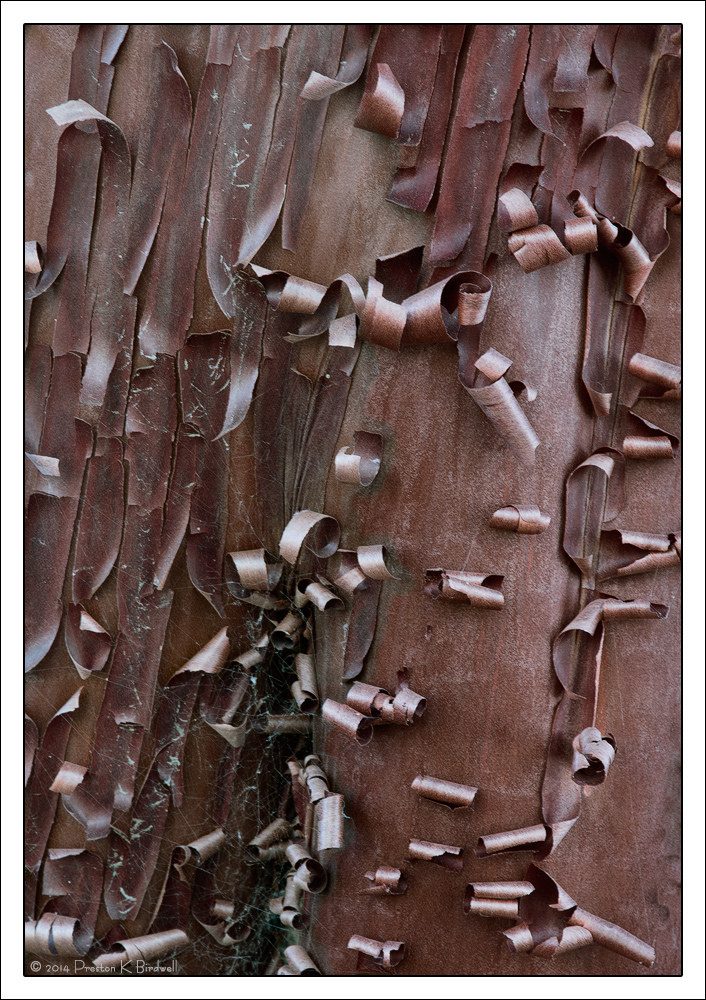
Here's another from my Manzanita Bark series.
Nikon D-7100
Nikkor DX 18-140mm
TK's Masks
Please see the large version. Thanks!
Your thoughts are always appreciated.
--P
Comments
10 comments
Comment posted by John&Patty Benway on September 23, 2014 at 4:43 PM
I'm going to say this is my favorite so far, the curls are much tighter together giving it more of an abstract look. Excellent color, detail and composition.
John
Registered on May 12, 2006, 626 Posts, 8700 Comments
Comment posted by Pat Sampson on September 23, 2014 at 4:49 PM
Very rich Preston. Reminds me of shaved chocolate. I think this is my favorite but I liked the second post a lot as well. The color is certainly nice in this.
pat
Registered on May 19, 2007, 953 Posts, 15989 Comments
Comment posted by Steve Thompson on September 23, 2014 at 6:56 PM
What a fascinating photo Preston, I love it. The texture it shows in the bark is amazing. The lighting was very flattering and it does seem to have an abstract feeling.
Registered on August 7, 2014, 125 Posts, 2319 Comments
Comment posted by Paul Breitkreuz on September 23, 2014 at 8:43 PM
Another very strong technical take on this one again, Preston. I do have to stick with the previous one as a favorite so far, that one was perfect for me all the way around.
Registered on February 25, 2006, 525 Posts, 8448 Comments
Comment posted by Mark Seaver on September 23, 2014 at 10:22 PM
There are some neat additions here, Preston. I like the angled trunk and especially those two section towards the left showing what look like scratches (got any squirrels around?) and maybe some spider webs.
Registered on January 23, 2011, 1103 Posts, 17270 Comments
Comment posted by Tony Kuyper on September 23, 2014 at 11:09 PM
I've been watching this series and liking the comps a lot. They seem to be begging for a B&W presentation where the contrast could be pushed without regard to managing color. They all seem just a bit flat with the midtone colors.
Registered on November 1, 2003, 364 Posts, 22328 Comments
Comment posted by Preston Birdwell on September 24, 2014 at 3:28 PM
Thanks for your comments, everyone!
Tony: I tweaked this to bring up the contrast just a bit, especially in the mids. Your thoughts?
Registered on November 1, 2003, 471 Posts, 5188 Comments
Comment posted by Harley Goldman on September 24, 2014 at 6:02 PM
Another good one, Preston. I think I like the last one a bit more, but no need to compare. Both are very well done.
Registered on November 19, 2003, 586 Posts, 11271 Comments
Comment posted by Dan Kearl on September 25, 2014 at 2:04 AM
I like the Op better than the repost. It is much more natural looking and the color is better.
Cool scene, looks metallic.
Nice find and nicely photographed.
Registered on September 2, 2013, 209 Posts, 1514 Comments
Comment posted by Ed Lowe on September 25, 2014 at 11:54 AM
It is hard to pick a favorite , Preston. I really can't decide between this one and the prior post as both are beautifully done. This one has more details to enjoy and add visual tension, but the other is a little bit less complicated and more serene. You can't go wrong with either one IMO.
Ed
Registered on February 7, 2004, 414 Posts, 7115 Comments


Comments
10 commentsJohn
pat
Tony: I tweaked this to bring up the contrast just a bit, especially in the mids. Your thoughts?
The large version is on my web site
--P
Cool scene, looks metallic.
Nice find and nicely photographed.
Ed