Nature Photographers Network
This is the preserved archive of the original Nature Photographers Network. The community continues at naturephotographers.network.
Ode to Autumn Joy
‹ PreviousMacro & Close-up GalleryNext ›

Ode to Autumn Joy

by Marylynne Diggs

Gallery: Macro & Close-upPosted September 24, 201487 views6 comments
I don't know how it happened, but I took my first macro flower/bee session the last week of summer. Time flew this year.

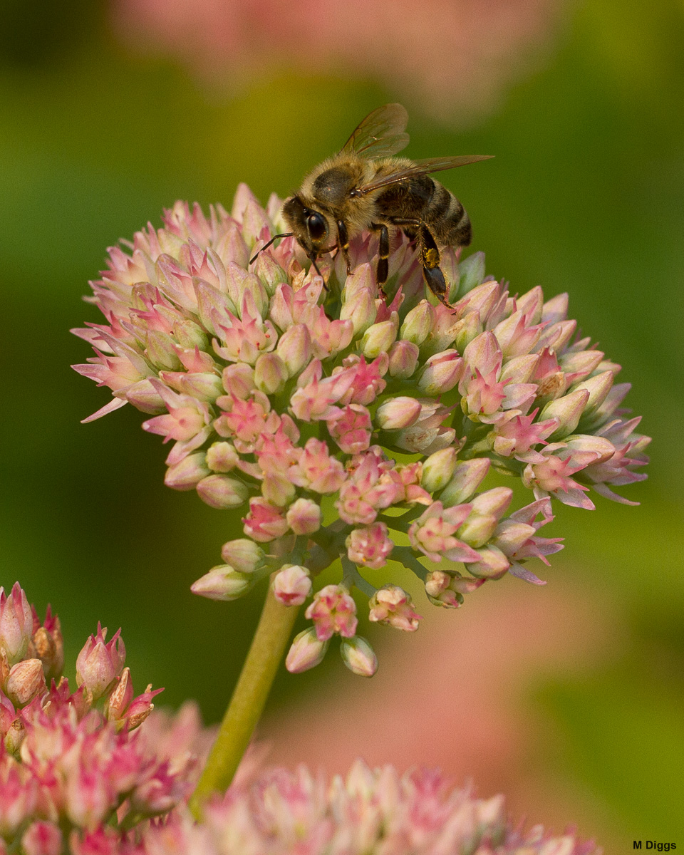
Here is a bee on a Sedum Autumn Joy. I'm a bit out of practice, and feedback of all sorts is encouraged and welcome.

7D with 100mm L Macro
Tripod, rf release
f/6.3, 1/500s, ISO 200

Comments

6 comments
Comment posted by scott lanz on September 24, 2014 at 9:47 PM
Well, this looks like you are in mid-season form, Marylynne. Wonderful image. The bee looks great - excellent detail and exposure from the nice light. Really like the supporting sedum and the nice bg as well. The bee is just a bit pushed into the corner in this frame, but still a definite keeper.

So, I was surprised to click on the larger image and see a different, vertical image of this bee and flower. Not sure if you did that accidentally or on purpose. Anyway, I do like the vertical version a lot as well. I like the bee's position in the frame more in the vertical, but I think I prefer the exposure and color a bit more in the horizontal. Hard to chose between them as they are both excellent. Maybe that's why you posted both - you couldn't choose either? Sorry, I am not much of a help on picking one over the other but if you put a gun to my head and made me pick, it would probably be the vertical image. :wavey: :toast:
Registered on November 14, 2003, 840 Posts, 12902 Comments
Comment posted by Barb Pflaum on September 25, 2014 at 10:14 AM
Excellent detail on the bee. Good comp and colors. Nicely done!
Registered on January 14, 2009, 316 Posts, 2724 Comments
Comment posted by Marylynne Diggs on September 25, 2014 at 10:32 AM
Thanks, Scott and Barb. The vertical was an accident! I can recrop the square one to give the bee more room and/or recrop to vertical. It was a challenge to avoid cutting off a floret, but I can swing it with some rotation probably. As for the vertical one, the bee's body seemed less pleasing in that one, but perhaps it is more interesting? I'll keep tinkering with both.
Registered on December 14, 2010, 122 Posts, 1034 Comments
Comment posted by Mark Seaver on September 27, 2014 at 7:26 PM
The colors in the flower (and background) are lovely and the sharpness of the bee is great, plus you've got a fine highlight in it's eye. I like the extra space up top in the "larger version". If you've got it, I think a bit more space on the right would also be good.
Registered on January 23, 2011, 1103 Posts, 17270 Comments
Comment posted by Marylynne Diggs on September 28, 2014 at 1:27 PM
Here is a re-do of the small, more square crop but with more space top and right. Let me know if this changes the small v. vertical large preference.

Edit...hmmm, I think I went too far with adding to the right. Looks much better with a black border too!
Registered on December 14, 2010, 122 Posts, 1034 Comments
Comment posted by scott lanz on September 29, 2014 at 12:25 AM
Much better, Marylynne. Nice work. I think the comp and position of the bee is just right now. :toast:
Registered on November 14, 2003, 840 Posts, 12902 Comments