Nature Photographers Network
This is the preserved archive of the original Nature Photographers Network. The community continues at naturephotographers.network.
North Sierra Pond II & Repost
‹ PreviousLandscape GalleryNext ›

North Sierra Pond II & Repost

by Jim Hansen

Gallery: LandscapePosted October 7, 2014149 views9 comments
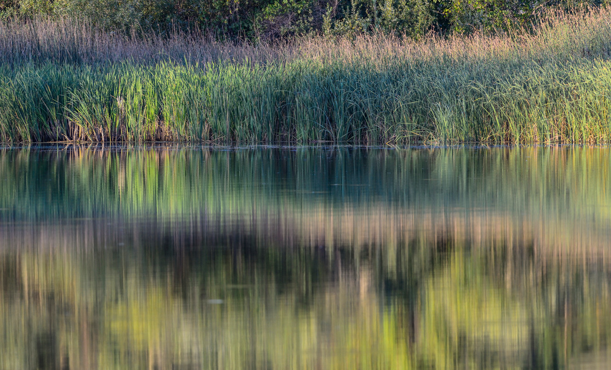
This is the same pond included in my last post a couple of days ago. Same time, different day(a few minutes before sunset). I was set up for bird photography that day, but couldn't resist a shot of the far shore with the telephoto rig.
D800e, 300f4, 1.4tc, 1/400, f6.3, ISO 1600, HH.

Not the typical shooting parameters for landscape. Didn't have a tripod so went with ISO 1600 to get the thing sharp. Comments and criticism are very much appreciated.

Comments

9 comments
Comment posted by Pat Sampson on October 7, 2014 at 6:32 PM
Strong comp and beautiful light and color Jim. I might bring up the contrast a bit in the grass but I wouldn't want to weaken the appealing mood of this either.

pat
Registered on May 19, 2007, 953 Posts, 15989 Comments
Comment posted by Ian Cameron on October 7, 2014 at 8:57 PM
I really liked the look of the thumbnail for this one and it is nice to see some lens compression being used in a landscape. Great colours and nice soft light to show an intriguing pattern
Registered on August 6, 2004, 1125 Posts, 3318 Comments
Comment posted by Emily Kent on October 8, 2014 at 1:51 PM
The soft pastel colors are really appealing. Very artistic reflection as well!
Registered on August 12, 2014, 18 Posts, 45 Comments
Comment posted by D.A. Edwards on October 8, 2014 at 4:31 PM
I like the understated, calming feel of this composition. A very painterly landscape.
Registered on October 8, 2014, 226 Posts, 1187 Comments
Comment posted by Jim Hansen on October 8, 2014 at 6:06 PM
Thanks for the comments Pat, Ian, Emily, and Dave. I originally had contrast up as well as saturation prior to posting. Thought it was a little much, so went for the more subtle look. This is what it looks like. If anyone is still around, would enjoy opinions over which looks better to you. Thanks.
Registered on May 5, 2011, 161 Posts, 908 Comments
Comment posted by Pat Sampson on October 8, 2014 at 8:58 PM
I like both Jim but prefer the first because of the peaceful mood the presentation supports. The second image is also appealing to me though.

pat
Registered on May 19, 2007, 953 Posts, 15989 Comments
Comment posted by Mark Seaver on October 9, 2014 at 4:01 PM
I like all of the bands of subtly different colors and the fine gentle lighting. This speaks to me of sitting quietly by a pond and thoroughly enjoying the end of a day outdoors. Well seen and presented, Jim.
Registered on January 23, 2011, 1103 Posts, 17270 Comments
Comment posted by Preston Birdwell on October 9, 2014 at 5:39 PM
I prefer the original post, Jim. The second is too contrasty so the quiet mood is lost. If you want to increase the contrast, try for something between the two to separate the mid tones.

--P
Registered on November 1, 2003, 471 Posts, 5188 Comments
Comment posted by Jim Hansen on October 10, 2014 at 8:21 PM
Thanks very much everyone for your comments and suggestions.
Registered on May 5, 2011, 161 Posts, 908 Comments