Nature Photographers Network
This is the preserved archive of the original Nature Photographers Network. The community continues at naturephotographers.network.
Pink Water
‹ PreviousPOP Photos GalleryNext ›

Pink Water

by Emily Kent

Gallery: POP PhotosPosted October 8, 2014112 views5 comments
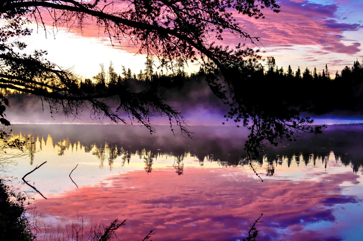
I took this photo a few years ago before I had really begun to think much about photography principles, but I think it's hard to go wrong with north country scenery. This was captured on Red Rock Lake in the Boundary Waters Canoe Area (BWCA), outside of Grand Marais, Minnesota. I went up with a small group of women for our first Boundary Waters camping experience. It poured rain for the entire 4 days we were up there, and finally let up the morning we were scheduled to leave. This was the pink sky scene we woke up to outside of our camp site.

Comments

5 comments
Comment posted by John Launstein on October 10, 2014 at 2:53 AM
Hi Emily! This is a really striking image...the colours certainly pop and they present a striking contrast against the silhouetted branches and trees. The electric blue in the middle right (right at the top of the lake) is just a bit too saturated for me...it just demands attention at the expense of soaking in the rest of the beautiful scene. The purple fringe to the mist in the dead center could also be desaturated a touch, although it is much more noticeable in the smaller image.

I took a few minutes to check out your portfolio and galleries on your site...you have some beautiful work!
Registered on April 5, 2011, 223 Posts, 1193 Comments
Comment posted by Pat Sampson on October 12, 2014 at 3:50 PM
Strong composition Emily. I agree with John about desaturating this a bit but otherwise I like the image as posted. Nice mood to it as well.

pat
Registered on May 19, 2007, 953 Posts, 15989 Comments
Comment posted by Richard Teller on October 12, 2014 at 8:30 PM
The colors, fog and colors are beautiful. My personal taste is that the foreground branch is a bit to large in the in the frame.
Registered on August 23, 2010, 1162 Posts, 6692 Comments
Comment posted by Preston Birdwell on October 16, 2014 at 2:56 PM
I agree with Richard regarding the branch: It's too domineering. I also agree about the color--it looks aver-saturated to me. This is a nice image and would have a better feel if the colors were corrected. It looks like a nice place for a sunrise.

--P
Registered on November 1, 2003, 471 Posts, 5188 Comments
Comment posted by Rick Diffley on October 18, 2014 at 3:57 PM
Thanks for sharing this image. What is noticeable to me is that the silhouetted branches on the far right are a solid black with no detail. At the bottom, there's a 3 single dark plants (Not sure what they are...) that area a slight distraction. Also, the area of the sky on the left-side, in between two branches seems overblown.
Registered on April 8, 2012, 52 Posts, 279 Comments