Nature Photographers Network
This is the preserved archive of the original Nature Photographers Network. The community continues at naturephotographers.network.
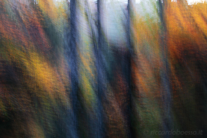
oil on canvas
‹ PreviousLandscape GalleryNext ›

oil on canvas

by Riccardo Boesso

Gallery: LandscapePosted October 15, 2014171 views15 comments
Hi all,
this is my first post here in NPN. :smile:
I apologize for any errors with my English.

I made this shot last Sunday in Cansiglio woods (north eastern Italy), with low light and interesting colors.
I used an intentional camera movement to get the effect I desired (after several shots).
It should recall an oil painting with a somehow "impressionistic" tecnique.
I'd like to know what do you think about it.
Any critics are really welcome.


Eos 5D MkII, 70mm, f/16, 0.5 sec, ISO 250

Comments

15 comments
Comment posted by Ed Lowe on October 15, 2014 at 3:43 PM
First off welcome to NPN, Riccardo. I hope you post more images and comment on others as well. I like the abstract quality of this image along with the combination of warm and cool colors. My only suggestion would be a small crop from the top to get rid of those bright sections of sky.

Ed
Registered on February 7, 2004, 414 Posts, 7115 Comments
Comment posted by Riccardo Boesso on October 15, 2014 at 3:56 PM
Thank you for your suggestion and you time Ed.
I will post other images for sure, and I will also try to be useful with my opinions on others' images.
:)
Registered on October 15, 2014, 13 Posts, 72 Comments
Comment posted by D.A. Edwards on October 15, 2014 at 5:45 PM
I kind of like the white bits on the edge, Riccardo. It enhances the painterly effect implied in your title (although it looks more like watercolor than oil.)
Welcome to NPN, too. :toast:
Registered on October 8, 2014, 226 Posts, 1187 Comments
Comment posted by Pat Sampson on October 15, 2014 at 6:54 PM
Welcome to NPN Riccardo.

I like this image very much. Love the complementary colors and the contrasts between warm and cool. Lots of color interest in it for me. I'm on the fence about cropping out the sky but am leaning towards leaving it as is. Beautiful first post. I'm looking forward to seeing more of your work.

pat
Registered on May 19, 2007, 953 Posts, 15989 Comments
Comment posted by Jeff Martyka on October 15, 2014 at 10:51 PM
Welcome to NPN.

I love the feel of this image. It reminds me of a beautiful tapestry because of the lines created by the trees as though its folded. As such, for me it works better without the top bit of sky, but that is clearly just a person preference. Nicely done.
Registered on June 20, 2014, 30 Posts, 155 Comments
Comment posted by Mark Seaver on October 15, 2014 at 11:19 PM
Riccardo, welcome to NPN! This is a wonderful abstract and yes, quite impressionistic. I too could see taking just a bit off the top to make the bright whites go away. Terrific first post.
Registered on January 23, 2011, 1103 Posts, 17270 Comments
Comment posted by Riccardo Boesso on October 16, 2014 at 3:04 AM
Thank you all for your "welcome" and for your comments!
Following your suggestions, I cropped the white sky on the top-left corner and this is the result.

Actually it seems better this way :)
Registered on October 15, 2014, 13 Posts, 72 Comments
Comment posted by Gary Reed on October 16, 2014 at 10:35 AM
Riccardo, Welcome aboard. I like the impressionistic feel here. I would agree to a crop to remove the white top. Also I might lighten up the image to bring the colour out a bit more. :toast:
Registered on September 19, 2009, 198 Posts, 1074 Comments
Comment posted by Ryan Shain on October 16, 2014 at 11:47 AM
The repost is sweet with out the white on top Riccardo. Beautiful framing of the image, and love the warm and cool color play. Nicely seen and captured.
Registered on February 20, 2007, 226 Posts, 4571 Comments
Comment posted by Guy Manning on October 16, 2014 at 12:16 PM
This is nice use of the blur technique. Tthe colors and placement balance beautifully.

An interesting thing happened when you cropped out the white. Visually, the image lost some contrast. It wasn't something you did in processing,

When viewing an image, the brain likes to see at least a bit of pure white and pure black in any image (the amount doesn't matter as long as it exists). If the brain does see it, it is satisfied that the image has a good contrast range. So by removing the white the image now looks slightly flat. If you don't mind the low key look, you can leave it as is. But the image looses its brightness in the yellow-orange areas and doesn't seem as lively.

To resolve that you can increase brightness in the yellows a bit and get the feel back.
Registered on October 17, 2011, 13 Posts, 44 Comments
Comment posted by Riccardo Boesso on October 16, 2014 at 12:55 PM
Thank you all for your comments.
Dear Guy, I really appreciate your explanation on how the brain perceives colors and contrast: useful and "challenging".
Thank you very much for sharing your knowledge :smile: .
Registered on October 15, 2014, 13 Posts, 72 Comments
Comment posted by Bill Reid on October 16, 2014 at 1:36 PM
Welcome to NPN Riccardo and a very striking first post. The repost looks great to me with great color and a wonderful abstract feel to it. Look forward to seeing more from you.
Registered on January 27, 2013, 65 Posts, 2460 Comments
Comment posted by Mark Zelinka on October 16, 2014 at 4:46 PM
These types of shots are fun to do and you pulled it off nicely. I especially like the pastel colors.
Registered on August 20, 2007, 206 Posts, 998 Comments
Comment posted by Preston Birdwell on October 16, 2014 at 7:30 PM
I like the repost, Riccardo, since I, too, found the white spots distracting. However, I do agree with the suggestion to brighten the yellows just a bit.

Welcome to NPN! We hope to see more of your work, and read the comments you leave for others.

--P
Registered on November 1, 2003, 471 Posts, 5188 Comments
Comment posted by Bill Fach on October 20, 2014 at 11:41 PM
Riccardo: Terrific final result. Frame filling fantastic.>=))>
Registered on November 1, 2003, 1805 Posts, 26981 Comments