Nature Photographers Network
This is the preserved archive of the original Nature Photographers Network. The community continues at naturephotographers.network.
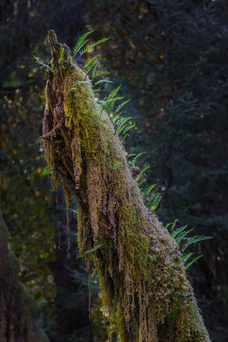
Stumped
‹ PreviousLandscape GalleryNext ›

Stumped

by Ronald Murphy

Gallery: LandscapePosted October 16, 2014196 views11 comments
Hoh Rain Forest, Olympic National Park, WA

Raw file processed in LR5, with TK resize/sharpening for web.
Canon T3i, 1/80 s, f/2.8, ISO 400, EF 70-200 mm f/2.8 @ 160 mm, CPL

Please view the large image!

Seeking any and all advice and comments. Thanks in advance.

Comments

11 comments
Comment posted by Allen Brooks on October 16, 2014 at 4:16 PM
These shots are always tough for me. I enjoy seeing this on my hikes, but never seem to be able to capture it in the camera. I like the light here. I wonder if a tighter shot towards the top would work better or at least a crop just below the group of ferns on the right. Maybe, also consider decreasing the brightness on the orange leaves(?) in the background.
Registered on July 27, 2011, 262 Posts, 2597 Comments
Comment posted by Ed Lowe on October 16, 2014 at 6:55 PM
The details with the moss and ferns on the stump are particularly nice, Ronald. My only suggestion would be to try and darken the BG a little to make those lovely details stand out a bit more. Just a thought.

Ed
Registered on February 7, 2004, 414 Posts, 7115 Comments
Comment posted by Preston Birdwell on October 16, 2014 at 7:12 PM
My first thought was that this looked liked a scene straight out of the movie Avatar. I love the details in the snag, but I think the background could go a little darker. Still cool, though.

--P
Registered on November 1, 2003, 471 Posts, 5188 Comments
Comment posted by Richard Teller on October 16, 2014 at 10:38 PM
Nice color, light and textures. But the composition just isn't doing for me. Also the light color rimming the stump looks out of place.
Registered on August 23, 2010, 1162 Posts, 6692 Comments
Comment posted by Catherine Reilly on October 16, 2014 at 10:55 PM
The Hoh is such a complex place in which to choose a composition that shows off the area's features. So this is stunning for its simplicity in telling that story. I like the background and bokeh but might work a little more to conceal some of the brighter spots, especially the ones nearest the subject and among the ferns. A stump with mossy dreadlocks is pretty unique.
Registered on August 16, 2006, 603 Posts, 9192 Comments
Comment posted by Riccardo Boesso on October 17, 2014 at 3:32 AM
I agree with Preston...seems lihe a scene from Avatar. Great detail and excellent DoF, maybe darkening the background a little bit the leaves would stand out even more.
Registered on October 15, 2014, 13 Posts, 72 Comments
Comment posted by Mark Seaver on October 17, 2014 at 7:16 PM
Ronald, I like this. The ferns scattered along the top, the moss hanging along the side and the fine background all tell a good story. However, in my opinion, you could tell the same story with a much tighter view of the top of this neat log. Test by crop a bit below that good looking fern leaf that pokes out on the left a little above center (or the two dangling moss bits just below that, or the gap in the fern leaves on the right a bit below center) and coming in a bit tighter from the right.
Registered on January 23, 2011, 1103 Posts, 17270 Comments
Comment posted by Mark Zelinka on October 18, 2014 at 12:31 PM
I think you're on the right track with this. it's an interesting scene, well presented. The bokeh is a bit distracting and a tighter crop might be better?
Registered on August 20, 2007, 206 Posts, 998 Comments
Comment posted by John Williams on October 18, 2014 at 10:06 PM
I'm enjoying this. I love Licorice Fern, and they are not easy to capture well. I'm in agreement that a slightly tighter crop would be good to compare.
Registered on September 6, 2007, 221 Posts, 5985 Comments
Comment posted by Ryan Shain on October 19, 2014 at 10:33 AM
WOW Ronald,

This image presents a wonderful delicate and tender nature. The details are superb, and the dark background provides for a sweet contrast that has main attraction jumping off the page.

I really dig this!!!
Registered on February 20, 2007, 226 Posts, 4571 Comments
Comment posted by S Govindarajan on October 21, 2014 at 10:58 PM
Fantastic foreground, Ronald. Fabulous details and comp. Agree with others on the darker background. :toast:
Registered on April 19, 2008, 115 Posts, 1921 Comments