Nature Photographers Network
This is the preserved archive of the original Nature Photographers Network. The community continues at naturephotographers.network.
Cave Point Storm
‹ PreviousLandscape GalleryNext ›

Cave Point Storm

by Ryan Shain

Gallery: LandscapePosted October 30, 2014182 views15 comments
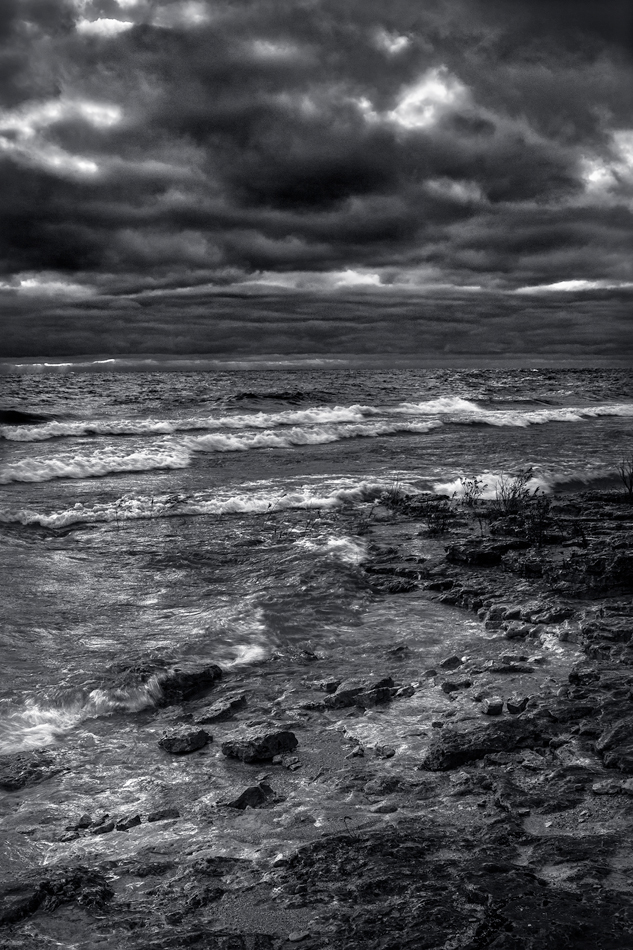
I recently spent some time up in Door County WI, and came away with a wonderful experience. This image was captured on the shores of Lake Michigan at Cave point County Park. I highly recommend it to any photographer headed out that way.

I have included the original color raw image as well to see where I started from on this one. The black and white image is more or less how I felt and what I saw from this stormy morning.

Please help me decide about the processing on this one, and thanks for taking the time to leave your comment :smile:

Canon 70d
24-105
polarizer
hand held 3 and 2 stop GND's
Tripod
f 10 at 1/30 s
cable release

Comments

15 comments
Comment posted by Ryan Shain on October 30, 2014 at 10:19 PM
Raw processed as jpg for comparrison
Registered on February 20, 2007, 226 Posts, 4571 Comments
Comment posted by Mark Seaver on October 30, 2014 at 11:09 PM
The b&w version is a big improvement. I'm chuckling because when I saw the thumb, I though to myself "It was a dark and stormy night" and yes this image says storm really well.
Registered on January 23, 2011, 1103 Posts, 17270 Comments
Comment posted by gary phillips on October 31, 2014 at 1:58 AM
I like this a lot, Ryan. I think that the horizon being indistinguishable really makes this shot. Nice.
Registered on October 24, 2013, 185 Posts, 4136 Comments
Comment posted by Stuart Williams on October 31, 2014 at 4:22 AM
i like the mood here but it seems a touch too dark to me. i would experiment with bringing up the dark-darks a little ...
Registered on December 7, 2007, 247 Posts, 4792 Comments
Comment posted by scott lanz on October 31, 2014 at 8:20 AM
Plenty of drama, even more so with the converted version, which I like better, Ryan. I'll second Stuart's suggestion, but this is very nice as is.
Registered on November 14, 2003, 840 Posts, 12902 Comments
Comment posted by Pat Sampson on October 31, 2014 at 8:29 AM
Love the mood and the drama and I prefer the black and white. The conversion works really well for me as posted but I tend to like darkness in images. Excellent capture - great scene.

pat
Registered on May 19, 2007, 953 Posts, 15989 Comments
Comment posted by Harry Lichtman on October 31, 2014 at 11:07 AM
I think many of the tones are dark and too similar. Some gradation between the sky and land might add some depth to the image. The clouds are very moody and ominous, but maybe a little brighter? I also think a stronger FG element might give more focus to the shot, though that may not have been possible with this location.
Registered on September 17, 2010, 304 Posts, 3507 Comments
Comment posted by Rick Turner on October 31, 2014 at 11:53 AM
ok as is :wavey:
Very nice to my eye.
Registered on February 18, 2012, 534 Posts, 2755 Comments
Comment posted by Ed Lowe on October 31, 2014 at 12:01 PM
Moody and dramatic; I like it, Ryan. This is just a suggestion of course, but I might be inclined to bring up the darkness just a touch. Still vey nice as is.

Ed
Registered on February 7, 2004, 414 Posts, 7115 Comments
Comment posted by Nick Bristol on October 31, 2014 at 12:09 PM
Ryan, Glad you enjoyed your trip to Door Co. I like this b&w presentation from Cave Point very much. You really captured the mood of this place on a stormy morning. :smile:

Nick Bristol
Lone Rock, WI
Registered on February 1, 2004, 752 Posts, 14140 Comments
Comment posted by Stan Rose on October 31, 2014 at 2:43 PM
Man, this is one tough shot to process... The mood is great, I think it's terrific scene...what gets me is the similarity in tones, as Harry mentioned. I guess you could say that the sea and sky are 'one' here--they're both fluids, it's all stormy...but if it were me id probably try to separate the two--maybe use selective color to draw out the differences, then fool with color filters. I'm stumped..
Registered on September 15, 2005, 836 Posts, 17099 Comments
Comment posted by John&Patty Benway on October 31, 2014 at 4:03 PM
You really captured a mood here Ryan, I have to say, I really like the B&W, it screams storm. Definitely works for me.
John
Registered on May 12, 2006, 626 Posts, 8700 Comments
Comment posted by Paul Breitkreuz on October 31, 2014 at 4:31 PM
One has to see the larger version to get the impact of this conversion, Ryan. Speaking on the conversion it was super wild in color too. But, the larger B&W seems to be the ticket here on this scene. Nice work. :cool:
Registered on February 25, 2006, 525 Posts, 8448 Comments
Comment posted by Bill Reid on November 4, 2014 at 3:39 PM
A little late to the party but a very moody B&W with very nice details. Maybe a little dark in the sky for me but no deal breaker. Very well done B&W.
Registered on January 27, 2013, 65 Posts, 2460 Comments
Comment posted by Ryan Shain on November 5, 2014 at 9:28 AM
Thanks to everyone for setting aside some time to make comments, and I may post this again with some changes, enjoy the day!
Registered on February 20, 2007, 226 Posts, 4571 Comments