Nature Photographers Network
This is the preserved archive of the original Nature Photographers Network. The community continues at naturephotographers.network.
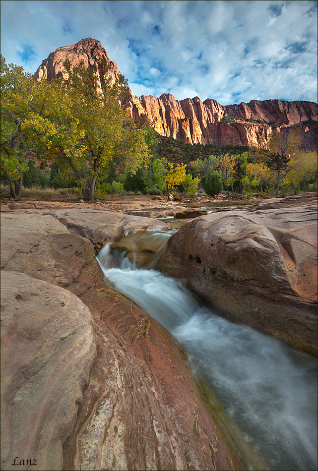
Zion Sunrise (Vert)
‹ PreviousLandscape GalleryNext ›

Zion Sunrise (Vert)

by scott lanz

Gallery: LandscapePosted November 2, 2014393 views18 comments
Here's an alternate vertical version of the Zion sunrise image I posted a few days ago (previous image in my gallery). I shot it in both ways. This one captures more of the stream, which at least one person thought was desirable, but less of the landscape. What do you think of this one, and which version do you prefer? Thanks! D600, 18-35 @18, f22, .3, iso 100, cpl, GND. :wavey:

Comments

18 comments
Comment posted by Harley Goldman on November 2, 2014 at 9:27 AM
I think they both work quite well, but just in different ways. You can't go wrong with either presentation.
Registered on November 19, 2003, 586 Posts, 11271 Comments
Comment posted by Jim Greenwood on November 2, 2014 at 9:46 AM
I somewhat prefer this vertical version, for what in my opinion is a stronger foreground and a more balanced composition. Zion is such a vertical world. I'd estimate that roughly 2/3 to 3/4 of my compositions from Zion are vertical format.
Registered on November 9, 2003, 229 Posts, 1523 Comments
Comment posted by Pat Sampson on November 2, 2014 at 9:48 AM
I prefer the first Scott, simply because to me it conveys more of the scene but I agree with Harley - you can't go wrong with either. Beautiful work.

pat
Registered on May 19, 2007, 953 Posts, 15989 Comments
Comment posted by Todd Bloomquist on November 2, 2014 at 9:52 AM
Scott, I feel that is a strong composition. I like the leading line of the water (and the foreground rock lines, for that matter) that directs our eye toward the peak. I would be curious what a B&W version might look like. Well done.
Registered on January 21, 2012, 10 Posts, 51 Comments
Comment posted by Roel Wijtmans on November 2, 2014 at 9:56 AM
This one feels more balanced for me, Scott. But both versions work fine! Shutter speed for the water is spot on, I like the pattern that can be seen in the lower part.
Registered on September 30, 2012, 116 Posts, 2257 Comments
Comment posted by Mark Seaver on November 2, 2014 at 11:23 AM
Interesting how we react differently (as we should). For me, this one feels subtly unbalanced (heavy right) but when I try to analyze why, the comp. seems fine. :confused: I wonder what dodging the tree(s) below the main peak would do for the balance. I like the long look at the stream here. I do like them both.
Registered on January 23, 2011, 1103 Posts, 17270 Comments
Comment posted by Dan Kearl on November 2, 2014 at 12:22 PM
Superb, I like this better than the first one.
Registered on September 2, 2013, 209 Posts, 1514 Comments
Comment posted by gary phillips on November 2, 2014 at 1:13 PM
This is my favorite, Scott. I may have been the one that wanted a little more stream. Regardless, both shots are keepers. I agree with Jim, in that Zion really presents itself as a vertical environment. :toast:
Registered on October 24, 2013, 185 Posts, 4136 Comments
Comment posted by Preston Birdwell on November 2, 2014 at 5:31 PM
I like this. There's a nice dynamic going on with the water and the and the rock. It may be just me, but the sky looks a little cyan-heavy. That's minor--this works very well.

--P
Registered on November 1, 2003, 471 Posts, 5188 Comments
Comment posted by Brian Schrayer on November 2, 2014 at 8:48 PM
I think I prefer the vertical comp because the diagonal provides a stronger line back to the peak in the background.
Registered on May 28, 2004, 114 Posts, 2890 Comments
Comment posted by Wayne Jones on November 2, 2014 at 10:05 PM
That's a tough decision, Scott. I like the expanse of landscape and sky in the horizontal one, but I think this one is visually more exciting. If I could have my way (which often is impossible) I would like this better if the camera were further to the right, (erecting scaffolding? mounting your camera on a 10-foot pole? :confused:) :wink: The reason for that wish is that the "action" in this comp seems to be all on the right side, so it balances well compositionally, but dynamically it's heavier on the right. Since I can't get everything I want on one image, I'll have to take BOTH. :smile:
Registered on April 18, 2007, 953 Posts, 6435 Comments
Comment posted by D.A. Edwards on November 3, 2014 at 12:41 AM
Put me in the prefer-the-vertical camp. Plus it eliminates the blown out cloud whites from the horiz version. No nits on this one, nice work.
Registered on October 8, 2014, 226 Posts, 1187 Comments
Comment posted by Howard Cheek on November 3, 2014 at 7:56 AM
I like this version best Scott.
It puts all the emphasis on the rock bound stream, with its 'bolder' style comp (lame attempt at a play on words here) :smile:
Well done! :toast:
Registered on July 24, 2008, 1201 Posts, 10758 Comments
Comment posted by John&Patty Benway on November 3, 2014 at 9:45 AM
Scott, I really like them both, at this moment, I prefer the vertical, either way, beautiful work.
John
Registered on May 12, 2006, 626 Posts, 8700 Comments
Comment posted by Navin Sarma on November 3, 2014 at 10:10 AM
Vertical wins out, for me Scott. I think the accentuation of shape in the river helps it. Beautiful shot
Registered on July 17, 2011, 233 Posts, 1373 Comments
Comment posted by Ryan Shain on November 3, 2014 at 1:07 PM
Scott,

I like the vertical image much more. To me, the image has a wonderful flow/energy about it's nature. The image looks great with colors, contrast details, and all of that stuff.

sweet capture
Registered on February 20, 2007, 226 Posts, 4571 Comments
Comment posted by Joel Hazelton on November 3, 2014 at 2:25 PM
Scott, these both look great. Both comps work, nice sky, etc. I'm only seeing an issue in the shadows in the FG vs the shadowed areas in the BG. I would recommend darkening the shadows in the FG a bit, while reducing the contrast or lightening the shadows in the BG cliffs.

Along those same lines, do you have any images with only the CPL being used? With side lighting and the nice sky, I imagine this scene might have looked great without the grad, and only using a CPL to darken the sky.
Registered on August 6, 2008, 194 Posts, 1315 Comments
Comment posted by Wade Hardy on November 3, 2014 at 5:25 PM
Both are great but I definitely like the vertical version better. For me, it provides more of a lead in and stronger foreground.
Registered on May 2, 2006, 121 Posts, 1824 Comments