Nature Photographers Network
This is the preserved archive of the original Nature Photographers Network. The community continues at naturephotographers.network.
Spotlight on the Peaks 2
‹ PreviousMan & Nature GalleryNext ›

Spotlight on the Peaks 2

by Wayne Jones

Gallery: Man & NaturePosted November 3, 2014131 views4 comments
CROPPING IDEAS? First, thanks to all those who answered my request for cropping ideas on previous two versions of this.

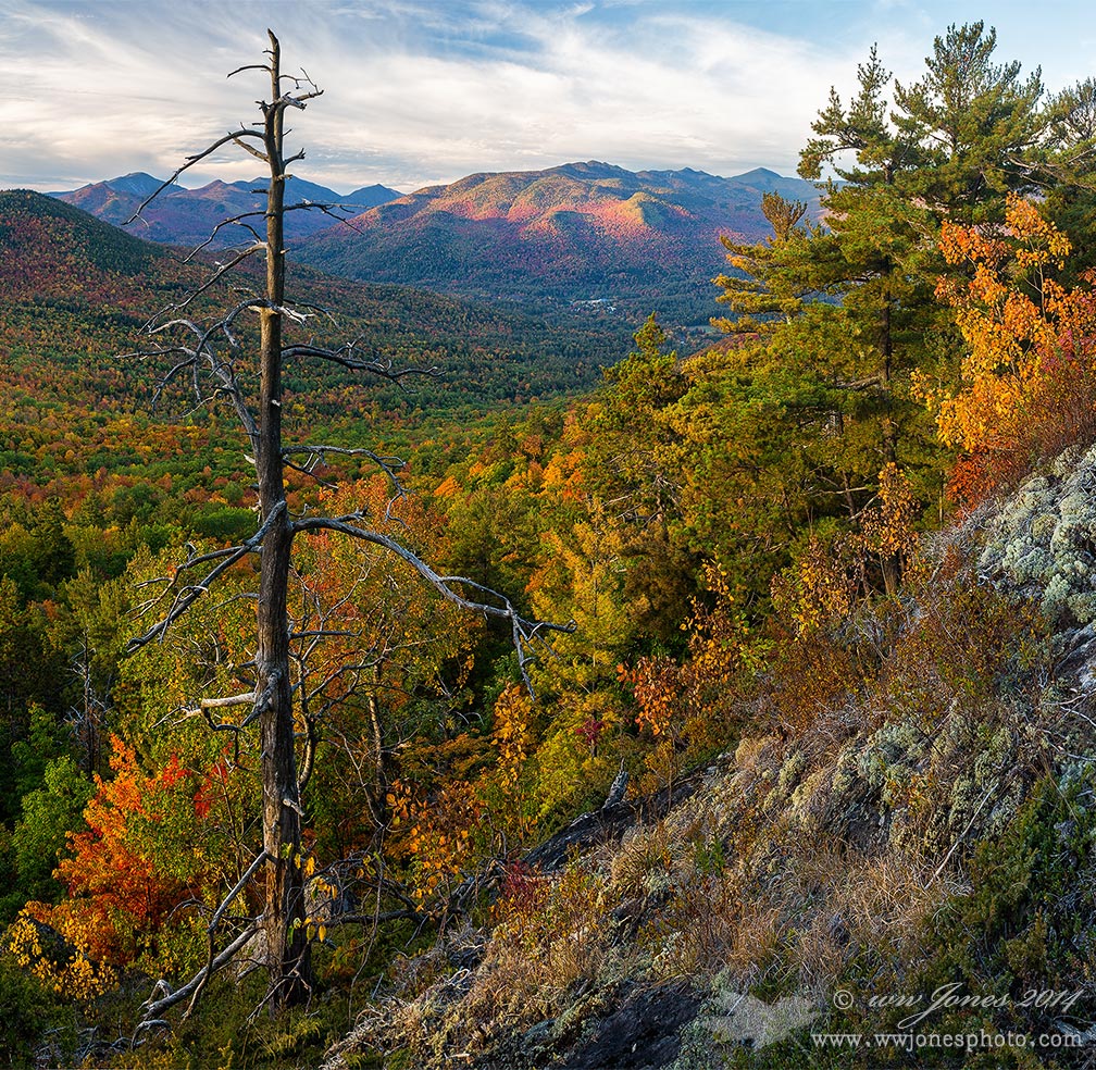
This is a crop of the sunrise view from Baxter Mountain in the Adirondack Forest Preserve that I posted in this Gallery yesterday. I also posted an alternative version (cropping out the village) Crop 3, in the Landscape Gallery,

For this square version, I wanted to concentrate on the light on the mountains above the village, so I sacrificed some of the foreground colors on both sides. It's not as colorful, but I think it's more focused on the colorful mountains. I kind of like big old snags in some landscapes, but not smack dab in the center of what I am trying to illustrate (unless it's a big old snag); so in this comp, I just moved that old pine to the side. What do you think?

THANKS for your advice.

Canon 5D3
Canon 24-105mm.; Circ. Pol.
0.6 sec. @ f/16; ISO 100
Five vertical frames (about 3 in this crop) stitched in PS CC

Comments

4 comments
Comment posted by Peter Cross on November 3, 2014 at 11:52 PM
I like them all. You want me to choose? As before, this would be great with a raptor perched on the snag. Colors are really nice and your crop here is good. I don't think anyone would notice that little smudge in the distance as being a town. But this way you get to post another photo. Well done.
Registered on April 3, 2010, 271 Posts, 1342 Comments
Comment posted by D.A. Edwards on November 4, 2014 at 2:38 AM
I think this crop does the best job of highlighting the peak spotlight effect although all of the versions have had their own appeal.
Registered on October 8, 2014, 226 Posts, 1187 Comments
Comment posted by Gary McGhee on November 4, 2014 at 7:13 AM
I like the square format here Wayne, everything fits nicely within it. The autumnal colours are really nice and the lighting and colour on the peaks in the distance adds to the wonderful depth.

Gary.
Registered on April 15, 2010, 142 Posts, 2416 Comments
Comment posted by Richard Teller on November 6, 2014 at 10:10 PM
I like this image better. It gets the tree out of the center and allows the eye to roam around the rest of the image better. Beautiful color and comp.
Registered on August 23, 2010, 1162 Posts, 6692 Comments