Nature Photographers Network
This is the preserved archive of the original Nature Photographers Network. The community continues at naturephotographers.network.
Beachstones V / repost
‹ PreviousLandscape GalleryNext ›

Beachstones V / repost

by Vance Gese

Gallery: LandscapePosted November 8, 20141,543 views14 comments
Want to thank everyone for the wonderful comments on the last post. Really appreciate the feedback. Think I'll keep that one.

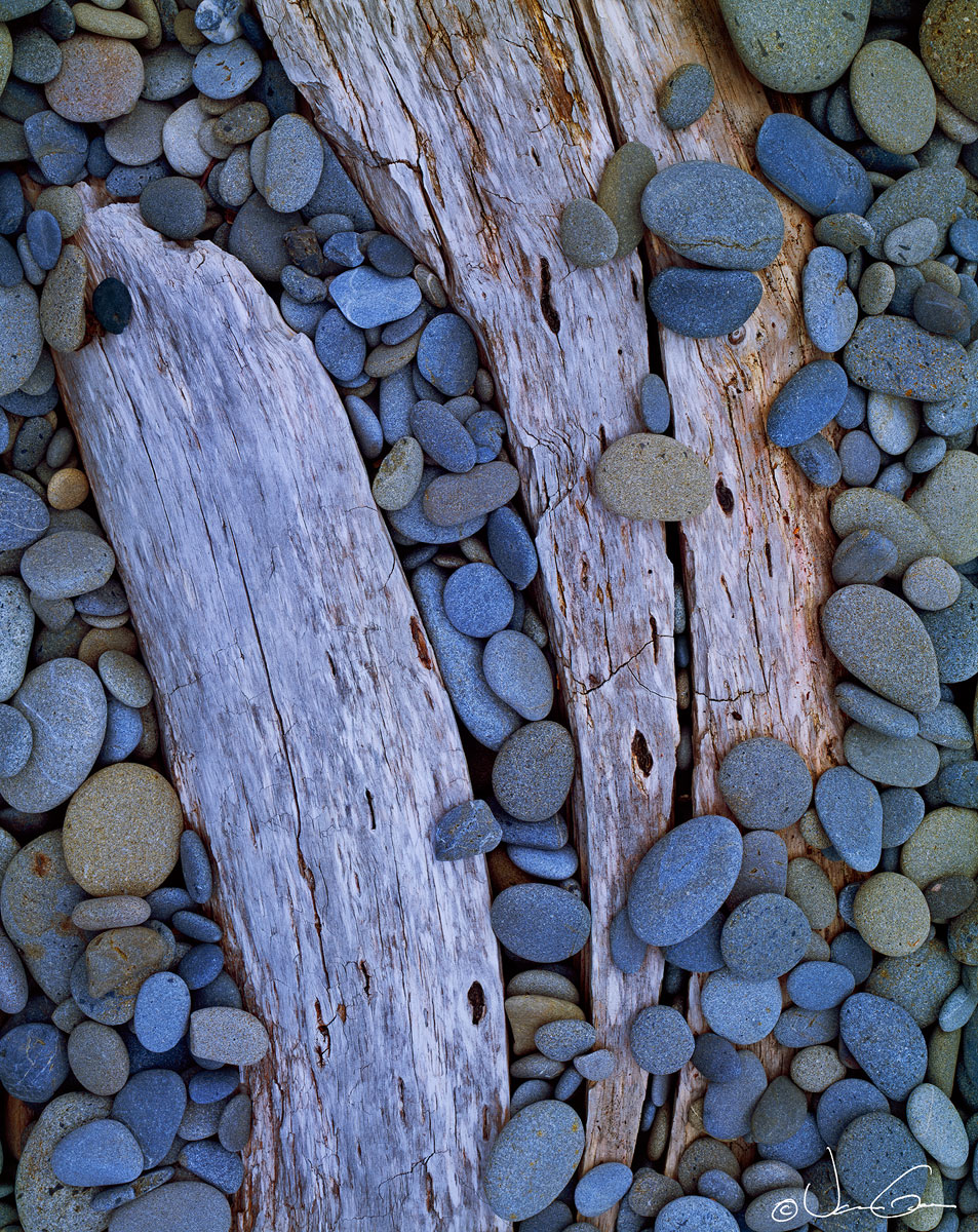
Made this image in July of this year south of Kalaloch Beach of Olympic NP. Loved the grain and textures in this partly buried driftwood; my first thought was that the form of the wood almost looked like a breaching whale in profile with the stones like huge water drops cascading down. Regardless, the lines and the stones really came together nicely I thought.
Would appreciate any and all suggestions and comments.
4x5, 150mm, Provia 100F. M1 scan, Tony Kuyper's always remarkable masking techiques.

Please take a look at the larger image.

Thanks.

Comments

14 comments
Comment posted by Richard Teller on November 8, 2014 at 9:02 PM
I like the composition and the textures of the wood and stones. I am just wondering about the color. Was everything that blue. I just don't know what to think about the color.
Registered on August 23, 2010, 1162 Posts, 6692 Comments
Comment posted by gary phillips on November 9, 2014 at 2:14 AM
Wonderful study, Vance. Love the detail in the composition and I love the color of the stones. Again, this is more about making sense of chaos and finding something coherent in the randomness that surrounds us. Beautiful work as always.
Registered on October 24, 2013, 185 Posts, 4136 Comments
Comment posted by scott lanz on November 9, 2014 at 7:35 AM
Very artistic, Vance. Well seen and composed. I see Richard's point about it the blue (even the wood has a slight blue cast) but I like the blue tones. Lovely image overall.
Registered on November 14, 2003, 840 Posts, 12902 Comments
Comment posted by Tony Kuyper on November 9, 2014 at 8:47 AM
Wonderful comp. The elements came together very nicely in your composition. My first reaction was that it seemed a little too blue, but that might be the white background. I notice it less in the larger version.
Registered on November 1, 2003, 364 Posts, 22328 Comments
Comment posted by Paul Breitkreuz on November 9, 2014 at 10:32 AM
Simply love this one, Vance. This intimate close up is excellent for my own personal photographic tastes. The 4x5 provided such super detail it's like being right there. Although Provia pushes towards blue in general, this scene seems about right to me for this deep shadow area. As always, we can adjust to our own liking. I tend to move toward warmer these days even with some of the blue I get out of Velvia. However, again, this scene seems perfect to me as is. :toast:
Registered on February 25, 2006, 525 Posts, 8448 Comments
Comment posted by Bill Reid on November 9, 2014 at 11:50 AM
Incredible detail and tones in the large version Vance and I like how you composed the scene. I agree at first it seemed a bit blue but after looking at it a bit I like it that way. Very nicely done as always.
Registered on January 27, 2013, 65 Posts, 2460 Comments
Comment posted by Vance Gese on November 9, 2014 at 1:42 PM
Thank you very much for the comments everyone. I do agree that the blues come across a bit too strong. Have warmed this up a bit in the repost. Would appreciate your thoughts.
Registered on November 13, 2008, 298 Posts, 6629 Comments
Comment posted by Ryan Shain on November 9, 2014 at 2:19 PM
This is stunning Vance,

You have captured such a beautiful balance between the two pieces of wood and the stones. The detail, texture and color are superbly displayed, and the warmed up version looks great. I prefer the warmer image Vance.

:toast:
Registered on February 20, 2007, 226 Posts, 4571 Comments
Comment posted by Pat Sampson on November 9, 2014 at 2:27 PM
Superb composition Vance. On my Macbook Pro with retina and Chrome browser the repost looks more natural to me and I prefer it. The detail seems to pop just a touch more. I'd love to have either version on my wall. Well seen.

pat
Registered on May 19, 2007, 953 Posts, 15989 Comments
Comment posted by Paul Breitkreuz on November 9, 2014 at 4:28 PM
Vance, the repost is much better. As I stated, I find myself liking warmer side of things even with Velvia.... :biggrin:
Registered on February 25, 2006, 525 Posts, 8448 Comments
Comment posted by Harley Goldman on November 10, 2014 at 5:54 PM
Really nice, Vance, especially the repost. Very well done.
Registered on November 19, 2003, 586 Posts, 11271 Comments
Comment posted by Eva McDermott on November 12, 2014 at 12:09 AM
I especially like the repost Vance. I am enjoying the array of olive and steel gray pebbles against the drift wood.
Registered on January 4, 2009, 1015 Posts, 13229 Comments
Comment posted by Nick Bristol on November 12, 2014 at 9:46 PM
Vance, I'm a little late here but glad I saw this one now. This looks fantastic to me! I think you did an excellent job with this comp and capturing such a wonderful feel between the stone and wood. I do see and feel the whale in this as well and think that was a wonderful vision on your part. I like the original post but think the warmed up repost works best. Really nice work!

Nick Bristol
Lone Rock, WI
Registered on February 1, 2004, 752 Posts, 14140 Comments
Comment posted by Jon Daining on November 17, 2014 at 9:02 PM
Gorgeous work as usual! The subdued blue tones are lovely. No nits.
Registered on February 25, 2012, 25 Posts, 191 Comments