Nature Photographers Network
This is the preserved archive of the original Nature Photographers Network. The community continues at naturephotographers.network.
Sunny Storm
‹ PreviousLandscape GalleryNext ›

Sunny Storm

by John Williams

Gallery: LandscapePosted December 13, 20143,914 views18 comments
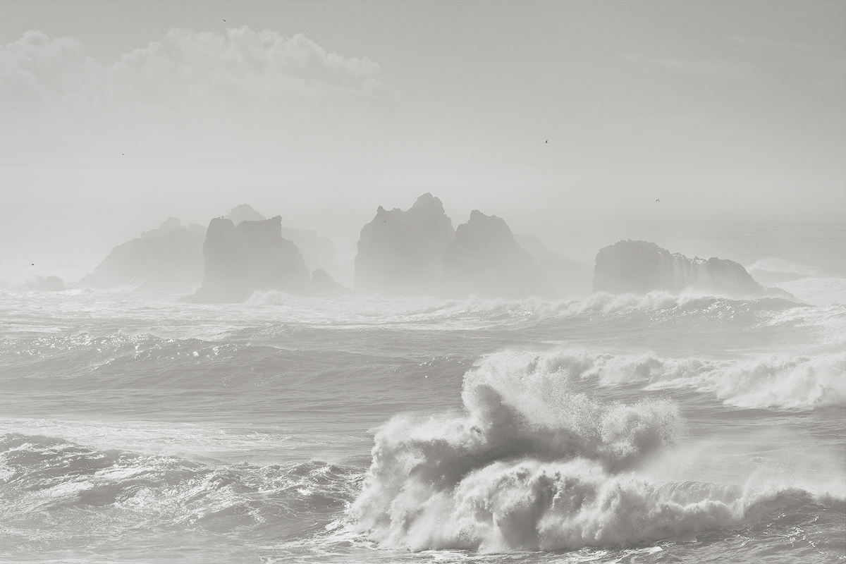
Earlier this year I spent a weekend at the Oregon Coast and experienced an odd combination of massive swells with calm and bright conditions. I wrestled with creating a low-contrast version of the first photo I posted from this trip, but eventually decided a high-contrast version worked much better.

I'm still trying to learn black and white photography, and decided to make a second run at a low-contrast image with this photo. I'll post the raw version below; as you can see the scene was pretty low contrast as shot.

This is from Bandon. I recommend viewing the larger version, because the birds help give perspective to the photo and they look like dust bunnies in the small version.

Nikon D7100
Nikon 55.0-200.0 mm f/4.0-5.6 at 145mm (217mm equiv.)
1/500 sec at f/11 and ISO 100

Comments

18 comments
Comment posted by John Williams on December 13, 2014 at 11:29 AM
Here's the raw version with all edits turned off.
Registered on September 6, 2007, 221 Posts, 5985 Comments
Comment posted by Nick Bristol on December 13, 2014 at 12:32 PM
John, I think this worked out very nice. I'm really enjoying the feel this has. The larger version is really cool to look at and even study for awhile. The birds do work nice in the large view too. :smile:

Nick Bristol
Lone Rock, WI
Registered on February 1, 2004, 752 Posts, 14140 Comments
Comment posted by Alberto Patiño on December 13, 2014 at 12:45 PM
I really like the B&W conversion, the low contrast works very well for this scene, and the birds, even if small, really add much to the photograph. Nicely done!
Registered on December 2, 2014, 278 Posts, 1736 Comments
Comment posted by Michael Westerbeck on December 13, 2014 at 1:28 PM
John, I really like the contrasts here. The soft feel with the rugged sea stacks and rough surf. Nice conversion too. :smile:
Registered on March 21, 2012, 32 Posts, 111 Comments
Comment posted by Bill Fach on December 13, 2014 at 2:22 PM
John: One of my absolute favorite places on the planet superbly rendered. Thanks to your and Stuart's suggestion I'm delving into some high key stuff myself. 2 thumbs up. >=))>
Registered on November 1, 2003, 1805 Posts, 26981 Comments
Comment posted by Dan Kearl on December 13, 2014 at 6:59 PM
I love the waves in the foreground, the birds are a tad small in the frame for me.
I also think a bit more contrast on the rocks would make it pop a bit more.
Registered on September 2, 2013, 209 Posts, 1514 Comments
Comment posted by Mark Pelton on December 13, 2014 at 9:31 PM
large version is beautiful. like the contrast here.
Registered on November 25, 2003, 380 Posts, 4647 Comments
Comment posted by Stan Rose on December 13, 2014 at 9:31 PM
cool! Love the wave action. The hazy salt spray look is interesting...not sure it would have mass appeal but of course it need not :smile:
Registered on September 15, 2005, 836 Posts, 17099 Comments
Comment posted by Nancy Lea Sandy on December 13, 2014 at 9:40 PM
The low contrast and absence of color really gives this one a special mood. I find it very appealing
Registered on January 24, 2011, 576 Posts, 6942 Comments
Comment posted by Richard Teller on December 13, 2014 at 10:13 PM
Very dramatic image. With the lack of dramatic color the B&W works very well.
Registered on August 23, 2010, 1162 Posts, 6692 Comments
Comment posted by Gary McGhee on December 14, 2014 at 10:05 AM
Excellent photo all round John, love it.

Gary.
Registered on April 15, 2010, 142 Posts, 2416 Comments
Comment posted by Preston Birdwell on December 14, 2014 at 2:19 PM
This definitely works for me. The high-key gives a nice sense of light and contributes well to the mood. Don't change a thing, in my opinion.

--P
Registered on November 1, 2003, 471 Posts, 5188 Comments
Comment posted by Harley Goldman on December 15, 2014 at 9:51 AM
This works for me. I really like the high key presentation. Great job of taking the bright light and making it work for you. I really like the image.
Registered on November 19, 2003, 586 Posts, 11271 Comments
Comment posted by Mark Metternich on December 15, 2014 at 7:32 PM
Cool shot. Also low key AND high contrast at the same time. :toast:
Registered on June 19, 2009, 276 Posts, 6240 Comments
Comment posted by Navin Sarma on December 15, 2014 at 11:00 PM
Beautiful light and interesting processing John. It does not quite look like a BW, almost a toned off white (might be more of an illusion or my own mind playing tricks on me). Regardless, love both images for different reasons, but both show the force of this coast. I think overall I like the large swell, high contrast image a little bit more
Registered on July 17, 2011, 233 Posts, 1373 Comments
Comment posted by Stuart Williams on December 16, 2014 at 3:02 AM
john, i like the tones here - the low contrast works fine for me. i'm a little on the fence with the comp and i suspect that if you had zoomed in to 200mm and made a stitched pano of those shrouded forms, you might have something rather intriguing. what do you think?
Registered on December 7, 2007, 247 Posts, 4792 Comments
Comment posted by Albert Darmo on December 17, 2014 at 12:15 PM
Hi John :wavey: your work always amazes me :eek: I enjoy the first version better. A breathtaking scene, with dramatic mood.. :toast:


Albert Darmo
Canada
Registered on November 25, 2008, 1386 Posts, 11978 Comments
Comment posted by John Williams on December 17, 2014 at 1:15 PM
Thanks so much everyone!
Registered on September 6, 2007, 221 Posts, 5985 Comments