Gallery: LandscapePosted December 19, 2014152 views5 comments
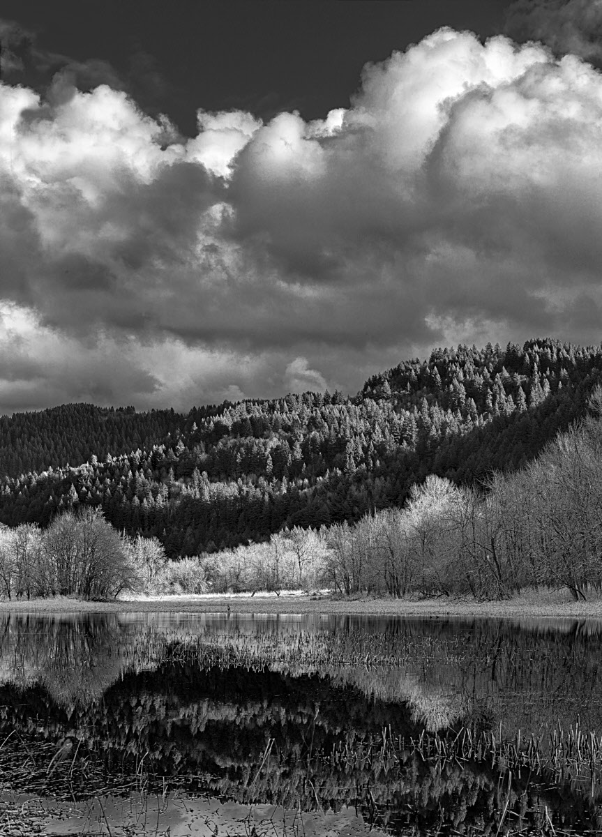
Mirror Pond, Columbia Gorge below Crown Point. Canon 5DMk2, EOS 70-200 at 70mm. Iso 100, f16, 1/1sec
Comments
5 comments
Comment posted by Nancy Lea Sandy on December 20, 2014 at 10:23 AM
Extremely vibrant for a b&w. I like your processing with the bold contrasts and layers of texture. Nice work
Registered on January 24, 2011, 576 Posts, 6942 Comments
Comment posted by Preston Birdwell on December 20, 2014 at 10:38 AM
Nice light here, Daniel. I like the sky and the hills. The foreground, including the lighter trees looks 'crunchy' in the small version. The large version is better. I think compression is hurting the detail there in both versions. I like the layers of light and dark.
--P
Registered on November 1, 2003, 471 Posts, 5188 Comments
Comment posted by Daniel Rappaport on December 20, 2014 at 4:26 PM
Oops, I was so enamored of the full quality version of this that I didn't see what compression did to it. Probably should have skipped the web sharpening step. The larger version suffers a bit less.
Registered on September 9, 2009, 294 Posts, 2006 Comments
Comment posted by Mark Seaver on December 20, 2014 at 7:06 PM
This looks like a "classic" b&w with a full range of tonality. Your processing does a fine job of bringing out the textures and tones throughout. The crunchiness seen in the smaller version is something that I've noticed recently in a couple of color posts as well...bright images with lots of details look oversharpened, but darkening them without changing any sharpening or viewing the larger version seems to reduce the crunchiness nicely.
Registered on January 23, 2011, 1103 Posts, 17270 Comments
Comment posted by Dan Kearl on December 20, 2014 at 7:27 PM
Ther large image look fine the small one suffers, but I always look at the large image before I comment.
I have a hard time with the color in the small images as they look flat......
I like the tones you have and the light.
The line of trees in the middle look a bit bright, almost infrared and I might tone them down.
Registered on September 2, 2013, 209 Posts, 1514 Comments

Comments
5 comments--P
I have a hard time with the color in the small images as they look flat......
I like the tones you have and the light.
The line of trees in the middle look a bit bright, almost infrared and I might tone them down.