Gallery: LandscapePosted December 23, 20142,905 views28 comments
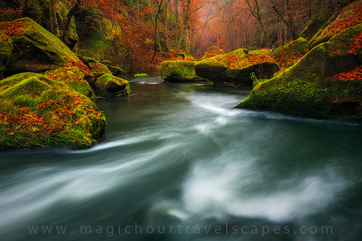
Another Czech landscape from the past autumn.
Canon 5DMkIII, 16-35mm, 4s
Comments
28 comments
Comment posted by Alberto Patiño on December 23, 2014 at 3:52 PM
I like the depth of the composition, especially the tree "tunnel" in the background. I wonder of the greens are a bit too saturated?
Registered on December 2, 2014, 278 Posts, 1736 Comments
Comment posted by Harley Goldman on December 23, 2014 at 4:11 PM
Very sweet scene. It looks a bit saturated on my screen, but that is a personal taste thing. Real nice image.
Registered on November 19, 2003, 586 Posts, 11271 Comments
Comment posted by Ronald Murphy on December 23, 2014 at 4:24 PM
Beautiful composition of a beautiful place. Looks a bit electric to me though.
Registered on March 13, 2012, 279 Posts, 975 Comments
Comment posted by Patricia Brundage on December 23, 2014 at 6:12 PM
Gives me the feeling of standing in the stream. Beautiful fall scenic from an unusual perspective. Fall colors can be very saturated, especially on overcast days, so the saturation could well be accurate.
Registered on March 23, 2006, 1111 Posts, 6531 Comments
Comment posted by Dan Kearl on December 23, 2014 at 6:30 PM
I don't care about the saturation, that is part of art and the artist vision.
I like it, very Adamus like, and the comp leads me through the photo.
Well done.....
Registered on September 2, 2013, 209 Posts, 1514 Comments
Comment posted by Enrique Vizcarra on December 23, 2014 at 7:19 PM
Beautiful
Registered on September 10, 2009, 223 Posts, 393 Comments
Comment posted by Gary Reed on December 23, 2014 at 7:54 PM
Very well captured!
Registered on September 19, 2009, 198 Posts, 1074 Comments
Comment posted by D.A. Edwards on December 23, 2014 at 10:08 PM
Not much to criticize here, technically and artistically beautiful. I have no problem with the saturation. I like the hint of brightness at the end of the stream.
Sweet
Registered on October 8, 2014, 226 Posts, 1187 Comments
Comment posted by Carey Closs on December 23, 2014 at 10:34 PM
I agree that the saturation makes the colors look somewhat unnatural but who cares. I'm sure a more naturalistic interpretation of this scene would make for a nice pic but I find the artistic processing of this image outstanding.
Registered on April 15, 2012, 107 Posts, 326 Comments
Comment posted by Ken Smith on December 23, 2014 at 10:39 PM
I like the large version of this as it contains the details needed to enjoy it..esp the top 1/3 with the delicate trees and fog in the distance. The water seems a bit large and weighty just a tad too soft to extract the exploding motions that try to reach out. …strictly a personal preference opinion. I love the green tint of the water blending with the fall colors of orange and red. Well done!
Registered on September 5, 2008, 449 Posts, 2444 Comments
Comment posted by Ian Cameron on December 24, 2014 at 5:49 AM
Very beautiful high colour scene with great movement in the water. I love the total exclusion of sky which really helps focus attention on the colour pallette. On tht note It does feel just a fraction too saturated but mainly on the yellow channel. I would probably reduce that a fraction but still retain the luminosity apparent in the image.
Registered on August 6, 2004, 1125 Posts, 3318 Comments
Comment posted by Kah Kit Yoong on December 24, 2014 at 7:34 AM
Thanks for your commentary. Czech has some of the most vibrant forests and fall colour I have ever seen. On this day the fog and soft light were absolutely perfect for capturing these at their best. I did optimise the colour even though it was pretty colourful to start off with.
Registered on September 27, 2006, 636 Posts, 10682 Comments
Comment posted by Rick Turner on December 24, 2014 at 9:44 AM
Dreamy Ian. Sweet
Registered on February 18, 2012, 534 Posts, 2755 Comments
Comment posted by Basil Greber on December 24, 2014 at 10:14 AM
Looks great to me - but then, I do tend to like it punchy. I like the green-red contrast and the flow of the water into the image. I wonder what happens if you smoothen the water even more with a longer shutter speed. Has this been attempted?
Registered on November 8, 2005, 219 Posts, 1340 Comments
Comment posted by Kah Kit Yoong on December 24, 2014 at 10:43 AM
A longer exposure doesn't look very good at all Basil just an amorphous mess, I had to blend in some texture from a shorter exposure in fact for this.
Registered on September 27, 2006, 636 Posts, 10682 Comments
Comment posted by Jeff Martyka on December 24, 2014 at 1:37 PM
I like the punch of the greens contrasted by the shadows in the green facing me...it's what makes the image art to me.
One of my favorite fall images. I really really want to look around there more...happen to have a 360 pano? :)
Registered on June 20, 2014, 30 Posts, 155 Comments
Comment posted by Kah Kit Yoong on December 24, 2014 at 1:54 PM
Thanks Jeff. Your wish for a 360 degree view illustrates something interesting about landscape photography. Even though the light was soft, even looking by eye in the opposite direction, the colours and luminosity of the scene was diminished by comparison. It was even more obvious in the images so yes there is a 240 degree panorama but it won't be released.
Registered on September 27, 2006, 636 Posts, 10682 Comments
Comment posted by Nancy Lea Sandy on December 24, 2014 at 1:55 PM
Stunning color. Looks like a fairlyland or something. The bold colors contrast particularly well with the silky water. Lovely scene, beautifully presented
Registered on January 24, 2011, 576 Posts, 6942 Comments
Comment posted by Ryan Shain on December 24, 2014 at 3:05 PM
The vibrancy in this image amazes myself Kah. The Czech forests have so much saturation and vibrancy about their nature. I am truly moved by this wonderful Autumn capture, and I now need to make it out that way in my lifetime.
Registered on February 20, 2007, 226 Posts, 4571 Comments
Comment posted by Prashant Khapane on December 24, 2014 at 3:12 PM
lovely composition. I'm wondering how you waded through the river. It looks tad saturated to me.
Registered on November 1, 2003, 492 Posts, 4580 Comments
Comment posted by Nick Bristol on December 24, 2014 at 5:39 PM
Beautiful!! I love the look and feel this image has. Great composition and that light is amazing. It feels like I'm looking at a transparency on a light table. The water flow / motion looks great to me as well. I think it would be very interesting to see this in a large print! Nice work Kah Kit.
Nick Bristol
Lone Rock, WI
Registered on February 1, 2004, 752 Posts, 14140 Comments
Comment posted by Basil Greber on December 25, 2014 at 6:55 AM
Ok, interesting, thanks for the info!
Registered on November 8, 2005, 219 Posts, 1340 Comments
Comment posted by Roel Wijtmans on December 25, 2014 at 8:49 AM
Stunning photo! The structure in the water is spot on with regard to the SS, and the green/orange combination on the rocks complemenst very well. The saturation is a bit too much for my taste though...
Registered on September 30, 2012, 116 Posts, 2257 Comments
Comment posted by Eva McDermott on December 25, 2014 at 12:33 PM
This has a mystical feel about it Kah Kit. The colors and water flow work for me.
Registered on January 4, 2009, 1015 Posts, 13229 Comments
Comment posted by Preston Birdwell on December 25, 2014 at 1:01 PM
I like this a lot, even though I do think the reds in the leaves on the rocks are a little over saturated. The flow of the water and the details throughout are very nice.
--P
Registered on November 1, 2003, 471 Posts, 5188 Comments
Comment posted by Ed Lowe on December 25, 2014 at 1:04 PM
Beautifully done Kah Kit. This has a wonderful soothing dreamy atmosphere to it and I really like the color palette in this scene.
Ed
Registered on February 7, 2004, 414 Posts, 7115 Comments
Comment posted by Kah Kit Yoong on December 25, 2014 at 4:22 PM
Thanks for the comments guys. I'm OK with the saturation as I like the fantasy feel to the scene however I'm posting a version here just a bit lower in the red and yellow channels.
Registered on September 27, 2006, 636 Posts, 10682 Comments
Comment posted by Nick Bristol on December 25, 2014 at 6:28 PM
Kah kit, I was ok with the original post but after seeing this repost I like it even better. I think you lowered the saturation in the red and yellow channels just right. It still has a nice fantasy feel / mood and maybe even a bit more pleasing to view. Excellent!
Nick Bristol
Lone Rock, WI
Registered on February 1, 2004, 752 Posts, 14140 Comments

Comments
28 commentsI like it, very Adamus like, and the comp leads me through the photo.
Well done.....
Sweet
One of my favorite fall images. I really really want to look around there more...happen to have a 360 pano? :)
Nick Bristol
Lone Rock, WI
--P
Ed
Nick Bristol
Lone Rock, WI