Nature Photographers Network
This is the preserved archive of the original Nature Photographers Network. The community continues at naturephotographers.network.
Bufflehead Redo
‹ PreviousAvian GalleryNext ›

Bufflehead Redo

by Jerry Austin

Gallery: AvianPosted January 6, 2015118 views7 comments
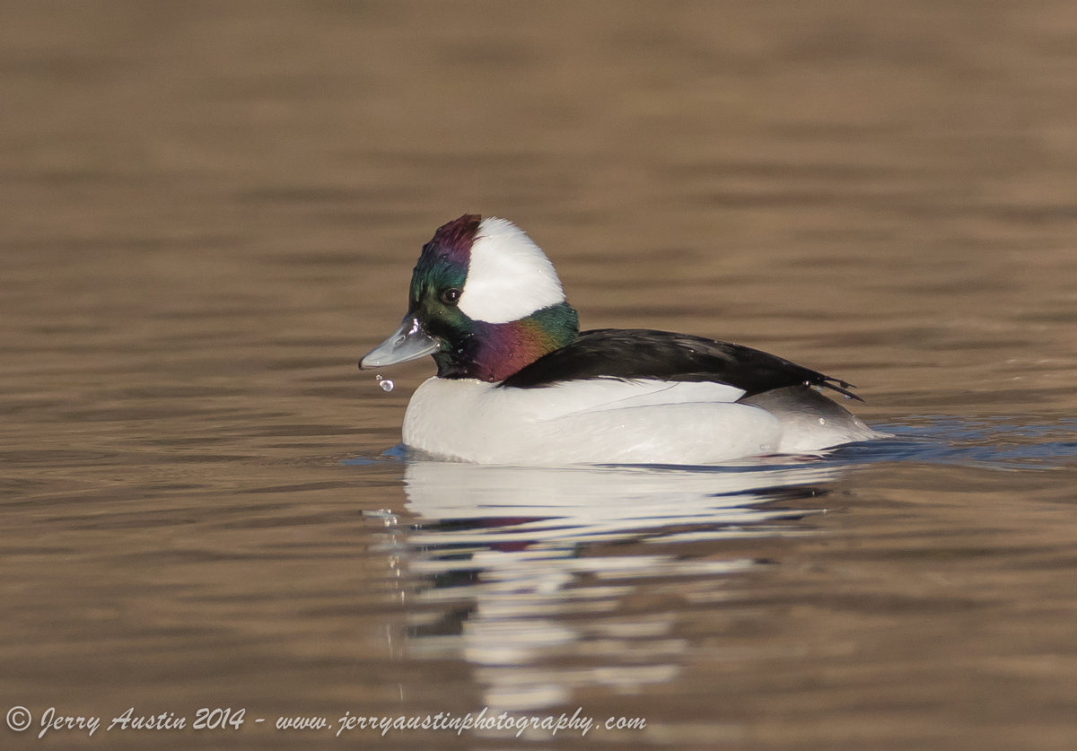
I was back out at the local lake today stalking the Buffleheads. I got a little closer this time, so I think the image quality is a bit better because the crop, while still substantial, is not as large as in my previous posts. It is still a struggle to properly expose the blacks without blowing the whites. It's a delicate dance. I liked the water droplet coming off the bill.

Processed using Lightroom 5 and Photoshop CC 2014. Comments and critiques welcome.

Canon 7D Mark II
Canon 200-400 f4 L IS
f7.1
1/2000s
ISO 640
Focal Length 560mm (Teleconverter engaged)

Comments

7 comments
Comment posted by keith mitchell on January 7, 2015 at 3:59 AM
Jerry this is very nice, lovely muted colours on the duck and the water droplet falling from the bill is a real bonus.

Keith.
Registered on July 12, 2008, 127 Posts, 1735 Comments
Comment posted by Steve Thompson on January 7, 2015 at 9:32 AM
Jerry, nice job handling the iridescent colors and the whites. Great catch light in the eye and the drip adds interest. :toast:
Registered on August 7, 2014, 125 Posts, 2319 Comments
Comment posted by Patrick O'Healy on January 7, 2015 at 11:32 AM
Jerry,
The handling the whites dance for this bird is really a challenge. You have done a good job. I really like the water drops from his beak. My pet idea of the moment is to not crop our images so tightly. I think we/I tend to do so because we are thrilled that we got something tack sharp that will stand up to it. I question whether we denigrate images with tight crops. (Perhaps your post is not the right medium for my soap box, but here it is.) Thanks for posting this. :toast:
Registered on March 13, 2011, 326 Posts, 1679 Comments
Comment posted by Luke Ormand on January 7, 2015 at 12:35 PM
My monitor at work is terrible - so I believe there's better detail in the whites than what I'm seeing. Overall a really nice image with great colors on the head and I like the droplets as well.
Registered on February 4, 2009, 1093 Posts, 7035 Comments
Comment posted by Alberto Patiño on January 7, 2015 at 1:08 PM
A very cute expression, and the water droplet a great detail!
Registered on December 2, 2014, 278 Posts, 1736 Comments
Comment posted by Allen Brooks on January 7, 2015 at 1:20 PM
I'd say this turned out really well. The blacks and whites look good and the iridescent colors of the head seem just right and not over-saturated. Nice head turn and catch light.
Registered on July 27, 2011, 262 Posts, 2597 Comments
Comment posted by Charles Rose on January 7, 2015 at 3:19 PM
I find the image to be very pleasing! I like the iridescence in the head feathers. Good detail too. :toast:
Registered on March 13, 2011, 58 Posts, 122 Comments