Nature Photographers Network
This is the preserved archive of the original Nature Photographers Network. The community continues at naturephotographers.network.
Bristlecone Lines
‹ PreviousLandscape GalleryNext ›

Bristlecone Lines

by D.A. Edwards

Gallery: LandscapePosted January 13, 2015207 views12 comments
Been MIA due to a hellacious flu, new computer upgrade and new software. Been keeping up though on the postings here and there's been some great work the last few weeks. But there are way too many frigid images in this gallery lately :razz:

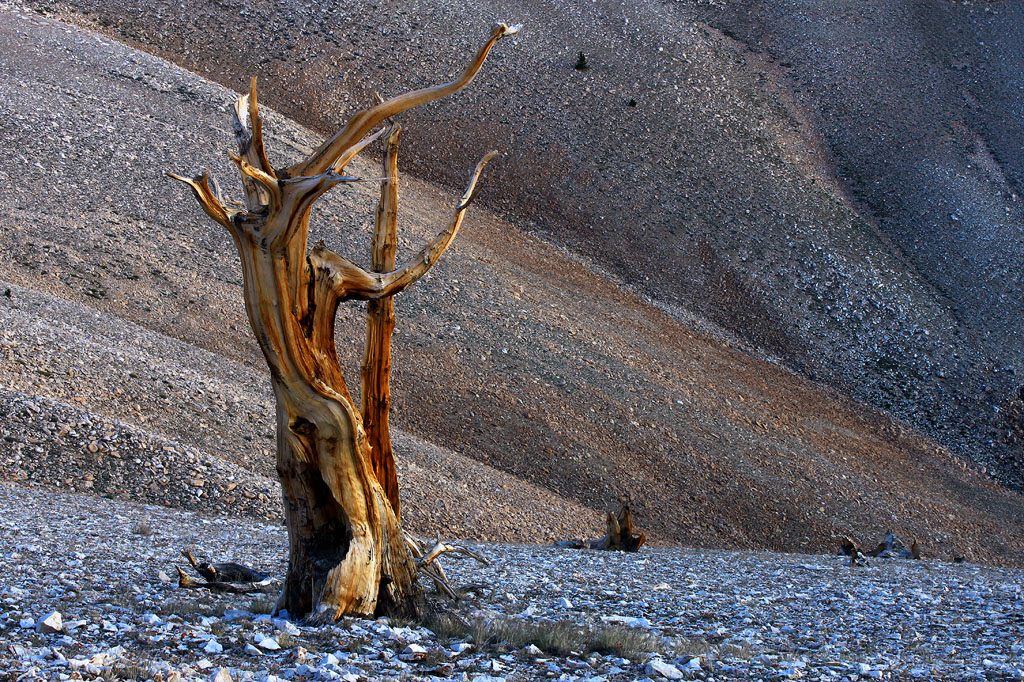
Here's one from back in August, high in the White Mountains, before dawn on my birthday. Not that it wasn't cold up there but at least there was no snow!

f/16, 2 sec, ISO-200, 43mm, tripod.

Comments

12 comments
Comment posted by Harley Goldman on January 13, 2015 at 5:51 PM
Real nice and unusual take on the Patriarch grove. I really like the background. I might be inclined to pull some blue out of the foreground, but that is very much a personal preference.
Registered on November 19, 2003, 586 Posts, 11271 Comments
Comment posted by Preston Birdwell on January 13, 2015 at 6:00 PM
Good to see you back, Dave. I like the tree: lovely color and detail. I do find the blue in the foreground rocks a little too saturated. Also, I'd like just a bit more room between the top of the tree and the edge of the frame. I do like the warm/cool color palette.

--P
Registered on November 1, 2003, 471 Posts, 5188 Comments
Comment posted by Alberto Patiño on January 13, 2015 at 8:06 PM
Gorgeous light on the dead bristlecone, Dave. The receding hills, with progressively decreasing light, look a bit like a fan that frames and focuses attention on the tree - beautifully done! :toast:
Registered on December 2, 2014, 278 Posts, 1736 Comments
Comment posted by Ken Smith on January 13, 2015 at 8:52 PM
I like the composition and color mix represented by the golden tones of the snag and similar in the hillside. The blue is a bit contrasty and I agree w/Harley to pull out some. Nice converging lines towards the lower rt corner…would like to have a little more on the right side to finish those lines if possible. Nice stark look to it…moonscape with a tree. Ken S
Registered on September 5, 2008, 449 Posts, 2444 Comments
Comment posted by Mark Seaver on January 13, 2015 at 9:16 PM
This is lovely, Dave. The warm colors in the tree and all of it's twists are set off wonderfully by the scree slopes behind.
Registered on January 23, 2011, 1103 Posts, 17270 Comments
Comment posted by Roel Wijtmans on January 14, 2015 at 11:01 AM
Really shows the harsh environment these trees grow and thrive in, nice! The colors in the rocks give a nice background transition.
Registered on September 30, 2012, 116 Posts, 2257 Comments
Comment posted by gary phillips on January 14, 2015 at 12:15 PM
You really conveyed the feeling of desolation here, Dave. I have to visit this place someday. I have to agree with some of the others about the tightness of the shot. A little more breathing room top and right would be nice but real nice image as is.
Registered on October 24, 2013, 185 Posts, 4136 Comments
Comment posted by D.A. Edwards on January 14, 2015 at 12:31 PM
Thanks for all of the comments! Above is a version with the blues/cyans dialed down a bunch (but had to save at Quality 4 to make the 300k restriction.)

As far as the tightness goes, believe it or not for how desolate this location is, there is a dirt road cut just above the frame. I actually had to clone a bit of it on the right side away. I have another image of a different tree with more of the lines converging on the right side also but I liked this one for the way that the upper branches fell at more or less right angles to the background lines.
Registered on October 8, 2014, 226 Posts, 1187 Comments
Comment posted by Nick Bristol on January 14, 2015 at 5:33 PM
Dave, This is a neat shot! I like the feel it has and love the light and textures in this. I think your comp works great and the diagonal lines add some nice interest for me. I kind of like the blues/cyans in the original so maybe something in between the two would work very nice. :smile:

Nick Bristol
Lone Rock, WI
Registered on February 1, 2004, 752 Posts, 14140 Comments
Comment posted by Dan Kearl on January 14, 2015 at 8:20 PM
The repost is better and A great looking tree.
I also agree on a bit more room for the tree but I like it a lot....
Registered on September 2, 2013, 209 Posts, 1514 Comments
Comment posted by Jim Zablotny on January 18, 2015 at 11:52 AM
Hi Dave,

I like the palatte, texture, and the diagonal lines. A little more space on the top may help, but overall, I like the repost a lot!.....................Jim
Registered on January 17, 2004, 705 Posts, 3594 Comments
Comment posted by Lucy Aron on June 19, 2015 at 2:16 PM

Striking minimalist feel.  Contrast of colors and textures works esp well.

Registered on February 25, 2011, 189 Posts, 1160 Comments