Nature Photographers Network
This is the preserved archive of the original Nature Photographers Network. The community continues at naturephotographers.network.
Yin and Yang + repost
‹ PreviousLandscape GalleryNext ›

Yin and Yang + repost

by Ed Lowe

Gallery: LandscapePosted January 23, 2015171 views18 comments
Nikon D200
Tokina 12-24 @ 24mm
f 14 @ 1/4 sec.
ISO 100
MLU & cable release
tripod
Acadia NP, ME

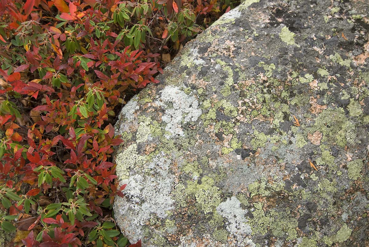
When I originally spotted this comp on Cadillac Mountain during the autumn season I immediately thought of the Chinese principle of the yin and the yang. The yin is the passive unyielding lichen covered granite and the yang is the active ever encroaching low bush blueberries.

As always thanks for your thoughts.

Ed

Comments

18 comments
Comment posted by gary phillips on January 23, 2015 at 8:36 PM
One occupies space, and one always fights for more. I like the composition and the concept. Ed. Life is certainly about give and take and the inevitable balance. :toast:
Registered on October 24, 2013, 185 Posts, 4136 Comments
Comment posted by Tom Falley on January 23, 2015 at 8:45 PM
Yes these types of images of lichen, rocks etc can be captivating, especially in a large image where the eye can feast on all the detail.

Cheers. Tom
Registered on November 21, 2014, 189 Posts, 454 Comments
Comment posted by Peter Cross on January 23, 2015 at 9:14 PM
My eye caught the thumbnail and for some reason screamed New England. Guess on old Mainer can detect itty-bitty pieces of Maine. But... I do like the photo and the concept. If you start thinking about this, your mind can be occupied for years. Nice colors (you got the pink in the granite about right) and the exposure gave you the right amount of light. Comp wise for true y&y the 2 should be balanced but I have no problem with this and this maybe the closest you could come.
Registered on April 3, 2010, 271 Posts, 1342 Comments
Comment posted by Alberto Patiño on January 23, 2015 at 10:29 PM
The contrast between bright and subtle colors works very well - I would not have come up with the Yin and Yang analogy, but now that you bring it up I think it works!! :toast:
Registered on December 2, 2014, 278 Posts, 1736 Comments
Comment posted by Harley Goldman on January 24, 2015 at 9:20 AM
Great concept and well done. Nice colors, textures and detail. I might be tempted to crop off the right, close to square, to balance the yin/yang?
Registered on November 19, 2003, 586 Posts, 11271 Comments
Comment posted by Bill Reid on January 24, 2015 at 9:21 AM
Looks great and I like the concept Ed. Nice details in the rock and colors in the shrub. I also like it with some taken off the right side almost to a square comp but not quite. Nice as is though. Great job.
Registered on January 27, 2013, 65 Posts, 2460 Comments
Comment posted by Patricia Brundage on January 24, 2015 at 9:25 AM
Knew immediately it was Cadillac Mountain. Good eye to see this composition. Good composition, techs and exposure. Well done!
Registered on March 23, 2006, 1111 Posts, 6531 Comments
Comment posted by Nancy Lea Sandy on January 24, 2015 at 10:27 AM
Nice title. This is a good study in contrasting textures and tones. Nicely seen and captured
Registered on January 24, 2011, 576 Posts, 6942 Comments
Comment posted by Ed Lowe on January 24, 2015 at 11:25 AM
Thanks for your comments and suggestions folks. As suggested by Peter, Harley and Bill here is a cropped version closer to 50/50. I think that does come closer to the yin and yang balance.

Ed
Registered on February 7, 2004, 414 Posts, 7115 Comments
Comment posted by Prashant Khapane on January 24, 2015 at 11:50 AM
I like this, like this a lot. No nits.
Registered on November 1, 2003, 492 Posts, 4580 Comments
Comment posted by Igor Doncov on January 24, 2015 at 12:34 PM
I like the 2nd composition better. You must have thought that the rock was more interesting than the foliage when you came up with the original composition. It might be interesting to see how it would look if the rock was cooler and the foliage remained warm.
Registered on November 22, 2014, 189 Posts, 2733 Comments
Comment posted by Nick Bristol on January 24, 2015 at 4:51 PM
Ed, I like what you did here very much! All the various color, textures and detail in the large version are quite impressive. A very cool image! I like the original comp but the repost probably works better with the Yin and Yang theme.

Nick Bristol
Lone Rock, WI
Registered on February 1, 2004, 752 Posts, 14140 Comments
Comment posted by Bill Fach on January 24, 2015 at 8:17 PM
Ed: Cool find and a fine capture. My first impression was to recommend a crop and the repost suits me to a tee. 2 thumbs up! >=))>
Registered on November 1, 2003, 1805 Posts, 26981 Comments
Comment posted by Albert Darmo on January 24, 2015 at 10:31 PM
Hi Ed :wavey: I prefer and see more harmony in the croped version.... the colors and detail are excellent :smile:


Albert Darmo
Canada
Registered on November 25, 2008, 1386 Posts, 11978 Comments
Comment posted by Alberto Patiño on January 25, 2015 at 12:52 AM
I really like the symmetry in the cropped version !! :smile:
Registered on December 2, 2014, 278 Posts, 1736 Comments
Comment posted by Mark Seaver on January 25, 2015 at 12:12 PM
I like the juxtaposition of the colors and textures on the rock against the mixed foliage. Your title covers that very well. Yes, the 50:50 crop fits the title even better and feels nicely balance. Good seeing, Ed.
Registered on January 23, 2011, 1103 Posts, 17270 Comments
Comment posted by Peter Richter on December 10, 2015 at 3:32 AM
Ed, I appreciate your original, uncropped version a lot, mainly because of the better balance between the visual impact of the different subjects. My attention is first drawn to the brighter areas within the rock, then to the striking reds of the foliage and finally I enjoy exploring all the delightful details of the lichen at the right third. The interplay of such different elements like the solid rock and the delicate foliage is really interesting to me.

Peter
Registered on November 10, 2010, 218 Posts, 2723 Comments
Comment posted by Cay-Uwe Kulzer on December 10, 2015 at 4:02 AM
Ed,

I am glad that you have poseted a cropped version because it really looks more balanced, something I missed also on the original post.
Registered on January 27, 2004, 494 Posts, 4021 Comments