Gallery: LandscapePosted January 27, 2015113 views10 comments
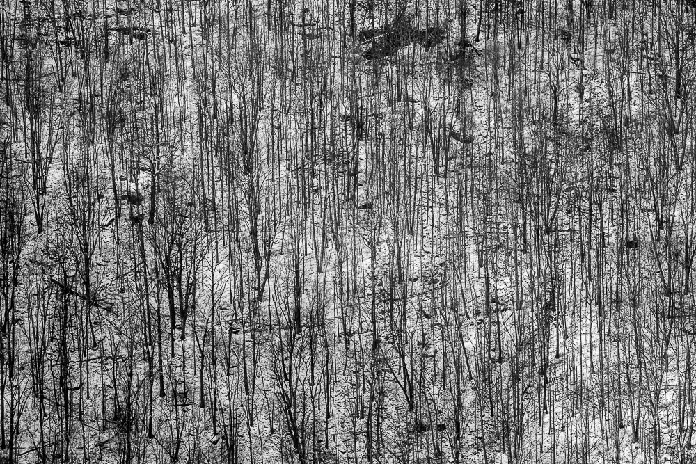
Another take on my last image. While the color version is more subtle and realistic, I think this may have a better graphic and abstract effect. Your thoughts?
Comment posted by Alberto Patiño on January 27, 2015 at 1:20 PM
yes, I think that b&w works better - it emphasizes the repeated pattern and is indeed more abstract.
Registered on December 2, 2014, 278 Posts, 1736 Comments
Comment posted by Luke Ormand on January 27, 2015 at 1:20 PM
a lot of intricate detail here - I like the B&W treatment, though the whites look a touch dull
Registered on February 4, 2009, 1093 Posts, 7035 Comments
Comment posted by Roel Wijtmans on January 27, 2015 at 2:20 PM
Both work very well, but I prefer the color version. The slight gradient in colors add a lot for me.
Registered on September 30, 2012, 116 Posts, 2257 Comments
Comment posted by Bill Reid on January 27, 2015 at 4:55 PM
Both look good Navin but I think I prefer the color version with the warm light adding a nice contrast in the scene. This has a very abstract feel to it. Well done both of them.
Registered on January 27, 2013, 65 Posts, 2460 Comments
Comment posted by Richard Teller on January 27, 2015 at 8:27 PM
I looked back and forth between both images several times. I think I like the b&w a little better. The larger version helped me make up my mine because of the detail you can see in it.
Registered on August 23, 2010, 1162 Posts, 6692 Comments
Comment posted by Mark Seaver on January 27, 2015 at 9:16 PM
Have to vote for the color version, Navin. This one is quite graphic, but doesn't give my eyes anywhere to rest.
Registered on January 23, 2011, 1103 Posts, 17270 Comments
Comment posted by Harley Goldman on January 28, 2015 at 10:19 AM
I prefer the B&W. To my eye, it has a stronger abstract look and feel. Both work well, but the B&W works better for me. Real nice image!!
Registered on November 19, 2003, 586 Posts, 11271 Comments
Comment posted by Mark Zelinka on January 29, 2015 at 2:17 PM
I gotta say I'm not crazy about it, as an abstract, I think the dark patch at top and smaller one at left seem out of place and there's not enough separation between the tree trunks to contrast with the ground.
Registered on August 20, 2007, 206 Posts, 998 Comments
Comment posted by Genny K. on January 29, 2015 at 8:29 PM
I like the abstractness of this. If you look at it long enough, you start to see patterns in there. Nice one.
Registered on June 5, 2006, 132 Posts, 2001 Comments
Comment posted by gary phillips on January 29, 2015 at 8:31 PM
My vote is for the black and white. I liked the color version and BTW, I liked the story.
Registered on October 24, 2013, 185 Posts, 4136 Comments

Comments
10 comments