Gallery: LandscapePosted February 5, 2015346 views18 comments
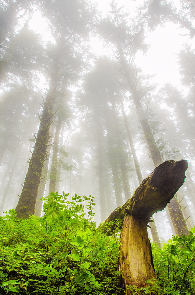
The same fallen tree from the previous image, taken about 40mins later, on the return hike back to my vehicle. Thanks for looking.
f/11
1/100
18mm
iso 800
Comments
18 comments
Comment posted by Igor Doncov on February 5, 2015 at 7:38 AM
I really like the sweep of the trees ever upwards with strong perspective lines. There is a sense of majesty about them.
I'm not too fond of the color balance here where the lower part of image is all saturated color and the top lacks color entirely. The two parts don't feel well integrated to me.
Registered on November 22, 2014, 189 Posts, 2733 Comments
Comment posted by Jerry Austin on February 5, 2015 at 8:06 AM
I like this. Very creative capture.
Registered on January 6, 2012, 651 Posts, 3448 Comments
Comment posted by Harry Lichtman on February 5, 2015 at 9:06 AM
I like this version of the scene better. I think it is the angled down tree really adds to the comp,where as before it was more of a detraction. The high key misty sky with green moss glowing through very beautiful.
Registered on September 17, 2010, 304 Posts, 3507 Comments
Comment posted by Mark Seaver on February 5, 2015 at 9:07 AM
I like the view here, Carey, with the emphasis on the fallen tree and the fresh greens set against the tall trees fading into the fog. It's both intimate and majestic. I do think the greens are over saturated.
Registered on January 23, 2011, 1103 Posts, 17270 Comments
Comment posted by Alberto Patiño on February 5, 2015 at 9:21 AM
I still see the tall tress looking down, I'm on the fence about which of the two composition I like more. I think that the first one, but I could probably talk myself either way.
Registered on December 2, 2014, 278 Posts, 1736 Comments
Comment posted by Harley Goldman on February 5, 2015 at 10:24 AM
I much prefer this version. The tree straight across the bottom on the other stopped my eye there. This flows nicely and the perspective works better here for me too. Very nicely done.
Registered on November 19, 2003, 586 Posts, 11271 Comments
Comment posted by Philip Hodgkins on February 5, 2015 at 10:32 AM
I agree with Igor on this one. It is an awkward comp to me. I think the concept is an imaginative one, but this would be a tough image to get balanced.
Registered on July 24, 2006, 2741 Posts, 12349 Comments
Comment posted by Roel Wijtmans on February 5, 2015 at 11:46 AM
I prefer this one over your previous one, feels more as a whole. The other one felt more like two competing elements in one picture. Maybe desaturate the greens a bit, otherwise it's really nice.
Registered on September 30, 2012, 116 Posts, 2257 Comments
Comment posted by Richard Hartmann on February 5, 2015 at 2:47 PM
Love it. Reminds me of a bike ramp in the misty forest.
Registered on January 15, 2009, 13 Posts, 772 Comments
Comment posted by Ryan Shain on February 5, 2015 at 8:01 PM
Hi Carey,
I can really feel your perspective in this capture, and I feel small among these wonderful trees. I like the composition you have chosen in this image as well, and I really feel a sense of respect for the trees in this image. A wise man once said the wisdom in the trees, not the class windows. This image makes me think of that quote. A very sweet capture Carey.
Registered on February 20, 2007, 226 Posts, 4571 Comments
Comment posted by gary phillips on February 5, 2015 at 10:59 PM
A pretty unique take on this forest shot, Carey. I liked your other image a lot and I think this is a notch above it. Nice work.
Registered on October 24, 2013, 185 Posts, 4136 Comments
Comment posted by Carey Closs on February 5, 2015 at 11:31 PM
Thanks for the feedback everyone.
To Igor and Phil, such is the nature of shooting in the fog I guess. Anything close to the camera is going to look more colorful. I think though, if this were matted and an given a color of frame that matched the wood in the trees that it would probably balance it out more.
To everyone who mentioned the saturation, I did bump it some just too make the image pop a little more but it doesn't look excessive to me. Again, I'm not using a well calibrated monitor so that could be why it looks ok. I've included a repost with less saturation, brightness and contrast so if you get a chance, please let me know if it is an improvement and whether your monitor is calibrated as well.
Thanks again everyone
Registered on April 15, 2012, 107 Posts, 326 Comments
Comment posted by Bill Fach on February 6, 2015 at 12:06 AM
Carey: Love the POV on this and the overall comp. Count me in with the camp noting the green saturation but this is a terrific comp and capture. Nicely done. >=))>
Registered on November 1, 2003, 1805 Posts, 26981 Comments
Comment posted by Igor Doncov on February 6, 2015 at 1:41 AM
This is definitely an improvement Carey. Darkening the foliage makes the transition from color to fog more subtle.
Sometimes it takes time for me to understand why someone takes a picture of something in a certain way. There's a snow picture of Prashant's that I've been looking at for a week before I "got it". Fortunately, in that case I withheld commenting and gave it time.
Registered on November 22, 2014, 189 Posts, 2733 Comments
Comment posted by Preston Birdwell on February 6, 2015 at 3:52 PM
I like this one more than the first, for the reason Harley stated. The saturation on the repost looks better. I love the mist and comp works well.
--P
Registered on November 1, 2003, 471 Posts, 5188 Comments
Comment posted by Chris Chamberlain on February 6, 2015 at 11:36 PM
This is a cool perspective and great atmospherics too. I might try and bring down the brightness of the sky and fog to add some depth as well as increase the moody feeling.
Chris
Registered on March 13, 2007, 500 Posts, 8365 Comments
Comment posted by Harley Goldman on February 7, 2015 at 9:57 AM
Saturation on the repost looks much better to me. I am on a calibrated monitor.
Registered on November 19, 2003, 586 Posts, 11271 Comments
Comment posted by Carey Closs on February 10, 2015 at 8:42 AM
Thanks for the feedback on the repost everyone.
Registered on April 15, 2012, 107 Posts, 326 Comments

Comments
18 commentsI'm not too fond of the color balance here where the lower part of image is all saturated color and the top lacks color entirely. The two parts don't feel well integrated to me.
I can really feel your perspective in this capture, and I feel small among these wonderful trees. I like the composition you have chosen in this image as well, and I really feel a sense of respect for the trees in this image. A wise man once said the wisdom in the trees, not the class windows. This image makes me think of that quote. A very sweet capture Carey.
To Igor and Phil, such is the nature of shooting in the fog I guess. Anything close to the camera is going to look more colorful. I think though, if this were matted and an given a color of frame that matched the wood in the trees that it would probably balance it out more.
To everyone who mentioned the saturation, I did bump it some just too make the image pop a little more but it doesn't look excessive to me. Again, I'm not using a well calibrated monitor so that could be why it looks ok. I've included a repost with less saturation, brightness and contrast so if you get a chance, please let me know if it is an improvement and whether your monitor is calibrated as well.
Thanks again everyone
Sometimes it takes time for me to understand why someone takes a picture of something in a certain way. There's a snow picture of Prashant's that I've been looking at for a week before I "got it". Fortunately, in that case I withheld commenting and gave it time.
--P
Chris