Nature Photographers Network
This is the preserved archive of the original Nature Photographers Network. The community continues at naturephotographers.network.
Lonely Windmill
‹ PreviousMan & Nature GalleryNext ›

Lonely Windmill

by Jim Hansen

Gallery: Man & NaturePosted February 25, 201566 views6 comments
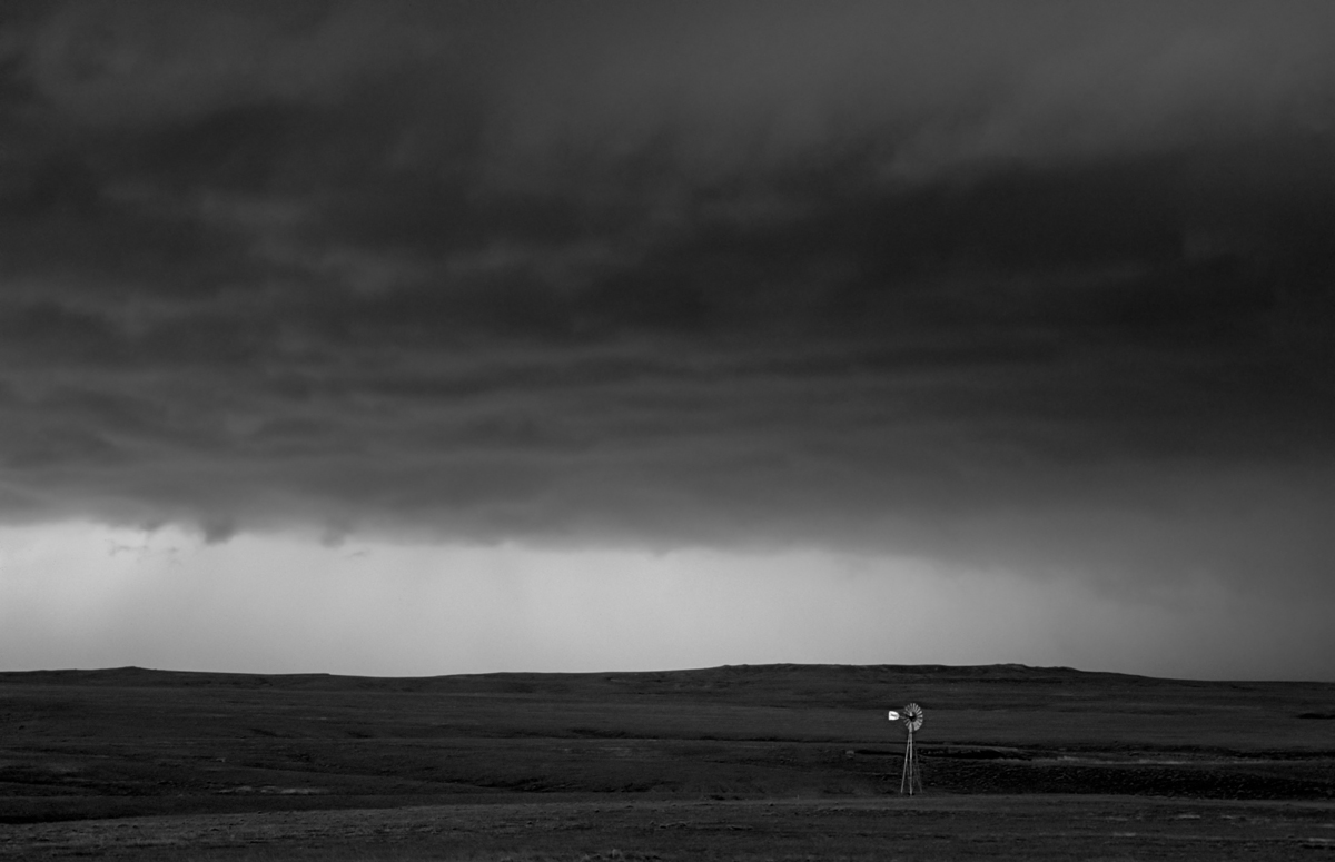
This was taken on the plains of Eastern Wyoming. It was dead still except for the frequent thunder from the approaching storm. I left it quite dark not only because this is how I remember it being, but I think it benefits the mood I was going for with this one. This was the edge of a massive thunderhead. This was awhile back, so I don't remember any of the shooting parameters. This is one of my first forays into black and white, so I would appreciate any comments on the quality of the conversion (done in photoshop cc) as well as the composition. Thanks.

Comments

6 comments
Comment posted by John Tobias on February 25, 2015 at 10:02 PM
Good composition, the bright vane on the windmill draws your attention to it nicely. At first look I thought this would be western Kansas or eastern Colorado. I would like to see the color version.
Registered on September 12, 2009, 2120 Posts, 6455 Comments
Comment posted by Richard Teller on February 25, 2015 at 11:00 PM
I think you have captured the feeling of a large storm coming across the open prairie very well. The wind pump adds interest and a point of focus to the image.
Registered on August 23, 2010, 1162 Posts, 6692 Comments
Comment posted by Rick Turner on February 26, 2015 at 11:16 AM
I am a windmill nut and this is very well done. :wavey:
I would suggest >dodge>highlights>20% and go over clouds just to see what it might bring out. As is :toast:
Registered on February 18, 2012, 534 Posts, 2755 Comments
Comment posted by Alberto Patiño on February 26, 2015 at 5:04 PM
I really like the simple composition and the light, just as they are. B&W suits the composition very well!
Registered on December 2, 2014, 278 Posts, 1736 Comments
Comment posted by D.A. Edwards on February 26, 2015 at 8:05 PM
Like it very much as is, Jim. It's a perfect subject for a conversion and you've done a fine job. :toast:
Registered on October 8, 2014, 226 Posts, 1187 Comments
Comment posted by Jim Hansen on March 5, 2015 at 9:34 PM
Thanks everyone for your thoughtful comments. Rick, I tried your suggestion but didn't seem to improve it. John, I don't think anyone would like the color version. I worked with the color many times and was never able to get it right. So, I was elated when I saw what B&W did with this. Thanks again. By the way, I moved the windmill about 10-15 feet to the right for better balance.
Registered on May 5, 2011, 161 Posts, 908 Comments