Nature Photographers Network
This is the preserved archive of the original Nature Photographers Network. The community continues at naturephotographers.network.
Lindis Lines
‹ PreviousLandscape GalleryNext ›

Lindis Lines

by D.A. Edwards

Gallery: LandscapePosted March 3, 2015137 views6 comments
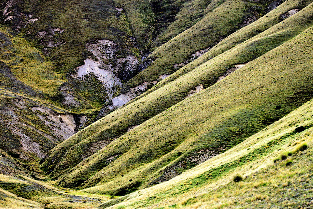
Did some walking around the Lindis Pass area of the South Island of NZ a couple of years ago on a cloudy, brisk day. In retrospect I wish that I had more time to spend there but was in a rush to get back to Christchurch for a flight. Lots of great textures around from the tussock and the paucity of trees made for some graphic landscapes.

f/13, 1/80 sec, ISO-400, 84mm, handheld.

Comments

6 comments
Comment posted by Mark Seaver on March 3, 2015 at 10:00 AM
Definitely some fine lines and textures here, Dave. There's a nice sweep coming in from the right and zig-zag valley adds some interesting depth. Were this mine, I'd dodge the upper left and burn in the lower right to even out the tones, making it more of an abstract, but that's me...not necessarily where your muse would go.
Registered on January 23, 2011, 1103 Posts, 17270 Comments
Comment posted by Roel Wijtmans on March 3, 2015 at 11:03 AM
The lines are very nice, the composition is spot on. I do think it could get a bit more effective by obtaining a more even luminance in the whole picture. Especially the lrc is a bit too bright which keeps pulling my eyes. Nice one!
Registered on September 30, 2012, 116 Posts, 2257 Comments
Comment posted by D.A. Edwards on March 4, 2015 at 6:27 PM
Here's a quick re-work per Mark's and Roel's suggestions re: dodging and burning the corners for your contemplation.

ETA: How do I change the title of this posting to indicate that there is a re-post included??? :confused:
Registered on October 8, 2014, 226 Posts, 1187 Comments
Comment posted by Igor Doncov on March 5, 2015 at 9:17 AM
This is a very nice composition Dave. New Zealand seems to be full of them. I do think the repost is better than the original but I sort of liked the uneven lighting. I think darkening the right ridge the way you did it and leaving the back the same would have been better. The only nit I had was that the lrc is noticeably out of focus.
Registered on November 22, 2014, 189 Posts, 2733 Comments
Comment posted by Bill Reid on March 6, 2015 at 1:15 PM
Some interesting shapes and textures in this Dave. To change the title go to your gallery and click edit under the picture and make the change to the title. The repost looks better and because the fore ground is out of focus I would darken it even more so your eye skips to the lighter area in the center. A nice scene though.
Registered on January 27, 2013, 65 Posts, 2460 Comments
Comment posted by R.Bill Moser on March 7, 2015 at 7:12 AM
I really do love this idea and composition. Great lines and textures. The bottom right is a bit too bright for me, especially the lights. Also it looks a bit soft there as well. The repost is much better for my personal taste. But it is really a great composition
Registered on January 29, 2010, 285 Posts, 4281 Comments