Nature Photographers Network
This is the preserved archive of the original Nature Photographers Network. The community continues at naturephotographers.network.
Unstad (+repost)
‹ PreviousLandscape GalleryNext ›

Unstad (+repost)

by Dietrich Gloger

Gallery: LandscapePosted March 17, 2015438 views23 comments
Hello,
I think I have been inactive for more than a year, but it feels good to be back with some new stuff!

I am back to post a few new LF images, starting with images from last September, from a trip to the Lofoten Islands. I want to give credit to Ian Cameron, who provided details on accomodation, seasons and photo-spots, making the decision to go quite easy.

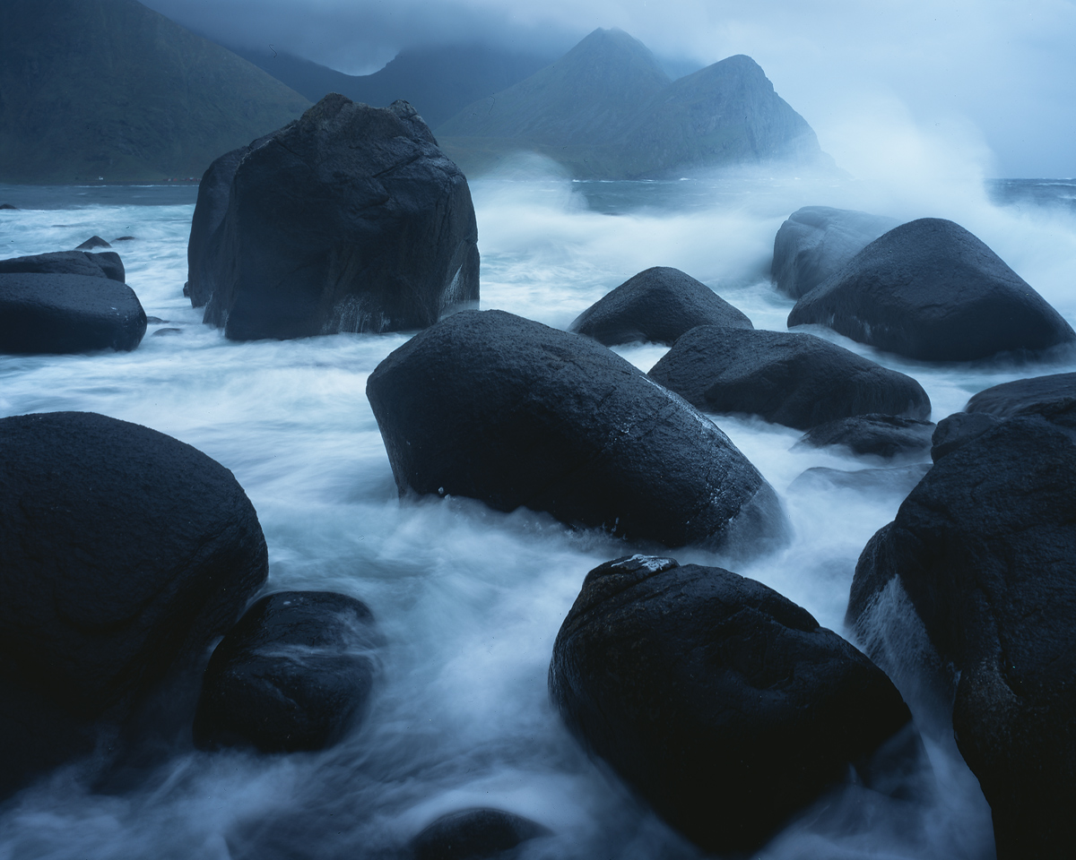
This one shows Unstad beach (Lofoten Islands, on "Vestvagoy"), one of the many beaches that face north, exposed to winds and dramatic waves. This beach is particularly renown among surfers for good waves, which were 4 meters that day - and too much for surfers I guess. For a LF photographer from Austria, photographing a beach with crashing waves of the north atlantic is very cool, however. :cool:

Thanks for looking or leaving a comment, and check out the large version!

For full disclosure: I cloned out some foam patches on the dark rocks in the fg.

Comments

23 comments
Comment posted by R.Bill Moser on March 17, 2015 at 2:11 PM
It's nice to see someting again from you Dietrich. And what a shot. It's so good to see some new comps and locations from the Lofoten Island. I really love the mood and the action that is going on in this image. Great image :toast:
Registered on January 29, 2010, 285 Posts, 4281 Comments
Comment posted by Harley Goldman on March 17, 2015 at 2:42 PM
Nice action and scene. For my tastes, I would prefer it warmed up a lot to get rid of the blue (like an PS 85 warming filter at 35 or 40%), but that is very much a personal taste thing.
Registered on November 19, 2003, 586 Posts, 11271 Comments
Comment posted by Ronald Murphy on March 17, 2015 at 3:52 PM
Welcome back. Beautiful, moody photo. I usually prefer a somewhat faster shutter speed, but that is certainly a personal thing. A little more detail in the dark areas would be nice too.
Registered on March 13, 2012, 279 Posts, 975 Comments
Comment posted by Tom Falley on March 17, 2015 at 4:49 PM
Interesting photo! I actually like the shutter speed, in that it really conveys the idea of air full of all enveloping spray and mist. Bit of an issue keeping the camera and lens out of the salt spray? I do agree the blueness of the monochrome effect is not to my taste, but that is an individual preference. This might look good, as is, in a large print.

Cheers: Tom
Registered on November 21, 2014, 189 Posts, 454 Comments
Comment posted by Igor Doncov on March 17, 2015 at 5:05 PM
Nice to see you posting again Dietrich. Maybe this means Andrei will start posting as well. I like this blue and black interpretation of this region. It looks very "Wagnerian". The composition is well thought out and creative. I agree with the poster that the SS speed is too slow. And I wonder if lightening up those rocks just a tad to bring out a little more detail would help. I think that the long ss has made them a bit foggy and removed some of the glisten that should be there from the wetness. Not sure about that last statement.

Welcome back!
Registered on November 22, 2014, 189 Posts, 2733 Comments
Comment posted by Dietrich Gloger on March 17, 2015 at 5:27 PM
Hey, thanks for all the comments and feedback, keen eyes everyone!

Yep, it was hard to keep off the spray and I bet some of the softness on the rocks that Igor mentions comes from spray on the lens. Might even be some motion blur. It was a lot of work up there on the rock, and I wasted a few sheets!

Shorter shutter speed would have required to open up the aperature - and I would have lost the depth of field. Moreover, the dynamic range of the film was quite challenged with the black rocks and the breaking waves, so there was not much room to play with the exposure, and I exposed for the highlights. There is not much to recover from the shadows, just a bit, but with film, this quickly looks washed out.
So, the only thing I can take care of is the color cast, I agree it is a tad too cold and blue, thanks!

Igor, thanks for "Wagnerian" :wink: Andreas will likely not post again, he's in different forums these days.

-Dietrich
Registered on January 26, 2007, 360 Posts, 9876 Comments
Comment posted by Sandro Bisotti on March 17, 2015 at 6:49 PM
without distracting elements or unuseful chromatisms. Assured composition, well focused mood, severe and inspiring rendition.
all the best,
sandro
Registered on February 8, 2015, 30 Posts, 265 Comments
Comment posted by gary phillips on March 18, 2015 at 12:36 AM
Very nice, Dietrich. Lot's of power in this image. I think I would love to see this is b/w. To me it's pretty monochromatic anyway. Love it in blue, but maybe more in mono.
Registered on October 24, 2013, 185 Posts, 4136 Comments
Comment posted by Dietrich Gloger on March 18, 2015 at 1:09 AM
Hi, here is a repost - less blue, brighter shadows, and some more sharpening of the rocks.
Gary, the b/w is a good idea - I tried it already while working on this one and it works very well imo. Thanks!
Registered on January 26, 2007, 360 Posts, 9876 Comments
Comment posted by Stuart Williams on March 18, 2015 at 4:23 AM
great to see something from you again, Didl. interesting forms here and i like the fact that the FG rocks somewhat mirror the forms of the BG hills. I wonder why, though, you didn't have a sheet of B&W film (or perhaps you did?)
Registered on December 7, 2007, 247 Posts, 4792 Comments
Comment posted by Alberto Patiño on March 18, 2015 at 12:37 PM
This is a beautiful dark moody image, Dietrich. I think that the original works well, but the repost is even better. I also think that the strong blue cast works perfectly for this image - I would not touch the white balance in this case!
Registered on December 2, 2014, 278 Posts, 1736 Comments
Comment posted by Roel Wijtmans on March 18, 2015 at 12:55 PM
Very nice! Shutter speed is ok for me, although it would be interesting to see a shorter ss as well. This really shows the beating these rocks have to deal with on a daily basis. I dig the original, but I think the repost is even better! Its colors look more balanced than the first one.
Registered on September 30, 2012, 116 Posts, 2257 Comments
Comment posted by Aaron Feinberg on March 18, 2015 at 5:19 PM
Well that's a pretty place. Nice mood. Cant decide if the splash in the upper right is distracting or not. Dig though.

aF
Registered on October 26, 2009, 399 Posts, 2789 Comments
Comment posted by Eva McDermott on March 18, 2015 at 7:26 PM
Wonderful to see you posting again Didl. I really like the shutter speed and the drama it adds. Your repost works for me. I visited Lofoten in 2013 on one of Ian's workshops. He took us to some great locations.
Registered on January 4, 2009, 1015 Posts, 13229 Comments
Comment posted by Neale Dyster on March 18, 2015 at 8:46 PM
Love the repost, welcome back.
Registered on February 19, 2008, 94 Posts, 738 Comments
Comment posted by Tony Kuyper on March 19, 2015 at 11:28 PM
Gorgeous, Didi. Very nice blend of textures and contrasts.
Registered on November 1, 2003, 364 Posts, 22328 Comments
Comment posted by Nick Bristol on March 20, 2015 at 10:01 AM
Didi, This is really nice! I like this comp a lot and love the mood you have here. I think the shutter speed worked out great with the water and spray and I enjoy the cool tones very much. The repost works perfect for me! Excellent! :smile:

Nick Bristol
Lone Rock, WI
Registered on February 1, 2004, 752 Posts, 14140 Comments
Comment posted by Bill Reid on March 20, 2015 at 4:04 PM
Beautiful tones, color and comp Didl and the water looks great giving the scene a wonderful mood. The repost is excellent. :toast:
Registered on January 27, 2013, 65 Posts, 2460 Comments
Comment posted by Kah Kit Yoong on March 22, 2015 at 10:06 AM
A seascape where you can really feel the power of the sea. Great shot.
Registered on September 27, 2006, 636 Posts, 10682 Comments
Comment posted by Gary McGhee on March 22, 2015 at 12:22 PM
Plenty to look at in this frame filling shot Didl, I think the comp looks busy but it works. The conditions come through very well and I can imagine just how difficult this was to take.

Gary.
Registered on April 15, 2010, 142 Posts, 2416 Comments
Comment posted by John Williams on March 22, 2015 at 9:33 PM
Awesome mood. Those are dramatic boulders.
Registered on September 6, 2007, 221 Posts, 5985 Comments
Comment posted by Vance Gese on March 23, 2015 at 2:07 AM
Apologize for being a little late in posting a comment, Dietrich. This is stunning. I love the composition, with those bold dark boulders gracing the foreground, the powerful motion of the surf, and the distant misty mountains. Incredible. Hats off to you for hauling a 4x5 onto a rock amongst all that surf, getting under that dark cloth, getting the tilt just right, all taking time and not knowing if a wave is going to smack into you. Exquisite image.
Registered on November 13, 2008, 298 Posts, 6629 Comments
Comment posted by Albert Darmo on April 3, 2015 at 6:12 PM
Hi Dietrich :wavey: Great to see you back. A well deserved WP :toast: :toast: :toast: :toast:


Albert Darmo
Canada
Registered on November 25, 2008, 1386 Posts, 11978 Comments