
Nature Photographers Network
This is the preserved archive of the original Nature Photographers Network. The community continues at naturephotographers.network.
Down the Chute II
‹ PreviousLandscape GalleryNext ›

Down the Chute II

by Wayne Jones

Gallery: LandscapePosted March 23, 2015289 views13 comments

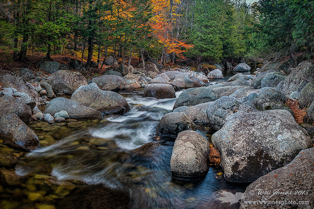
Thanks so much for all your comments on my last two posts of Adirondack autumn river scenes. A couple of weeks ago, many of you suggested changes to "Down the Chute", a square version of this scene (which deleted in June 2015). Based on your input, I produced this horizontal version, which I think is an improvement, even though it still includes s small bit of sky. Just wondering if you think even that little bit of sky is a problem.

THANKS

Comments

13 comments
Comment posted by Bill Reid on March 23, 2015 at 12:36 PM
This looks great Wayne and the small bit of sky looks fine to me. This scene flows better for me than the square comp not feeling as tight. Another of your fine Adirondack scenes with really nice processing. Well done. The sky piece looks bluer in this whereas gray in the other.
Registered on January 27, 2013, 65 Posts, 2460 Comments
Comment posted by Roel Wijtmans on March 23, 2015 at 1:05 PM
This composition makes the photo a lot more intimate, so I think it is a big improvement. Very nice little scene, especially with the autumn colors.
Registered on September 30, 2012, 116 Posts, 2257 Comments
Comment posted by John Williams on March 23, 2015 at 2:16 PM
Agreed that this is an improvement over the square version. The sky doesn't distract too much, but a slight crop off the top (just to where the branch hits the leaves) works well.
Registered on September 6, 2007, 221 Posts, 5985 Comments
Comment posted by Luke Ormand on March 23, 2015 at 2:44 PM
Great image - love how the focus is on the moving water and the detail in the rocks. Look forward to the revised NPN where this image won't be compressed so far
Registered on February 4, 2009, 1093 Posts, 7035 Comments
Comment posted by Igor Doncov on March 23, 2015 at 5:09 PM
It looks as though you've moved to a slightly higher vantage point. That together with the new format gives us a more sweeping view of the river. I personally like the white water streaks close to bottom that were absent from earlier shot. I agree with John that that very small crop eliminates the worst part of the sky and really doesn't change the rest to any significant degree.
Registered on November 22, 2014, 189 Posts, 2733 Comments
Comment posted by R.Bill Moser on March 23, 2015 at 5:34 PM
This is a beautiful scene and you did a good job on this one here. nice comp and and colors.
Registered on January 29, 2010, 285 Posts, 4281 Comments
Comment posted by Nick Bristol on March 23, 2015 at 7:38 PM
Wayne, This one works really well and I like it better that the previous one. A very nice feel to this and what a beautiful scene it is. I would agree that just a small crop of the top to eliminate the brightest sky makes it even better. Doesn't need much! :smile:

Nick Bristol
Lone Rock, WI
Registered on February 1, 2004, 752 Posts, 14140 Comments
Comment posted by Harley Goldman on March 24, 2015 at 10:00 AM
This is real nice, Wayne. The bit of sky looks fine to my eye, barely noticeable. I like the perspective. I would love to pull up a chair and sip a single malt right there!
Registered on November 19, 2003, 586 Posts, 11271 Comments
Comment posted by Mark Seaver on March 24, 2015 at 10:09 AM
Wayne, guess I've been AWOL from forums other than WC for the last week or so (but hey Florida with Mike was great). I missed the earlier post and had to go back and look. I like this version much better. There's a really fine flow (llc to ur) in this crop that the square version lacks. The touch of sky works fine here and helps emphasize the vanishing point of the stream for some extra eye movement.
Registered on January 23, 2011, 1103 Posts, 17270 Comments
Comment posted by gary phillips on March 24, 2015 at 11:04 AM
Wayne, i think this version really opens up the scene. Beaautiful flow thru the image. I like the expanded view of the rocks and less sky for sure. The little bit of sky remaining is fine for me. It helps retain the majority of the fall colors. Pretty successful retake on the imaage.
Registered on October 24, 2013, 185 Posts, 4136 Comments
Comment posted by Harry Lichtman on March 24, 2015 at 1:47 PM
The sky is not a problem Wayne. It doesn't pull my eye away from the rest of the image, which is when a bright sky an be problematic. The sky patch does look more green than blue on my moniotor. (Not a calibrated monitor). The stray branches coming into view on the right are the only very minor adjustment I might have made composing the scene.
Registered on September 17, 2010, 304 Posts, 3507 Comments
Comment posted by Tony Kuyper on March 24, 2015 at 3:01 PM
Lovely scene. The flashes of fall color make for a nice focal point. Maybe it's just me, but it seems a bit sharp. But only when I put my glasses on. Otherwise it's fine.
Registered on November 1, 2003, 364 Posts, 22328 Comments
Comment posted by Andrew Sentipal on March 27, 2015 at 11:32 AM
Sky works for me. Very nice image. :toast:
Registered on February 16, 2008, 200 Posts, 317 Comments