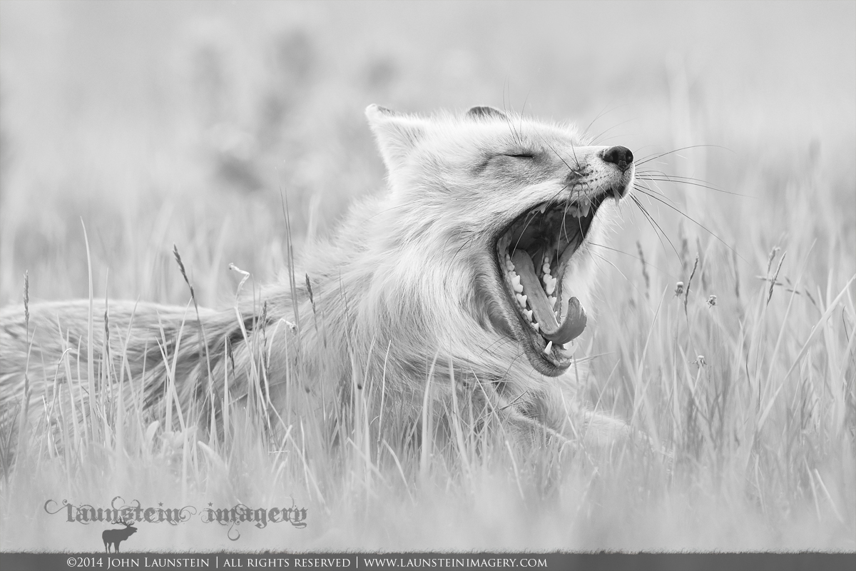
Tired Momma Redux (B&W)
by John Launstein
Hi all! I posted this last year in colour, but always thought it might be interesting in B&W, so I thought I'd give it a go. I decided to go with a bit higher key conversion by brightening the darks and mids a bit.
While the original image does have vibrant colours and quite beautiful tones, this makes it something...different.
Interested in hearing your thoughts...please view the LARGER version if you have time!
Nikon D600
Nikkor AF-S 500mm f/4D IF-ED
ISO 800
1/800sec @ f/5.6
tripod mounted with legs flattened for lower angle of view
Cropped slightly to app. 85% of original
Adjustments to colour balance, brightness and contrast before conversion to B&W in Nik Silver Efex Pro 2, with additional tweaking to finish.

Comments
9 commentsTFS
Steve
It works very well in B&W!
If this was mine, I would consider unsharpening the grasses near the whiskers!
Jagdeep Rajput
Jagdeep, I sent you an email but in case it doesn't go through to you, do you mean literally apply a blur to the grasses around the fox's face? The only part of the image that has had any sharpening applied is a very light round to the face itself (I masked it back off the whiskers as well as those always seem to get crunchy with any amount of sharpening whatsoever). Thanks for your suggestion in any event!
I've replied your mail. I just meant to blur out the grass blades near whiskers.
Jagdeep Rajput
I like the B&W treatment and processing here, but have to say that while I am just like everyone else and click away when an animal yawns, I usually don't end up really liking yawning photos (by that I mean I struggle with thinking what I'd ever do with them, aside from posting them here or working them in for humour in the occasional slideshow). At the end of the day I just don't find yawns aesthetically pleasing! But this is a real nice one!
I'm fine with the grasses near the snout - to me they add some visual interest. I think I'd like the shot even more if it was originally framed (or re-cropped, tho' I'm guessing you don't have the room) with less room on the left and more on the right. To me it feels a little (not a lot) like the fox's head is crowding the right side of the frame and consequently somewhat out of balance (to my eye).
I like B&W conversions (including the conversion process) myself...it can be very creative and engaging. But I am hoping Nikon DOESN'T strip out the colour info on future models - sometimes I kinda like colour too!
Cheers...
Brad
Thanks again, everyone! I agree--it looks better with a tighter crop from left, top and bottom. I noticed the same thing re working as a vertical, Lon! Thanks for the suggestion (and confirming my own sense!).