
by Vance Gese
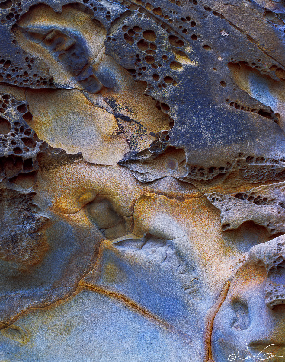
Some tafoni found along the Olympic coast last summer. Won't try and tell anyone that the colors were clearly evident when I exposed the film; they were there but only subtly hinted at in the transparency. I was able to bring out these colors and contrasts in the rock using Tony Kuyper's luminosity masks, as well as burning and dodging. The resulting image might be better characterized as an artistic interpretation. Would appreciate your thoughts, comments, and suggestions.
4x5, 210mm, Provia 100F
Large size image included.
Thanks.
Comments
22 commentsWow, This is fantastic, Vance! The large version is a special treat to view. Great comp with beautiful light and color. The shapes, textures and details are just wonderful. Perfect as is for me. Beautiful work!!
Nick Bristol
Lone Rock, WI
Beautiful colors, shapes and textures. The blues seem a bit intense, but work for me in this scene.
The color and light are wonderful Vance. The depth and detail are also amazing. The blues certainly work for me.
Splendid tafoni, Vance. I've been pushing the blues in some of my images lately so I have no problem with the artistic interpretation here. That large spot of blue at the bottom acts as an anchor for the rest of the scene. Not sure if it would have worked as well in that capacity if it was a probably more realistic gray. Not to mention how well the blue pairs with the golds. Sweet image.
I think this is very nice, Vance. Exploring your more colorful side worked out well in this image. Fantastic detail and although the blues may be a bit strong, the color combo is right on. Beautiful work.
Vance: My first glance at the thumbnail made me recall the images of Anil Rao. I hope you will take that as the high compliment intended. This is just marvelous. Well seen and superbly rendered. >=))>
Very nice abstract. Love the various shades of blue.
I like it, Vance. There's a very "outer space" or maybe "Hubble type image" feeling as presented with a fine eye flow from the lighter, blue bottom through the darker, more complex top.
Very nice abstract Vance. I like the smaller version more than the larger one. Perhaps it's a bit overprocessed and the nuanced tones have been lost?
Lovely abstract Vance. Love the composition. Only nit is my eyes tend to drawn to the right top corner, may be due to blue intensity or the feature in the rock.
This type of image that awakens others to artistic realm of nature is one of my favorites. Have to admit I had to look up the word "tafoni" so you also expanded my vocabulary. A beautiful resulting image!
Love this one, Vance. Like others I immediately thought of Anil's similar looking images. The blue works well along with the yellow here, an excellent contrast. But, I could also see it with less blue as another look overall. Regardless, it's excellent as is.
This is not an abstract, but an Abstract! This is really great I must say. The colors, the shapes in the rocks, it's all perfect. No nits!
A perfect composition, reminds me of British landscaper David Ward - same quality and feel! About the blue - it is maybe a tad strong. I think it is the steep color gradient towards the yellow areas that makes the blue a bit too dominant. Maybe working on that fade out of blue into yellow, by decreasing the blue saturation a bit...? Just a suggestion what I would experiment with if it were mine. But it's excellent work, no matter how it's presented.
Beautiful textures, colors and shapes. Very well done.
Thank you very much everyone, for the great comments. Your input is extremely valuable. Have backed off on the blues somewhat in the repost, mostly in the top 2/3 of the image. Starting to wonder if I am a little blue color blind as the blueness seems to be a recurring problem with some of my images that I don't seem to realize during processing/development.
Thank you for the comments with regard to Anil Rao and David Ward. I am always inspired by the amazing work of both of these photographers. They are both true artists.
Magnificent!! I prefer the original Vance.
As a follow up Vance, both images work very well. In comparison I prefer the original a bit better. A thought might be to try the 85 warming filter for another look, just for your own thoughts. Obviously you are the one who will make any final decision overall. As always, I find Provia has a lean towards blue, so, it can be a bit natural as in shaded areas, or injected by the film at times as well. In most cases it just gets to be a degree of blue and what you like in the end.
Again, both images work for me.
The repost is excellent Vance.
Excellent! Especially the repost. A really fascinating detail.
Wow, I was surprised when I saw your name at first because I figured this was one of Anil's images. I love everything about it Vance. The colors, composition, and processing are all top notch. I do like your decision to control the upper blues in the repost but they didn't really bother me in the original. Superb work.
Hi Vance,
I really admire your phtography, as your vision really creates a connection with myslef. This image is absolutely stunning because of so many aspects. The color tones creates such a wonderful contrast, it is mouthwatering good. I can almost feel the texture of this tafoni between my fingers, andf the composition is very well seen.
Oh and I like the reposy a bit more more than tht original, bit awesome work either way!
Wonderful Photography!!!!