
by Nathan Buck
Hi all.
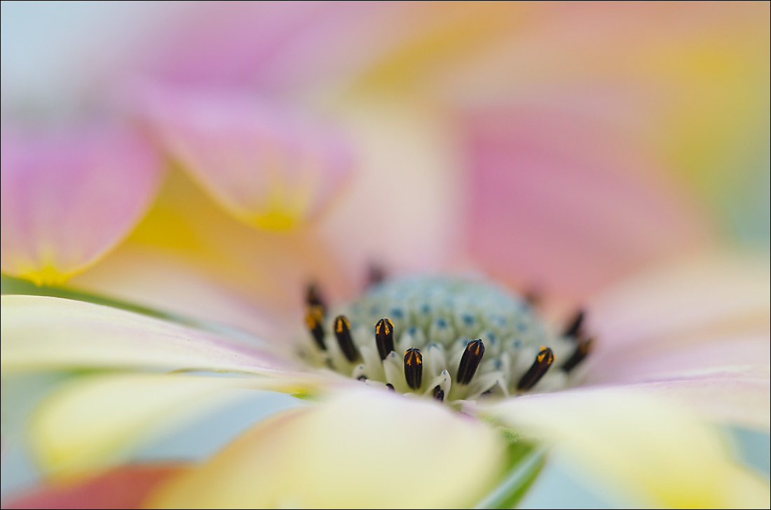
Another osteospermum shot from this year. This, I think, is the same bloom, just a different angle/comp. Thank you for your thoughts on my last photo.
Any and all thoughts appreciated.
Nathan
Nikon D7000, Sigma 180 macro, tripod, ISO 400, f4
Comments
8 commentsVery nice again, Nathan. I like the variety of colors in this year's osteo photos. Quite a range in this one (blue, green, orange, red, yellow, gold, green). The protruding petal mentioned by Ram in osteo 1 did not bother me. There are two protruding petals in this one, but maybe less pronounced and again not a deal breaker for me. I did like the perspective in 1 a bit better, I think.
Thanks Scott. It is that type of feedback that I am looking for! The blue, I think, is coming from a white fence in the shade in the BG. The colors in the blooms though all come from one plant. It was my first time this year seeing that variety and I have been enjoying it a lot.
Nathan
I think I like this one over the first one. It is just a bit better grounded in detail.
Nathan - My observations are very much in line with Scott's. The two petals at the back are much softer and less pronounced compared to the Osteo 1, so this one looks pretty much alright to me. However the perspective in 1 was definitely better. For some reason flowers slightly elevated in the frame seem to have a better impact for me than the ones closer to the lower edge.
I like both images but I prefer Osteo 1, because I love the comp and the beautiful wash of colors across the frame.
This I like rather more than the previous one, Nathan - the perspective down onto the centre seems that much stronger. Love the colours - have never seen an osteo come out like this.
Nathan: Interesting how a slight difference in POV changes the feel of an image so much. I may prefer the first by a tiny margin but both are top notch for me. Well done. >=))>
Cool parade of soft colors with just enough sharp focus emerging from center. Unusual look.