
by Nathan Buck
Hi all.
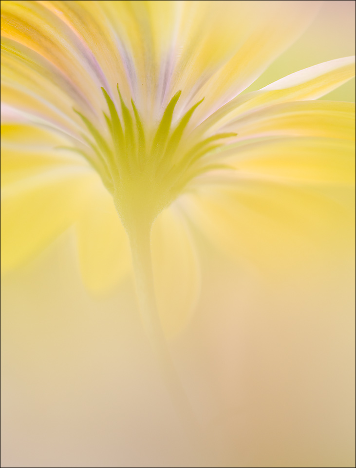
This is another that I took the other day that I liked. Same time shooting as Osteo 3. I liked the vertical too. Thank you, thank you for your previous suggestions. I tried to lighten the haze just a tad. I pushed up the contrast a touch and gave the color a little bit of a bump too.
Any and all thoughts appreciated.
Nathan
Nikon D7000, Sigma 180 macro, tripod, ISO 400, f3.5, cropped to 4x5ish
Comments
10 commentsNathan - Slightly more contrast here as you say. The purples stand out better in this than previous. I seem to like the vertical orientation here better than the horizontal.
Nathan, this works just as is - truly beautiful in every respect, I would not touch a thing!
I like the vertical as well, Nathan. I like the vertical orientation better, but I like the horizontal image and colors just a bit better. The vertical emphasizes the bottom up view even more, and has the beautiful display of petals across the enitre top, which I like. But both are excellent and the choice comes down simply to the preferred or more suitable orientation.
The vertical comp emphasizes the height and graphic quality of the underside of the flower. The lighting effect is more high key and artisitic that the other presentations. Think this is my favorite so far.
This one works too. Beautiful!
This is very beautiful, but if I had to decide between the 2 images, I would prefer Osteo 3, because I like seeing all the way to the tips of the petals on the right side. I also prefer the softer colors in Osteo 3. However, both images are lovely!
Nathan: I may give the horizontal orientation a slight edge but both are just superb. Two of your best IMO. >=))>
Nathan, for me both versions are beautiful. The osteospermum is my favorite flower and it's a great pleasure for me to admire it in your beautiful interpretation, true to your style. I love better the version 3 for the softness, the low satureted colors and the composition that shows in a better way the beauty of this flower. Great work Nathan.
Nathan, I favor this over the previous one. Much improved in detail and better contrast.
Nathan, both are excellent. I like this one better. Your brightness and contrast adjustments are just perfect. Beautiful!