
by Nathan Buck
Hi all.
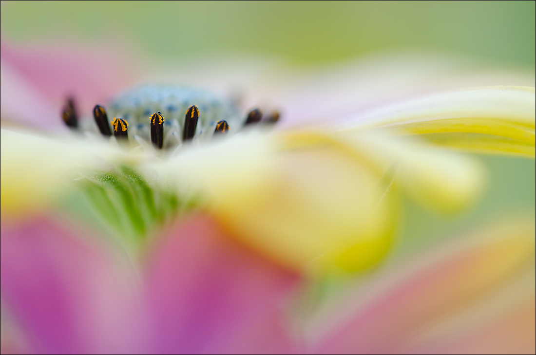
I found a shot in my files from earlier this year that took into account a lot of the suggestions that people had made. Higher in the frame, no distracting petals, colorful wash in the front...so I wanted to post it for some honest reviews. Is this one better than Osteo 1 in your opinion?
I did clone out some pink color in the top left of the frame, and there was a bit of a petal intruding there that I got rid of.
Please be honest. Thank you!
Nathan
Nikon D7000, Sigma 180 macro, tripod, ISO 400, f4
Comments
6 commentsNathan: I'll take one of each. I like the comp of both but I do prefer the placement of the center in this one so my eye can flow left to right. I think I have a slight preference for the softer color palette of Osteo 1. Osteo 6 has a simpler comp but I kind of like the intruding petals in Osteo 1. Kudos to you for working this subject so thoroughly and expertly. >=))>
Unusual point of view, juts like #1. I think I prefer #1, but I'm not sure why. The out of focus leaf edge(?) on the right is a but intrusive in this one, but that is not the reason why I prefer the first one. I guess it is just one of those subjective preferences that are hard to define!
Nathan - This is the kind of cram I like - subtle with no form whatsoever. The flower is higher in the frame, so that one appeals to me as well.
I really like this composition where the main flower is a solid subject and everything else is supporting subtly.
I think this is my favorite of the 6. Lovely color wash combo! There appears to be some kind of cloning artifact about 4 o'clock on the right third line.
I like the composition of this one better, Nathan, but find the saturation here just a shade high for my tastes Executed with perfect judgement of focal point and dof.
Hi Nathan. This is excellent, and I certainly like it, but I prefer Osteo 1 for the softer colors (I agree with Ian about this) and the more from filling colors/wash. The bg color is nice, but I don't like it as much as the colors in the petals and wash. In fact, I prefer this version with some of the top cropped (to the start of the pink in the ULC) to eliminate the bg going across the top. Maybe if you left the pink in the top left in? Also, in the version, I find the large oof petal in the right center more obtrusive than the petal in 1, which really did not bother me. Just shows you how subjective this all is.