
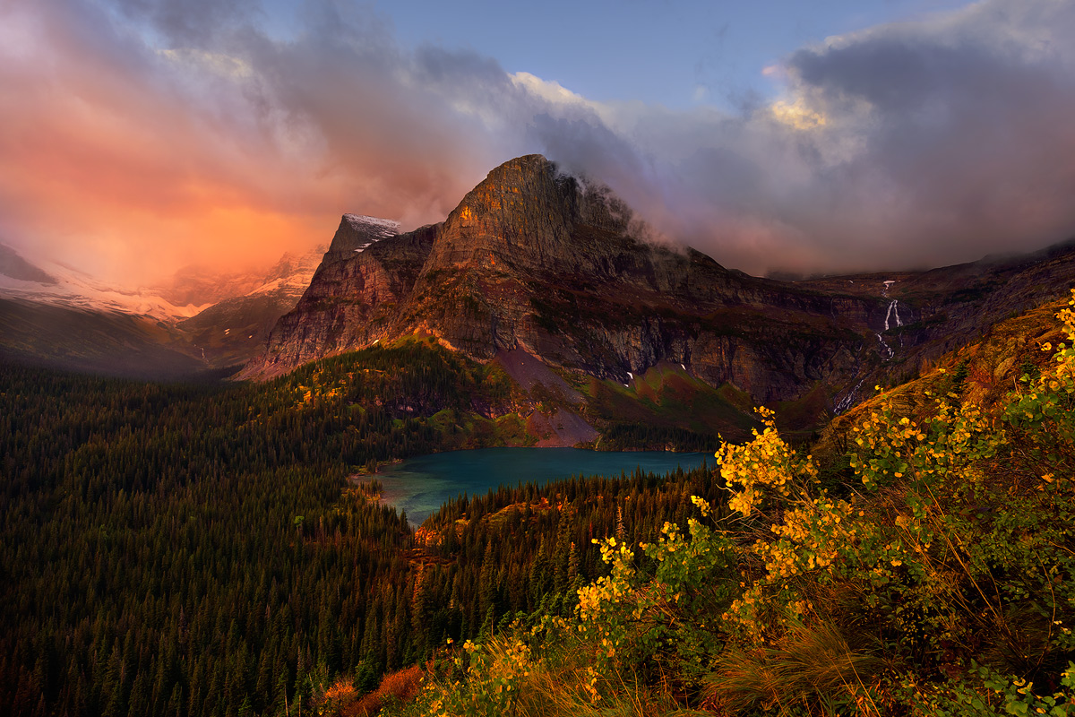
A moody morning with some glowing light at Grinnel Lake, Glacier National Park, in early autumn.
The highlights of this morning overlooking Grinnell Lake, were the fall colors of the foliage and the intense mood and light around the peak.
Nikon D810
Nikkor 14-24mm
@24mm
1/20s s
f/11
ISO 64
Comments
18 commentsThis is a good looking, moody view. The lake and the cascade in the distance create a strong sense of distance and invite exploration. It does look like you've pushed the saturation pretty hard
very saturated colours, but here this choice works well. Spectacular composition and great general effect.
All the best,
Sandro
You captured some epic light here Hillary. Great image and I like the processing. Though you pushed the saturation pretty hard I don't think it's too saturated...it's just about right. Very intense but beautiful colors. Well done
Now that is some seriously great light! I would lower the saturation a bit, but ither than that I have no nits. Very beautiful scene.
Beautiful light in the sunrise, on the mountains, and on the foreground leaves. The glowing foliage balancing the rising Sun works extremely well to create a lovely composition to keep and treasure this morning.
Thanks guys, yes, there was some saturation boosting, particularly with the warm tones, to bring the warm hues out and balance the upper left and lower right parts of the image. Appreciate your feedback on this!
The color is a bit 500px for me, but the scene and light are excellent. I would especially tone down the yellow leaves in front as they dominate the scene for me.
Very pretty scene! Glorious fall. I would second Mark's comment about the saturation based on my tastes, but that is very much a personal preference.
For me the warm tones are clashing with the torquoise blue. I would either cool down one or warm the other. The bright green tree within all those evergreens also really stands out and draws unwanted attention.
The overall concept of the fog enshrouding the peaks and the bright fg foliage is a good one. I think this image has potential.
Thanks Igor. Personally I like the warm to cool transition that the contrast in hues provides. It adds to depth and three dimensionality. The green hues were there. So was the turquoise lake. And the hues of autumn were all around in the foliage. I enjoyed the colors as nature presented them. There is some saturation boost in the warm hues, but less than viewers may think. It was a very colourful scene and the light was special, intense, a localized sunrise storm.
Very nice composition that's making a beautiful picture with this mix of colors in mountains, clouds, lake, flowers. For my taste as Mark said the saturation is bit pushed but, as always, it goes with the goal and the taste of the photographer. This picture is full of secret places so the eyes are all around looking for details.
The warm tones are lovely Hillary. I think they complement the turquoise lake and sky well. I wish there touch more light in the lower left corner but I am viewing this on my laptop so that could be the issue. I like your use of diagonals in the composition.
I like what you have here, Hillary. Looks like a classic oil painting. The large version opens up some of the darkeness lower left and that shadows helps to direct attention to the intense light from fore to sky. Reallyy beautiful.
Just amazing light, Hillary, and you were in the right place at the right time to capture it. While I have no issue with the overall saturation, I might suggest lightening and/or desaturating the brightest yellow on the prow of the mountain which, given the yellows of the trees in the rest of the scene, might be misinterpreted as yellow foliage way up there above treeline. Minor nit on a spectacular image.
Ditto what Gary said!
Jagdeep Rajput
Love it as is Hillary (especially the larger version). But then, I'm a color kind of guy
This is lovely. Does remind me of classic italian paintings
Very nice. I gotta say I love the saturation. Often it is used in place of having great light, so to have great light and still push it lends a surreal quality that seems nonetheless realistic. I hope that makes sense. I really like this.