
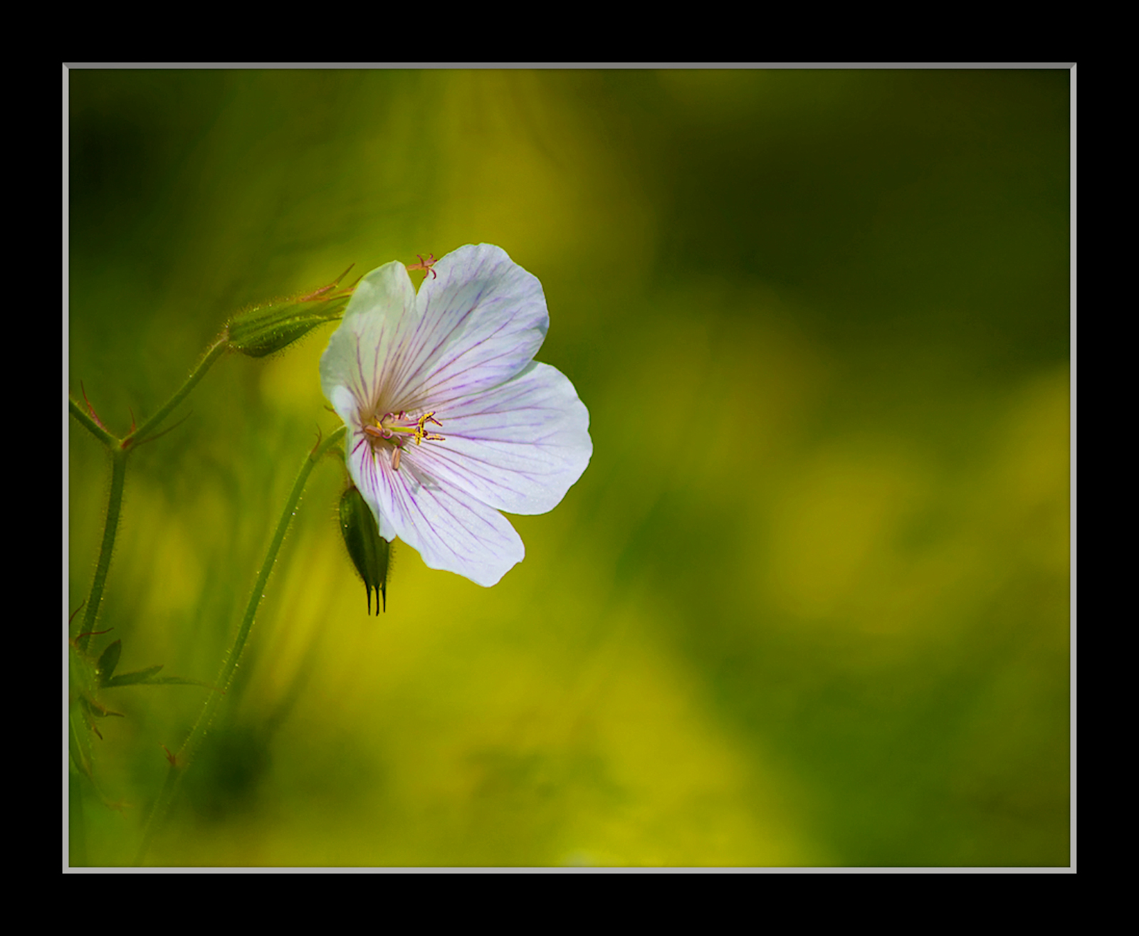
Trying shots of geraniums isolated within a herbaceous bed against backgrounds of leaves, stalks, yellow columbines and, sometimes, purple geraniums and cosmos as well; in this shot I felt the errant bud lying on the flower did not really distract and was a natural feature I wanted to keep. But maybe I should clone the stigma ?
Canon 7D, Tamron 55-200 @ 161, 1/1000 @ f 5.6, - 0.67ev, ISO 250
Comments
9 commentsIan, I have no issue with the bud or stigma. I do with the right side of the frame being unoccupied except by the color wash. I like this, but I think I prefer your "Summer Fire" over this one.
Ian - I love that textured background - its looks much prettier than totally blurred background. While the color appeal was great in the Summer Fire, this one also stands on it own. Very nice !
You've become the master of the beautiful, textured bg, Ian. No issue with the protruding stigma. I agree with Phil but only somewhat. I could see cropping this 10-20% but no more. Beautiful as is.
Definitely, Wow, Ian! The wash of colors in the background really sets of the gentle shape and colors of the geranium. To me, that extra stigma adds a fine touch of whimsy. I like your framing, it creates a fine sense of space.
This is lovely, Ian! The bud and stigma look fine to me. The textured bg beautiful. I wouldn't crop this. I like it as is.
Hi Ian Agree with Ram on the delightfully textured background... love the light and colors here... the errant bud adds to the beauty of the excellent composition

Albert Darmo
Canada
Hi Ian. I am in doubt about the composition of the photo. I like the bud, element complimentary of the subject, but I am always a bit disturbed by everything that touches or crosses the subject. I love all the rest of the photo included the mysterious BG.
Lovely. I would not clone anything out of this. I always like leaving some "space" for the subject to "look into" but in general, I find that leaving more than half the composition "blank" is excessive. I only mention that here because in this composition, I think the unoccupied space works very well, partly to balance the composition, and partly because the blurred pattern is beautiful in its own. A square composition might also work well, but I think this treatment is quite balanced. I really enjoy looking at it.
Ian: This works for me as is. I especially like the lighting and like the others think the BG is excellent. Well done.>=))>