Comment posted by Philip Hodgkins on July 5, 2015 at 8:11 PM
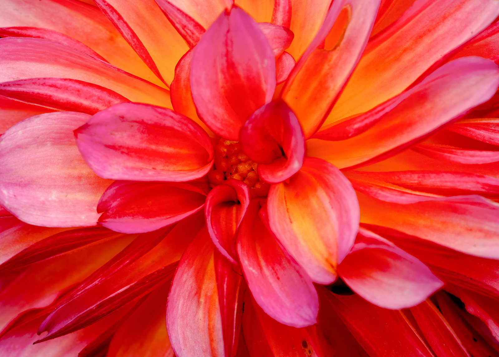
I have no problem at all with the color, Albert. I like the slightly curved petals, almost like a many bladed fan. Very bold and striking. A minor nit—there are two spots on a petal bottom right of center. I would make them go away.
Registered on July 24, 2006, 2741 Posts, 12349 Comments
Comment posted by scott lanz on July 5, 2015 at 9:31 PM
The bold color grabs the viewer attention and makes the image, Albert. Works well with the centered comp. Nicely captured and processed.
Registered on November 14, 2003, 840 Posts, 12902 Comments
Comment posted by Bill Fach on July 5, 2015 at 10:28 PM
Albert: Feeling lazy so I'll just ditto Phil and Scott. Like the bold frame filling color. >=))>
Registered on November 1, 2003, 1805 Posts, 26981 Comments
Comment posted by Jim Zablotny on July 5, 2015 at 10:30 PM
I have no problem with the color. I might burn in and and increase the contrast ever so slightly in the center of the flower to add some depth. Not much is needed. The spots are easily fixed too.........................Jim
Registered on January 17, 2004, 705 Posts, 3594 Comments
Comment posted by Ramamohan Pai on July 7, 2015 at 12:52 AM
Albert - Love the strong and bright colors. Dahlia appears to have seen better days already.
Registered on November 1, 2003, 550 Posts, 9037 Comments
Comment posted by Ian Wolfenden on July 7, 2015 at 10:59 AM
I love the composition, Albert, which is typical of your skill with close ups, but I do find the colour just a little saturated - my old eyes probably . A very dynamic image though !!
Registered on May 18, 2007, 1108 Posts, 7647 Comments
Comment posted by Mark Zelinka on July 7, 2015 at 6:58 PM
It does seem a little too red on my monitor here at work, but of course it's not calibrated. I like the effect you were going for, but I find the oof petals a little distracting.
Registered on August 20, 2007, 206 Posts, 998 Comments

Comments
7 commentsI have no problem at all with the color, Albert. I like the slightly curved petals, almost like a many bladed fan. Very bold and striking. A minor nit—there are two spots on a petal bottom right of center. I would make them go away.
The bold color grabs the viewer attention and makes the image, Albert. Works well with the centered comp. Nicely captured and processed.
Albert: Feeling lazy so I'll just ditto Phil and Scott. Like the bold frame filling color. >=))>
I have no problem with the color. I might burn in and and increase the contrast ever so slightly in the center of the flower to add some depth. Not much is needed. The spots are easily fixed too.........................Jim
Albert - Love the strong and bright colors. Dahlia appears to have seen better days already.
I love the composition, Albert, which is typical of your skill with close ups, but I do find the colour just a little saturated - my old eyes probably . A very dynamic image though !!
It does seem a little too red on my monitor here at work, but of course it's not calibrated. I like the effect you were going for, but I find the oof petals a little distracting.