Gallery: Weekly ChallengePosted July 24, 2015475 views4 comments
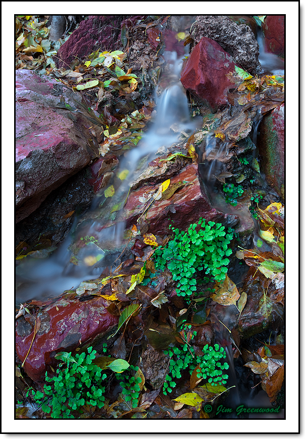
Zion Canyon - October 30, 2013
Canon 5D II
Canon 16-35mm f/2.8L II
32mm, f/16, 30 seconds, ISO 50, polarizer
Comments
4 comments
Comment posted by Mark Seaver on July 25, 2015 at 7:42 AM
The gentle flow of the water makes a fine contrast with the red of the rocks and the green plants here Jim. It's a beautiful, intimate look into red rock country. Both the reds and the greens are a bit too saturated for my tastes.
Registered on January 23, 2011, 1103 Posts, 17270 Comments
Comment posted by Preston Birdwell on July 26, 2015 at 4:08 PM
A very nice composition, and I like the flow of the water. I agree with Mark's comment about the saturation. Also, theres a cyan cast in the water, and you might consider cloning some of the small bits of debris. I love little gardens like this, and always keep an eye out for them.
--P
Registered on November 1, 2003, 471 Posts, 5188 Comments
Comment posted by Jim Greenwood on July 26, 2015 at 8:59 PM
Thanks for the feedback. I did bump up the magenta saturation and decrease the brightness of the large rock in the upper left corner to give the composition more balance. But overall, I only increased the saturation 10%. The rocks and the vegetation were wet, and I did use a polarizer. So I think those things, and the long exposure required, more than anything resulted in the color intensity.
Registered on November 9, 2003, 229 Posts, 1523 Comments
Comment posted by Mark Seaver on July 26, 2015 at 10:28 PM
Jim, if you process with Adobe software, they add significant saturation to the darker tones, especially if you do any darkening. I find myself dialing back the saturation by 10 - 20 points routinely in my Photoshop processing.
Registered on January 23, 2011, 1103 Posts, 17270 Comments

Comments
4 commentsThe gentle flow of the water makes a fine contrast with the red of the rocks and the green plants here Jim. It's a beautiful, intimate look into red rock country. Both the reds and the greens are a bit too saturated for my tastes.
A very nice composition, and I like the flow of the water. I agree with Mark's comment about the saturation. Also, theres a cyan cast in the water, and you might consider cloning some of the small bits of debris. I love little gardens like this, and always keep an eye out for them.
--P
Thanks for the feedback. I did bump up the magenta saturation and decrease the brightness of the large rock in the upper left corner to give the composition more balance. But overall, I only increased the saturation 10%. The rocks and the vegetation were wet, and I did use a polarizer. So I think those things, and the long exposure required, more than anything resulted in the color intensity.
Jim, if you process with Adobe software, they add significant saturation to the darker tones, especially if you do any darkening. I find myself dialing back the saturation by 10 - 20 points routinely in my Photoshop processing.