Gallery: FloraPosted October 5, 2015120 views6 comments
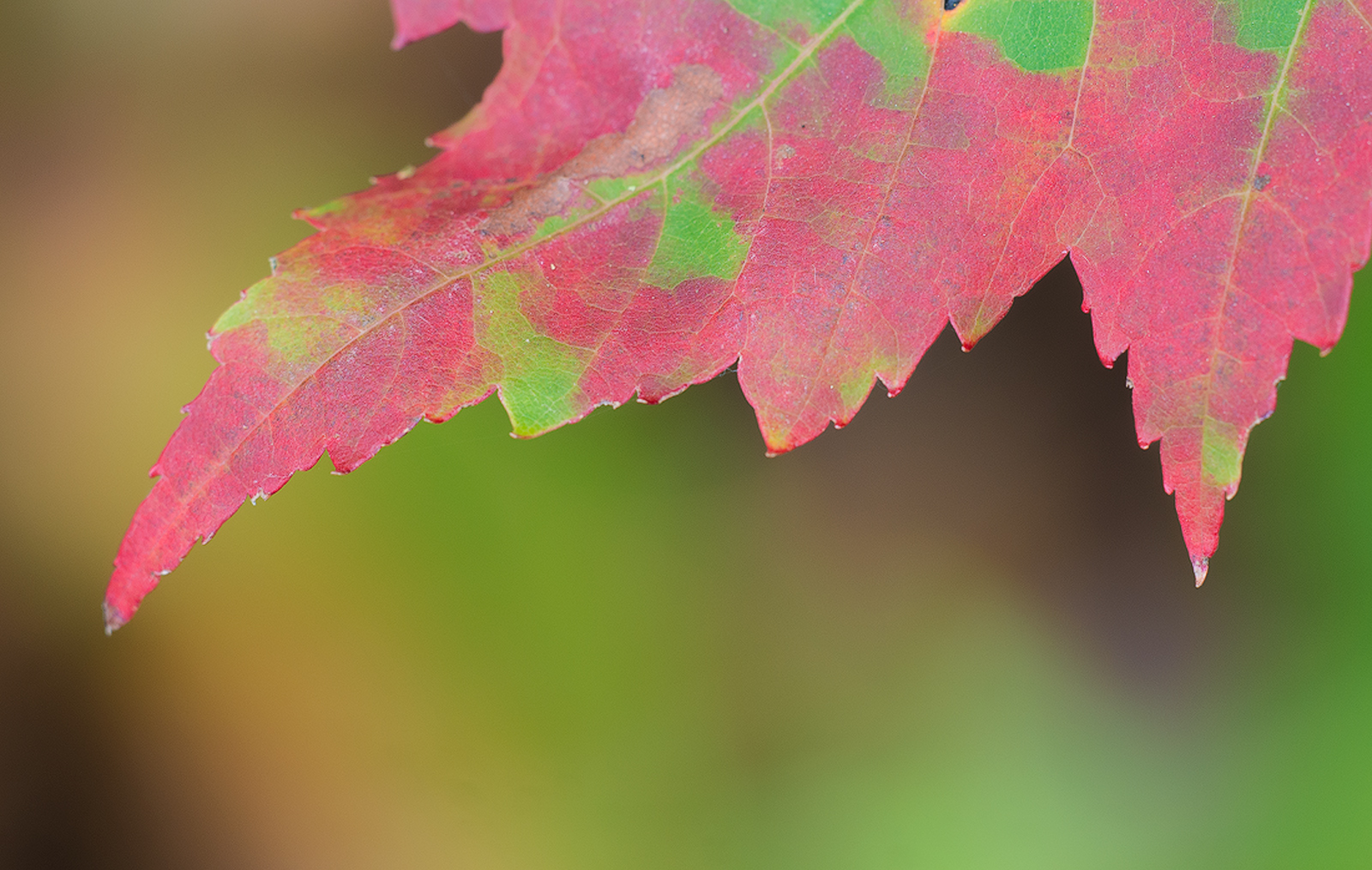
An experimental exposure done in gusty winds under cloud covered sky.K5 IIs 180mm f3.5 (1/8sec at f8, iso 200). Midtone and Lights LM's............................Jim
Comments
6 comments
Comment posted by Nathan Buck on October 7, 2015 at 1:16 AM
Interesting use of negative space. I like the lines and the colors on the leaf. I find myself wanting a bit more - but I am not sure what.
Nathan
Registered on November 1, 2003, 1101 Posts, 13589 Comments
Comment posted by Graham Brown on October 7, 2015 at 9:07 AM
Very colourful Jim, but for me it doesn' hold any interest. Graham
Registered on November 20, 2007, 275 Posts, 1365 Comments
Comment posted by Jim Zablotny on October 7, 2015 at 6:26 PM
Hi Nathan and Graham,
Thank you for your honest appraisals for this image. I was hoping for more interactions between red and greens. I should have come in closer and picked an area where the leaf veins intersected to provide a focal point and additional colors. Art is an experiment and sometimes the effort may not produce the desired result. Your comments also give me something to work with for my future attempts at abstraction..............................................Jim
Registered on January 17, 2004, 705 Posts, 3594 Comments
Comment posted by Philip Hodgkins on October 8, 2015 at 11:49 AM
For gusty winds, you done good! The colors are lovely. Good detail in the larger image. Not the most dramatic of images, but solid nonetheless.
Registered on July 24, 2006, 2741 Posts, 12349 Comments
Comment posted by Dennis Plank on October 9, 2015 at 7:35 PM
Very cool, Jim. I like the treatment you gave the leaf and the bg is killer. My only nit is that it feels to me like there's too much negative space at the bottom.
Registered on January 28, 2008, 1767 Posts, 23192 Comments
Comment posted by Albert Darmo on October 10, 2015 at 10:49 AM
Hi Jim I like this composition. and how you captured the interesting lines. but the poor leaf has flat color.. i'm sure you will find better subjects as the fall colors improve
Albert Darmo
Canada
Registered on November 25, 2008, 1386 Posts, 11978 Comments

Comments
6 commentsInteresting use of negative space. I like the lines and the colors on the leaf. I find myself wanting a bit more - but I am not sure what.
Nathan
Very colourful Jim, but for me it doesn' hold any interest. Graham
Hi Nathan and Graham,
Thank you for your honest appraisals for this image . I was hoping for more interactions between red and greens. I should have come in closer and picked an area where the leaf veins intersected to provide a focal point and additional colors. Art is an experiment and sometimes the effort may not produce the desired result. Your comments also give me something to work with for my future attempts at abstraction..............................................Jim
For gusty winds, you done good! The colors are lovely. Good detail in the larger image. Not the most dramatic of images, but solid nonetheless.
Very cool, Jim. I like the treatment you gave the leaf and the bg is killer. My only nit is that it feels to me like there's too much negative space at the bottom.
Hi Jim I like this composition. and how you captured the interesting lines. but the poor leaf has flat color.. i'm sure you will find better subjects as the fall colors improve

Albert Darmo
Canada