On the Wing + Colour RP
by John Launstein
Hi all! Been a crazy summer and fall for the Launstein clan behind the lenses...now if I can only dig out from the terabytes of RAW files to process! ;)
One of the blessings of living on waterfront is we get lots of waterfowl flying past. Sadly the flocks almost always fly past without much of a photo opp. However, the geese in particular often come in at dusk to feed in neighbouring fields, and Josiah and I always keep our eyes open for a cooperative group.
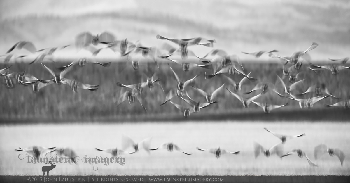
I've been wanting to get some images that show the incredible sense of motion and activity when the flocks lift off for the next feeding ground, and decided to crank down the ISO to get into the extremely-slow shutter speed category and see what I might end up with (I know, certainly not a new technique to avian photographers). I set up with a bank at the end of the field and the hills in the background and waited. Happily some rutting mule deer came through and the field went from calm to an eruption in a blink of an eye.
Curious to know what you think of this attempt at a motion blur (for me, the layers of background make it a little different).
Thanks in advance...
Nikon D600
Nikkor AF-S 500mm f/4 IF-ED
ISO 250
1/25sec @ f/4.5
-0.7EV
Tripod mounted

Comments
8 commentsNice to see you posting! Keep 'em coming. I'm always up for these kinds of creative endeavors. I like the layers you captured very much. with the two "rows" of geese. That works well. The background layers also add interest. I think the image could be rotated CW just a fraction. I played with it in PS. It may be an illusion, but still think it helps just a touch. I also applied a couple of targeted TK masks to add just a it more contrast and slight richer blacks and it made this even stronger for me.
Keith, I had done a light CW rotation to level the top third dividing line (background hills to darker bank). In the colour version I rotated it further and used the bottom third dividing line (field to bank) as the anchor, which makes the top line tilted CW. Can't win for losing. ;)
Here is the colour version as requested. :) In this one I kept the tones fairly dark and representative of the dusk light the image was created in.
Thanks again and have a great week!
Much prefer the black and white version.
Keith
A nice inspiration to others, thanks.
TFS
Steve