Nature Photographers Network
This is the preserved archive of the original Nature Photographers Network. The community continues at naturephotographers.network.
Lifespan+Scroll to 3rd Version
‹ PreviousLandscape GalleryNext ›

Lifespan+Scroll to 3rd Version

by Marylynne Diggs

Gallery: LandscapePosted November 7, 2015137 views12 comments
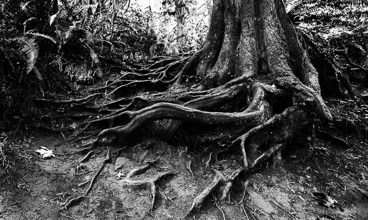
I'm working on a portfolio of a couple dozen black and white images, and I'm eager for feedback.  I'll be posting a half dozen or so of them here over the next few weeks.  Here is the first, taken most recently and the one I'm least confident about in a way.  Partly, it's the fact that I took it just a few weeks ago, and I generally need a month or more to get perspective on an image's overall impact and quality. 

Let me know what you think, and please feel free to suggest changes.  I have several versions of this with wider and narrower crops, etc. 

5DMiii with 16-35mm
ISO 200, f/9 1.3 sec
Tripod (obviously) and timer release
BW conversion in Nik with LR finishing

Comments

12 comments
Comment posted by Roel Wijtmans on November 8, 2015 at 11:22 AM
The comp is very nice, the roots pointing like tentacles to the solitary leave as if they are taking care of it, is well seen. It does feel a bit contrasty for me though.
Registered on September 30, 2012, 116 Posts, 2257 Comments
Comment posted by Mark Seaver on November 8, 2015 at 6:20 PM
I like the roots as tentacles and the looping eye flow that swings from the front right around the tree into the distance.  The fallen leaves are nicely located and there's a good emphasis on the left most leaf.  I do agree with Roel the the contrast seems too strong.
Registered on January 23, 2011, 1103 Posts, 17270 Comments
Comment posted by Vance Gese on November 8, 2015 at 7:54 PM
Really like the composition, with the nice dynamic flow.  The highlights seems too harsh to my eye; wonder if you could try and reduce the highlights somewhat, especially in the background.
Registered on November 13, 2008, 298 Posts, 6629 Comments
Comment posted by Marylynne Diggs on November 8, 2015 at 8:23 PM
Thanks everyone.  I was debating this more contrasty version v. another version I processed fairly differently.  I didn't mention contrast because I wanted to see if it came up naturally (and it did)!

Here is another version. There are two changes here: contrast and aspect ratio.  The first one above was 12x20 aspect and this one is 4x6.  Sometimes I like to change two variables to get feedback on both.  So, let me know if you like one aspect ratio better, and also whether this dials back the contrast sufficiently.

Thanks as always
ML
Registered on December 14, 2010, 122 Posts, 1034 Comments
Comment posted by Mark Seaver on November 9, 2015 at 7:27 PM
Marylynne, I like the reduced contrast in the repost and the extra content showing in the background.  I think the reduced contrast is a major improvement, although the combination of extra space and more content in the top center does add a nice touch of "what's over the ridge" that was missing in the original post.  You've created a very primordial feeling in this image.  (I expect to see a hobbit or maybe a dinosaur pop over the ridge at the back any moment now. cool )
Registered on January 23, 2011, 1103 Posts, 17270 Comments
Comment posted by Harley Goldman on November 9, 2015 at 9:14 PM
Nice job on the repost. I might even burn down the background highlights a bit to put more emphasis on the main attraction, the root structure. I like Mark's term "primordial", an apt description. 
Registered on November 19, 2003, 586 Posts, 11271 Comments
Comment posted by Ryan Shain on November 9, 2015 at 10:09 PM
Hi Marylynne,

I very much like what you have come up with in the repost of this image. The image just feels better, if that makes sense. I think it is the extra room that is created form the 4X6 aspect ratio. The graphic nature is sweet,a nd nice work.
Registered on February 20, 2007, 226 Posts, 4571 Comments
Comment posted by Marylynne Diggs on November 10, 2015 at 7:32 PM
Thank folks.  Here is one last (I swear) version.  I tried to strike a balance between encouraging the eye over the hill (as Mark said) and focusing on the roots.  It's ironic, isn't it, that more sky draws the eye back to the roots.

Anyway, this one is also 4x6, but lower and tighter.  I also processed it entirely in lightroom to see what an even more subtley in contrast would do. 

At the risk of demanding too much attention, here's are my two polling questions now:
Do you like the third crop or second crop better?
Do you like the LR version better than the NIK version? (I own stock in neither).

Thanks again to all who have helped and will help with dialing this one in.  It is special to me.  It's one of the first pictures I took after my father died, and it reminded me of him (but I'm not offended by the primordial comments in the least enlightened.)  The entire forest was primordial with lots of nurse logs, and I was in an introspective place.
 
Registered on December 14, 2010, 122 Posts, 1034 Comments
Comment posted by Lucy Aron on November 15, 2015 at 6:30 PM
Interesting shot thouugh my eye seems to be hungry for less contrast in the fg so maybe a little more definition there.
Registered on February 25, 2011, 189 Posts, 1160 Comments
Comment posted by Marylynne Diggs on November 15, 2015 at 8:23 PM
Thanks, Lucy.  Are you referring to the third variation posted, or the first.  I dialed back the contrast a good bit in the third, so I just wanna make sure I know which one seems too contrasty.
 
Registered on December 14, 2010, 122 Posts, 1034 Comments
Comment posted by Steve Kennedy on December 4, 2015 at 6:23 PM
Hi Marylynne!  I'm a bit late to the party.

I think the 3rd version is outstanding.  "Primordial" is definitely a good description.  The detail, texture and contrast improvements in the 3rd version are just right.  This image really works well as a B&W.  Well see!
Registered on March 9, 2009, 79 Posts, 676 Comments
Comment posted by Katie Jones on December 10, 2015 at 9:21 AM
Love this composition and the black and white works very well here. It really brings out the detail of those tree roots. I also like the white leaf that's just off to the left. It's an interesting touch. Nice job!
 
Registered on November 17, 2015, 17 Posts, 91 Comments