Reflections on Dug Bar + Repost
by Marylynne Diggs
Hi Everyone,
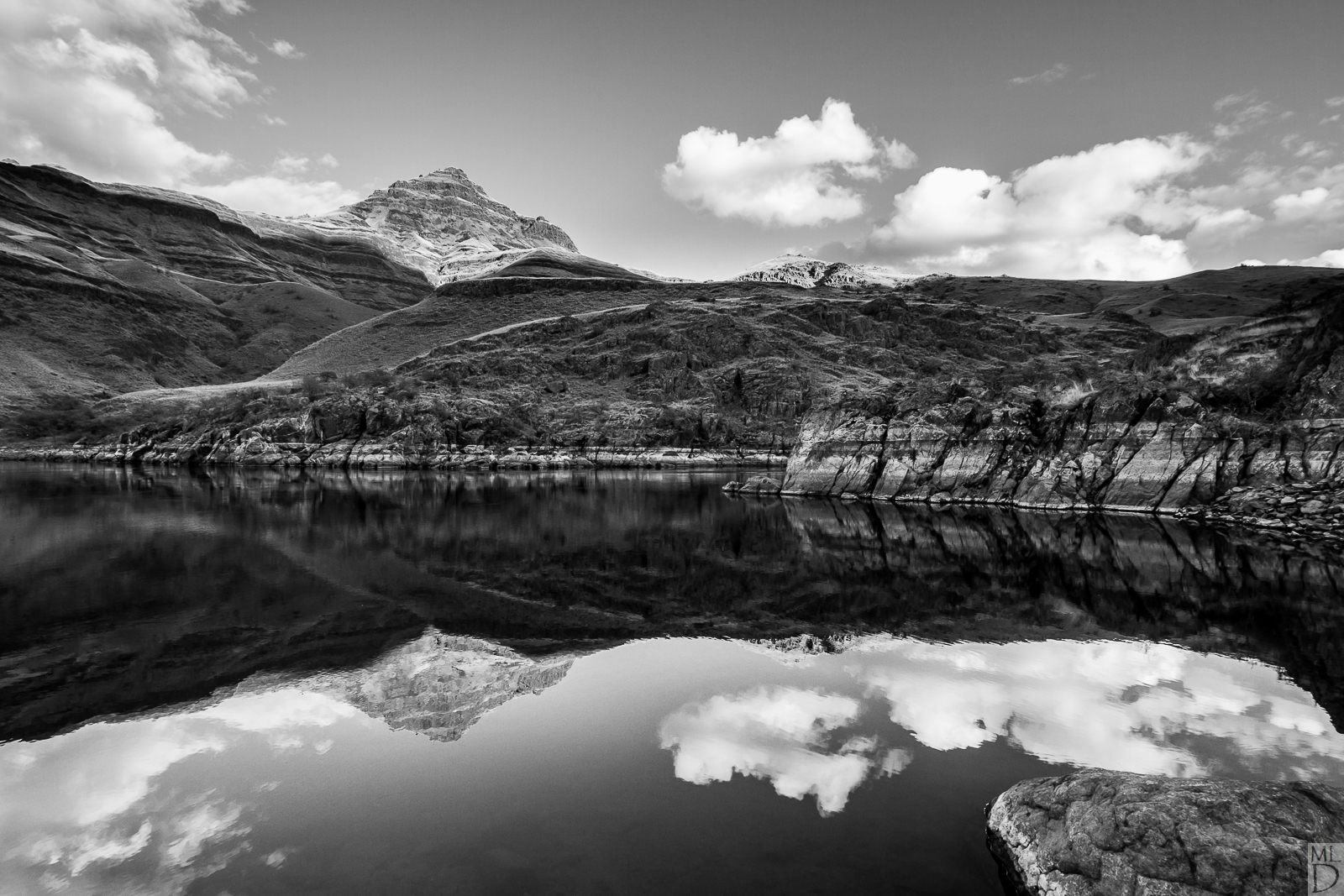
Here is the third in my series of black and white conversions. I'm putting together a portfolio of BW landscapes (see my gallery). Please let me know what you think of this one (composition, contrast, brightness, etc) and feel free to offer suggestions.
RE the title: This is taken at Dug Bar along the Snake River, site of the Nez Perce final crossing from their native land after their treaty rights were "revised" for the 3rd time. They fled into Idaho here, fought the good fight, and then opted for surrender over death before being forced into reservations in Idaho, Oklahoma, and Washington.
The next few BW images I post here will be of their native lands along the Snake River, Zumwalt Prairie, and the Wallowa Mountains and Valleys.
Canon 7D with Sigma 10-22mm at 10mm
ISO 160, f/13, 1/30s
Processed in LR entirely handling HSL and manually
And yes, I finally realized we can do 1600 and 1 MB and one upload!

Comments
9 commentsI think this image conveys a wonderful flow and the setting is delivered well. Just a suggestion when presenting B&W images, that when images are in color, you can get away with lighter areas on the edges. In black and white my eye is usually drawn to the edges if light areas are present. I suggest that maybe a slight burning of the edges especially where lighter areas touch will help to keep the viewer inside of the frame. Just my $.02.
Jim
I really like this and I think a very fitting and well done b&w.
I don't really have any nits, but will offer a couple tweaks. I might experiment with darkening the sky just a tad. Or perhaps bumping up contrast. As it is, the difference in exposure is actually appropriate between the sky and reflection - the reflection should be darker. But I also just noticed, as presented, the brightness or whiteness of the clouds is about the same top and bottom, yet the sky isn't. Perhaps just a curves tweak in the sky? Something to play around with anyway. Again, not a problem, just seeing how you might make it even better.
The second thing, and this is purely subjective and my opinion. How about a slight 5% crop top and bottom to make this just slightly more narrow, accentuating the length and symmetry? Just a thought there.
Overall this is a nicely processed and presented b&w
--P
I did a little more with the contrast and the water reflection, toned down ever so slightly some of the highlights, and then I went with a 12x20 crop. I like it much better, and I am very thankful for everyone's input. I'm happy to receive more if you think I took a bad turn in any of these changes. It's a little tricky to compare since the repost has a 500k limit and I couldn't figure out had to add a hex value frame on a repost.
I keep debating the rock. I think it's less aesthetic and more philosophical. It may have been the last Oregon rock many Nez Perce touched before crossing and losing their land. Maybe it's also state pride. Without that rock, it's a picture of Idaho
Thanks again! And holler if you see something else.
ML