Imnaha Canyon + Repost
by Marylynne Diggs
Greetings All,
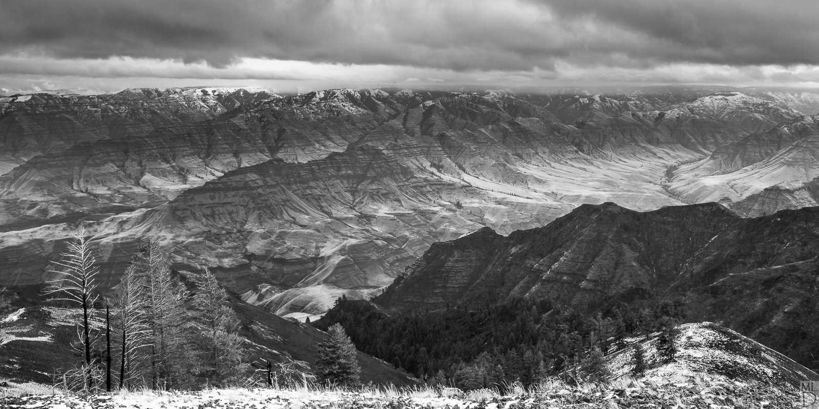
This is the fifth in a series of black and white images I'm working on. This is also from Wallowa County, looking into Imnaha Canyon. I remain undecided about this one. In some ways, it is more interesting than the last image, but it's also less linear and lacks the kind of universal simplicity of the last one.
Let me know what you think, and fee free to offer suggestions, feedback, etc. If it just "ain't got it," let me know that too.
ML

Comments
15 comments--P
Jim
This looks much better in the larger version where the eye can wander the scene. Compositionally, the high value grassy line at the bottom looks a little blown out, and compositionally too thin? There are a lot of great tones here, especially in the burnt pine, and down into the valley. Leads nicely.
Glad to see more black and white here, surprisingly a more difficult medium than digital color.
Cheers: Tom
I cannot add much to the great feedback you have gotten except to say I really like this photo. I think the ideas about dampening the grass in the foreground are constructive and beneficial. I also like Preston's suggestion about more foreground.
I really like this scene, the narrow format and the composition with the inclusion of the bare, burnt trees in the lower left.
Personal preference, but I might play with the contrast in the far range, but again it's your choice.
I would agree with the other comments about the bottom. My own rule says, "If you're going to include something, make sure it's obvious and on purpose." For me, either something was preventing you from including more foreground (position, some unwanted element, etc.) or you just chose to only include (crop) only that small sliver. As Jim mentions, compositionally I need just a little more for the base, AND the combo of bright snow/grass appears a bit blown. I think if you could address the bottom strip, this will be a fine addition to your working collection.
Lon
This is 12x20 instead of 10x20, which allowed more room for the feet without losing some of the drama in the clouds. I don't know whether the reduction in highlights/whites at the bottom (which results in more patchiness) makes it more distracting or less so. Let me know what you think.
I also added a tish more contrast in the distance. This was shot during a brutally windy, cold afternoon on that ridge, with a storm and snow approaching. I didn't want to include much of that snowy foreground, but I did like the trees. The question of more or less of it was a longterm struggle, so I'm glad to have some feedback on it.
It is a truly grand landscape out there. If you ever have a change to go to the Buckhorn Lookout at the edge of the Imnaha Canyon, I highly recommend it.