Nature Photographers Network
This is the preserved archive of the original Nature Photographers Network. The community continues at naturephotographers.network.
Diversity +RP already!
‹ PreviousLandscape GalleryNext ›

Diversity +RP already!

by Lon Overacker

Gallery: LandscapePosted November 30, 2015203 views13 comments
Thank you all for the comments about my previous image!

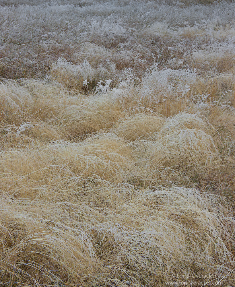
One of the things I am so drawn to in the meadows and grasses of Yosemite Valley is the diversity of the grasses; not only the variety of species, but of color and stage of life (some going dormant, while some green showing underneath.)  I hope this one reflects that thought and vision in my head.

This particular image has mulitple options within it.  But rather than me post alternatives, I think I'll just let this one sit out there and see what impressions are out there.

Your comments, opinions and critique more than welcome!

Nikon D800E
Tamron 24-135mm at 55mm
4-image focus stack at f/16

Thanks!

ps. FYI the larger view image uploaded is only 1000px in the vertical.  I thought about redoing a larger one to check the resizing behavior...  

Comments

13 comments
Comment posted by Tony Kuyper on November 30, 2015 at 9:23 PM
Been watching your rapid-fire postings here and have been thoroughly enjoying all the new images.  Digital doesn't seem to have affected your visual sense.  These still look like Lon Overacker images to me, especially since you crop them to 4x5.  Or does the 800E have a 4x5 sensor crop?  What fun huh?

Very much like the composition here, but the white frost feels a bit blue-gray.  It works, especially since this is obviously in shadow light, but the frostiness feels a bit subdued.
Registered on November 1, 2003, 364 Posts, 22328 Comments
Comment posted by Harley Goldman on November 30, 2015 at 9:40 PM
Nice comp with the grass patterns, the layers and depth,  but the color in background is throwing me off a little bit. I played with a gradient mask and a color balance adjustment and liked the results. 
Registered on November 19, 2003, 586 Posts, 11271 Comments
Comment posted by Lon Overacker on November 30, 2015 at 10:20 PM
E-Gads!  My first thought when seeing my own post, how flat it was.  Tony, thanks for your comment, I agree!  I feel like a student has failed the Master!  Thanks for your comment, great to  hear from you.

Thanks too Harley. You didn't mention what color or which way you took the top part with the gradient mask, but I'm guessing the very top was a little green?  I tweaked that as well.

Here is a reworked version that I hope shows a little more life!
Registered on November 24, 2006, 521 Posts, 19147 Comments
Comment posted by Alberto Patiño on November 30, 2015 at 11:09 PM
I love the combinatiuon of softness and detail, and I agree that the repost is even more beautiful. The repost also looks noticeably sharper than the original large image frown I noticed the same thing on one of your previous images, I believe the one of the trees reflecting on the river. 
Registered on December 2, 2014, 278 Posts, 1736 Comments
Comment posted by scott lanz on November 30, 2015 at 11:34 PM
Man, you guys are posting some sweet images from Yosemite. A beautiful portfolio of the "hidden" beauty of Yosemite valley in plain sight. I see three images within this one -  the one you posted; a square or maybe 4 x 5 vertical of just the bottom lighter grasses; and a 4 x 5 horizontal of the top half with roughly a 50/50 balance of the golden grasses and the darker reddish grasses at the top. 
Registered on November 14, 2003, 840 Posts, 12902 Comments
Comment posted by Albert Darmo on December 1, 2015 at 10:12 AM
Hi  Loncrying  The  repost  really sings..       a little change in  color can do wonders.   love  this composition with  the  detail  of the swirls of frosted grass receding  into the background..     beautifully composed..

Albert Darmo
Canada
Registered on November 25, 2008, 1386 Posts, 11978 Comments
Comment posted by Jim Jirka on December 1, 2015 at 10:39 AM
The repost is it. The repost seems to have a magenta cast in the BG. sad
Just kidding. The colors and tones in the repost really hit the nail on the head. Nicely done.
Jim
Registered on November 1, 2003, 254 Posts, 1620 Comments
Comment posted by David Schoen on December 1, 2015 at 11:53 AM
Yes, the repost is a bit warmer and less flat.  Inspiring.
Registered on November 6, 2006, 1213 Posts, 4587 Comments
Comment posted by Roel Wijtmans on December 1, 2015 at 11:53 AM
I had some small comments, but they are fixed in the repo, so.... The grasses look very nice and rich with details, but it is the gradient that makes this one work very well for me.
Registered on September 30, 2012, 116 Posts, 2257 Comments
Comment posted by Nick Bristol on December 1, 2015 at 5:00 PM
Lon, The repost took care of all issues for me. Great comp and I like the image alot.cool

Nick Bristol
Lone Rock, WI
Registered on February 1, 2004, 752 Posts, 14140 Comments
Comment posted by R.Bill Moser on December 2, 2015 at 12:18 PM
I really love the image. Love the pattern and the depth. The repost is even much better than the original posting...or should I say more beautiful. This is a very inspiring image. Really great. Love it
Registered on January 29, 2010, 285 Posts, 4281 Comments
Comment posted by Dietrich Gloger on December 2, 2015 at 2:30 PM
I did like the soft look of the original, but I agree that technically, the repost is more "correct". Some intermediate, or some very slight orton effect to the more contrasty version could be a "best of both worlds". A matter of taste, as usual. The composition is very good, again. I like how the scene starts with the big "arches" of the grass stems and how that sense of movement and direction is carried on towards the bg. A fine grass image.
Registered on January 26, 2007, 360 Posts, 9876 Comments
Comment posted by Youssef Ismail on December 10, 2015 at 8:55 PM
Maybe its the small size of the image, but it seems a bit soft.
Registered on November 1, 2003, 474 Posts, 5555 Comments