Nature Photographers Network
This is the preserved archive of the original Nature Photographers Network. The community continues at naturephotographers.network.
Touch of Frost Too
‹ PreviousLandscape GalleryNext ›

Touch of Frost Too

by scott lanz

Gallery: LandscapePosted December 20, 2015198 views11 comments
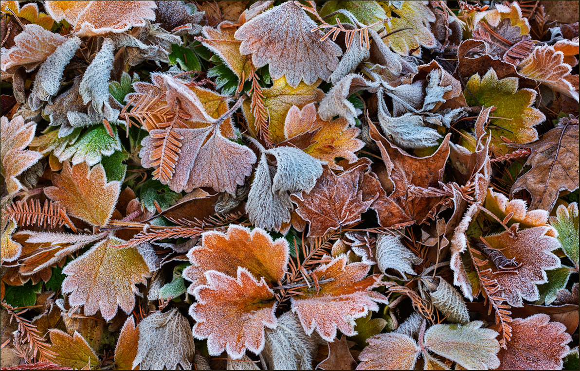
Thank you for your comments on the previous version of this scene. This is a different image of the same scene, shot slightly wider. I processed this one differently, warming it up and boosting the contrast quite a bit for a more graphic look. D600, 150, f25, 1/6, iso 200. Suggestions, critiques, questions and other comments welcome (including opinions on which works better). crying

Comments

11 comments
Comment posted by Dave Dillemuth on December 20, 2015 at 9:13 PM
Scott,
Hard to chose as these are all gorgeous but this maybe my favorite . The color palate is just beautiful. High contrast and warmer rendering works well.
Registered on December 10, 2015, 104 Posts, 1112 Comments
Comment posted by Ian Cameron on December 21, 2015 at 9:55 AM
There has been a glut of frosty leaves but this is one of the very nicest of them all with marvellous internal luminosity.
Registered on August 6, 2004, 1125 Posts, 3318 Comments
Comment posted by David Schoen on December 21, 2015 at 1:27 PM
Of your 2 leafscapes, this is the most lively due to the frost luminosity.  I looked at the two images side by side and I feel this is far superior.  Good job.  My leaves are all brown and wet now.
Registered on November 6, 2006, 1213 Posts, 4587 Comments
Comment posted by Mark Zelinka on December 21, 2015 at 2:52 PM
This is wonderful. Well seen and presented. There is a delicacy to the scene of these objects that are soon to decay.
Registered on August 20, 2007, 206 Posts, 998 Comments
Comment posted by Lon Overacker on December 21, 2015 at 4:19 PM
Another beauty Scott!  Such a beautiful combination of color, details, shapes - and the frost just ties everything together.

I like both images very much.  I like this one over the first in terms of the overall lighting and exposure. ie. the previous version I commented on some of the pale green leaves being a bit bright.  But for me, I might prefer the previous image when it comes to composition - ok, maybe composition isn't the right term, but I really liked the more compact, tighter comp from earlier. This one here is slightly wider, I think.  Minor points to be sure.

I think I would be pretty excited to have this in front of my camera!  Well done.

Lon
Registered on November 24, 2006, 521 Posts, 19147 Comments
Comment posted by Mark Seaver on December 21, 2015 at 5:02 PM
Scott, the choice is easy for me.  The extra contrast in this view adds a fine pop overall.  I also like having more leaves and texture included in the view.  Gives more places for my eyes to wander.  Setting up a shot like this is very hard and your comp. is terrific in how it creates a central rectangle with lots of interesting parts surrounded by complementary material.
Registered on January 23, 2011, 1103 Posts, 17270 Comments
Comment posted by Albert Darmo on December 21, 2015 at 6:00 PM
Hi  Scott crying   I  think this type of  scene  lends itself better to  more graphic  detail .  this  is why  i like this one  a wee bit better.. also  the composition is more  interesting with the added leaves and the frost luminosity..

Albert Darmo
Canada
Registered on November 25, 2008, 1386 Posts, 11978 Comments
Comment posted by D.A. Edwards on December 21, 2015 at 7:49 PM
I prefer this one also, scott, such a lovely, balanced composition of color and shape. Minor nit but I might be tempted to experiment with a bit more sharpening, perhaps selectively, on the image without getting to over-sharpened.
Registered on October 8, 2014, 226 Posts, 1187 Comments
Comment posted by Marylynne Diggs on December 21, 2015 at 9:39 PM
This is wonderful, Scott. I really like the palette and the frosty edges and textures.  Comparing it to #1, it's a draw. The composition in #1 feels more thoughtful (but randomness is good in the second), and I like the warm colors of the second, especially the needles (but #1 colors feel more natural to me).  Like I said, it's a draw for me. Now I'll read what others wrote cool
Registered on December 14, 2010, 122 Posts, 1034 Comments
Comment posted by Reno DiTullio on December 22, 2015 at 3:03 PM
What's not to like?  Beautiful in all aspects, color, light, arrangement, and the frost brings it all together.devil
Registered on November 14, 2003, 130 Posts, 1644 Comments
Comment posted by Igor Hoveijn on December 24, 2015 at 11:35 AM
These little scenes are just so beautiful. The previous version has a crayons feeling due to subtle contrast. This version is more vivid. Both are very nice in their own way. I am not going to choose.
Registered on November 2, 2015, 18 Posts, 192 Comments